Check the acquisition promise
Read the store headline, screenshots and description. What problem is the app promising to solve?
Study the storefront ↗
Michael Camilli · iOS
Explore the ad evidence, study the storefront, and build your next acquisition hypothesis.
01 / Creative research
Read the store headline, screenshots and description. What problem is the app promising to solve?
Study the storefront ↗Explore apps with direct store-link matches. Compare their hooks and formats without assuming the same approach works here.
Browse observed advertisers ↗Store rankings and revenue estimates describe market context. They do not establish ad spend, conversions or ROAS.
Review the market context ↗02 / Storefront & product
Study the product story and store experience behind the acquisition funnel.
03 / Market context
Keep revenue, downloads and store rankings separate from advertising performance.
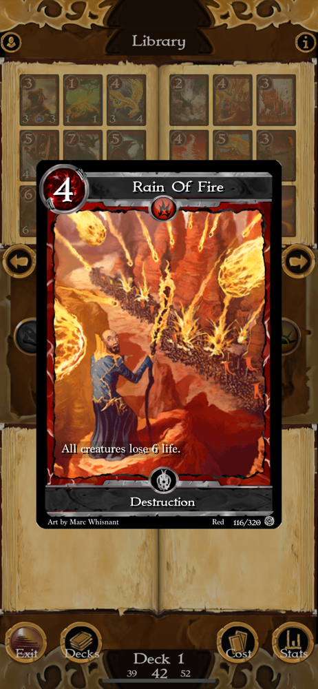
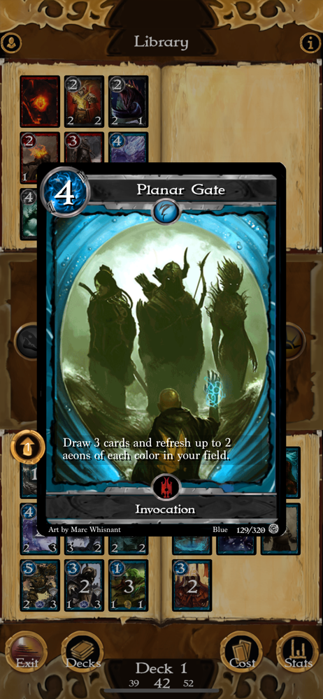
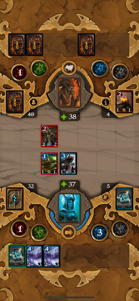
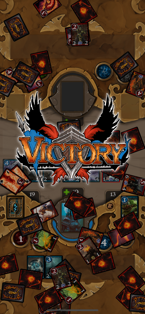
The pros: -the core gameplay is good. the mechanics are fun and engaging, with a good amount of depth -the card art is great -the rpg elements are a cool twist on the genre -theres a nice amount of customization options -does pressure you into micro transactions -only costs a buck and half The cons: -the UI could do with an complete overhaul. the bottoms often kind of blend in with the rest of the UI and are hard to see -it’s kind of clunky and a bit buggy, with some ocasional long load times. for instance, occasionally after a battle, it gets hung up and takes upwards of 30 seconds to load back into the map. -the tutorials could also use work. The highlighting, again, has too little contrast and is easy to miss. And there are things that aren’t explained or obvious from the tutorial, such as the fact that you need to tap on the “victory” or “defeat” messages after a battle to continue. It’s not a huge deal, but little things like that add up to detract from the experience. Overall, it’s a good game, and the pros definitely outweigh the cons, but a bit of polish and tidying up would go a long way. I would suggest looking at games like Hearthstone for cues on UI design. Generally, the simpler and sleeker, the better. obvious the dev doesn’t have the resources of blizzard, but you know what I mean.
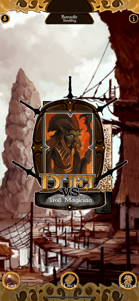
I love this game; been playing it for years. It's fun, engaging, and interesting, with a ton of cards and great gameplay. The developer keeps patching it and adding to it, which is amazing to me, and it keeps getting better, with a new expansion added just a little bit ago despite this game being several years old. The randomly-generated areas accessible through a portal are an excellent touch for replayability, and I absolutely love that the developer recently made the special cards unique to each opponent drop more frequently, cutting down severely on grind. Buy it if you like single-player, easy-to-pick-up card games with no microtransactions, no lag, good mechanics, and continuing love and attention from its creator. To say so, I favor gameplay over story or setting for something like this, so it doesn't bother me that the writing isn't tight, but if you're looking for that it's not here, sorry. Just battle after battle, with some occasional "Please help my brother!" which, of course, translates to "Go fight ______ in a dungeon colored thematically but which is otherwise essentially the same as any other!" The enemies are different, though, with interesting combos and deck composition tailored to them, and their own aforementioned special cards you can get when winning. If he ever makes the spaced-themed game he appeared to be working on, I'd be psyched to play that too, I'm sure.
Just what I was looking for! Got to the point in HS that I didn’t care if I won and hated it if I lost— not a great recipe for enjoyment. On the other hand, Lost Portal is simply pure fun— love it when I win and, if I lost, try again! The adventure format simply adds another dimension to this enjoyment and I can imagine interesting updates where it may even play a bigger role. A couple of requests from the developer: Playing on an iPad Pro and the attack button and discard pile are a bit overly particular as to where they get activated. I often have to try to discard more than once to hit the sweet spot (same goes for the attack button). Also, the game seems to require a vertical orientation with the home button at the bottom. As I like to play with the iPad plugged in, the plug gets in the way at that orientation. It would be great if it could be flipped to put the home button at the top. You have something really good here— looking forward to even better!
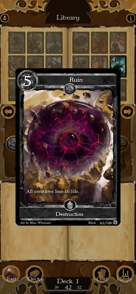
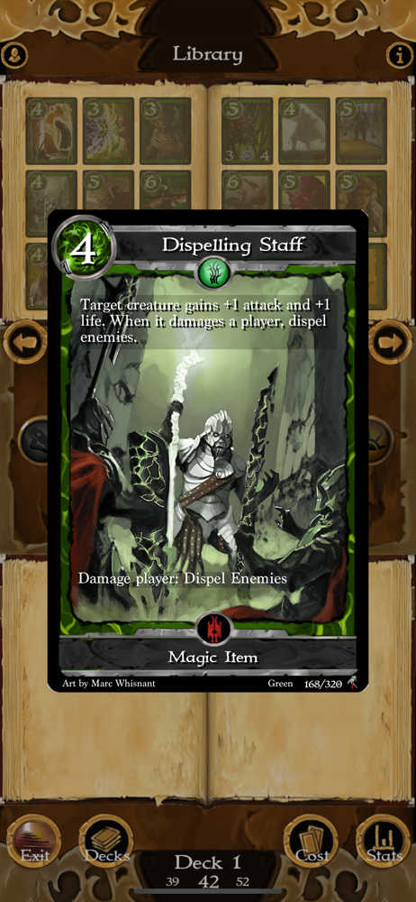
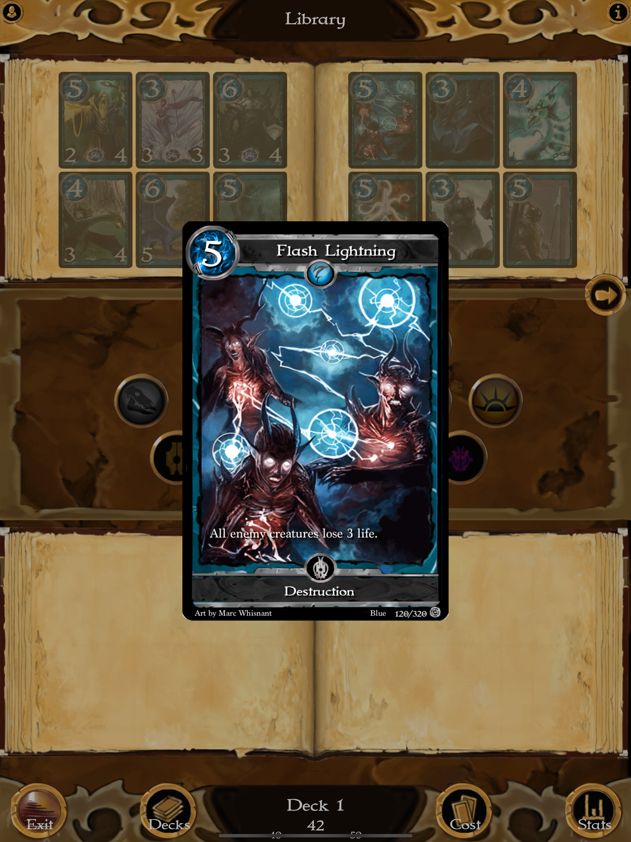
Lost Portal is a solo collectable card game where you explore dungeons and fight enemies and bosses, collect treasure and level up your character to g...
| Name | Price | Type |
|---|---|---|
| Aerahym Expansion | $1.79 | One-time |
| Primeval Expansion | $2.69 | One-time |
| Feldyr Expansion | $2.69 | One-time |