Check the acquisition promise
Read the store headline, screenshots and description. What problem is the app promising to solve?
Study the storefront ↗
Technology Credit Union · iOS
Explore the ad evidence, study the storefront, and build your next acquisition hypothesis.
01 / Creative research
Read the store headline, screenshots and description. What problem is the app promising to solve?
Study the storefront ↗Explore apps with direct store-link matches. Compare their hooks and formats without assuming the same approach works here.
Browse observed advertisers ↗Store rankings and revenue estimates describe market context. They do not establish ad spend, conversions or ROAS.
Review the market context ↗02 / Storefront & product
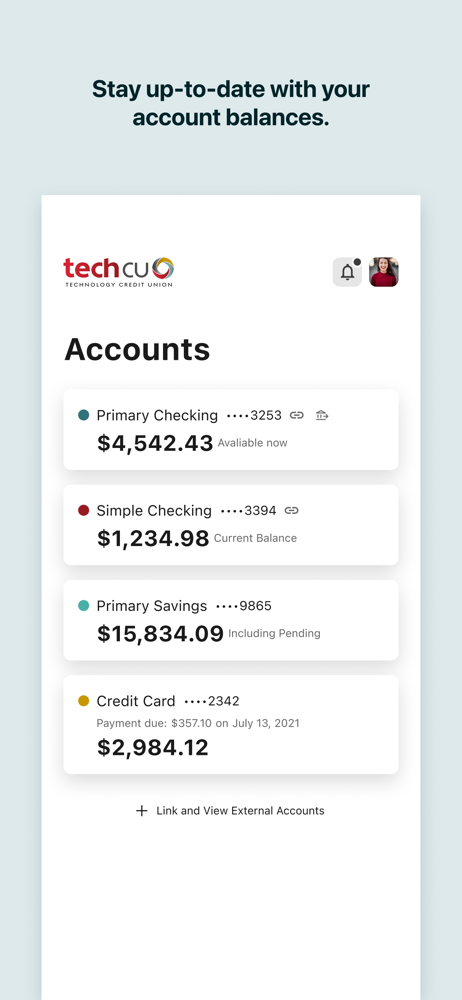
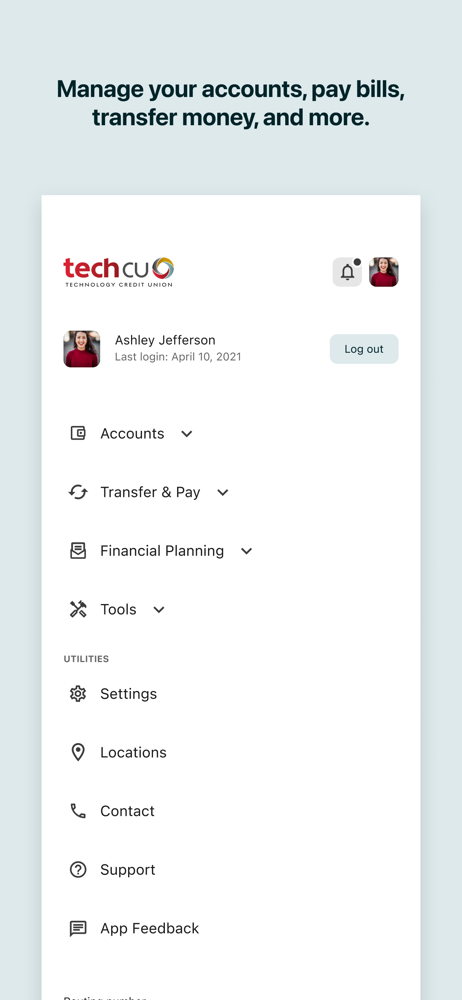
Study the product story and store experience behind the acquisition funnel.




03 / Market context
Keep revenue, downloads and store rankings separate from advertising performance.
I’m really impressed with the new app! Being able to see all my accounts under one log in is nice. The updated card management features are a my favorite. I love that I can now set travel notifications, block my card, or reset my PIN all on my own. Plus, I’m really excited about the upcoming Zelle integration, Great job on the improvements!
Not sure this new Feb 2025 app release was tested much if at all. Huge flaws in the features I use most often. Bill pay is practically unusable: the filter on account now displays the same *nnnn (where nnnn is the last four digits of the primary savings account) for all of our checking and savings accounts. Thus you can’t tell what account you are viewing or which it is paying from. Guaranteed to result in overdrafts and paying from wrong account. Is this meant to generate fee revenue for Tech CU? Since I use bill pay for pretty much all of my bill transactions, this is a most serious flaw. When using the account pull downs in transfer and other features, the displayed list will not scroll to show all accounts. For example if you have two savings, a HELOC, and more than two checking accounts you can only see 5 accounts randomly sorted. The way mine display it will not let me transfer from savings to checking as savings is below the display line. I pay property taxes from savings this way, so if not resolved before 9 April I will need to find another bank. Further, the card manager only shows information for the primary account holder though this is a joint account. So only two of our three cards can be controlled. This diminishes security against card number theft and fraudulent charges from prior capability!
The latest update to Tech CU mobile banking app is a step backward in usability. Forcing all accounts to be accessed with a single set of credentials may seem like a convenience, but in reality, it creates unnecessary frustration—especially with how accounts are displayed. Instead of grouping accounts logically by account number, they appear in what seems to be a completely random order. On top of that, the update removes the ability to use biometric authentication for separate accounts. This was an incredibly useful security and convenience feature, and its removal makes switching between accounts much more tedious. If accounts must be accessed under one login, they should at least be grouped properly by account number. Even better, bring back biometric authentication for individual accounts. I hope the developers address these issues in the next release.
Your Tech CU banking experience just got even better with a seamless, fast and easy experience across online and mobile 24 hours a day, 7 days a week,...