Check the acquisition promise
Read the store headline, screenshots and description. What problem is the app promising to solve?
Study the storefront ↗
Chengdu Zhuozhuo Technology Co., Ltd. · iOS
Explore the ad evidence, study the storefront, and build your next acquisition hypothesis.
01 / Creative research
Read the store headline, screenshots and description. What problem is the app promising to solve?
Study the storefront ↗Explore apps with direct store-link matches. Compare their hooks and formats without assuming the same approach works here.
Browse observed advertisers ↗Store rankings and revenue estimates describe market context. They do not establish ad spend, conversions or ROAS.
Review the market context ↗02 / Storefront & product
Study the product story and store experience behind the acquisition funnel.


03 / Market context
Keep revenue, downloads and store rankings separate from advertising performance.
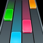
I know many players prefer the old 8-bit layout and how to note looks, but personally when I came back to this game after seeing it reverted, it made the game less comfortable. The hold notes blends in with the background, and when you miss the note the background zoom in, these things are making me frustrated with the game. Before the revert, I loved the ranking system where there is S, SS, SSS, and etc, it makes me feel achieved, feel good after getting all perfect and being rewarded with an SSS knowing I didn’t waste my time. I know and understand that it’s impossible to switch between the version constantly, so I hope the devs can see this review and make so players can choose which layout they want, just like backgrounds before the revert. Also I really liked the shop and the robots, it helped a lot with achieve SSS, and I hope devs can also add that back. Thank you!
This new update is a bit more stable, but I don’t like the new graphics. In fact the new design makes it harder to see what your doing, and the effects kind of bother me. If anything, I prefer what it used to be. I feel the old graphics were a little more original, and different in a good way. I like the old kind of 8-bit look, it was a little more pleasing to look at. So I’m kind of upset that was taken away. These new graphics just don’t feel the same, it’s almost too smooth, and too sleek. Ik you may not change it back, but I do prefer the old graphics, they seemed to fit the game better. Again, the game seems to run just a little. Also I’m a bit disappointed that my old data was not there. I logged on to a completely changed game, and started back at square one,
I love rhythm games and this game has SO much potential; It has already impressed me more than any other mobile game. First, I absolutely love the animation the developers chose to use. It is smooth, fun, and overall just easy to look at. Also, the music choice is absolutely killer. It is also awesome how the phone vibrates when you hit a note. Additionally, a huge THANK YOU to the developers for not making ads play at all. This game comes highly recommended from me if you are looking for a fun game to pass the time. To the developers: 1 - I would love to see options to make the game easier or harder added in the future as well as more songs. I really like how you level up to get more songs instead of earning coins and unlocking the songs. Adds an element of progression to the game. 2 - When the background turns to night time it can be difficult to see when to hold the notes and when not too. I tend to do much better during the daytime map because I can see this better. Maybe make the note tail whiter instead of black/grey. 3 - Thanks again for the awesome game!
We proudly present the freshest rhythm game Tap To Da Beat! Test your eye-hand coordination and improve your rhythm skills! Play your favorite genre...
| Name | Price | Type |
|---|---|---|
| Monthly remove ad | $0.99 | One-time |