
Check the acquisition promise
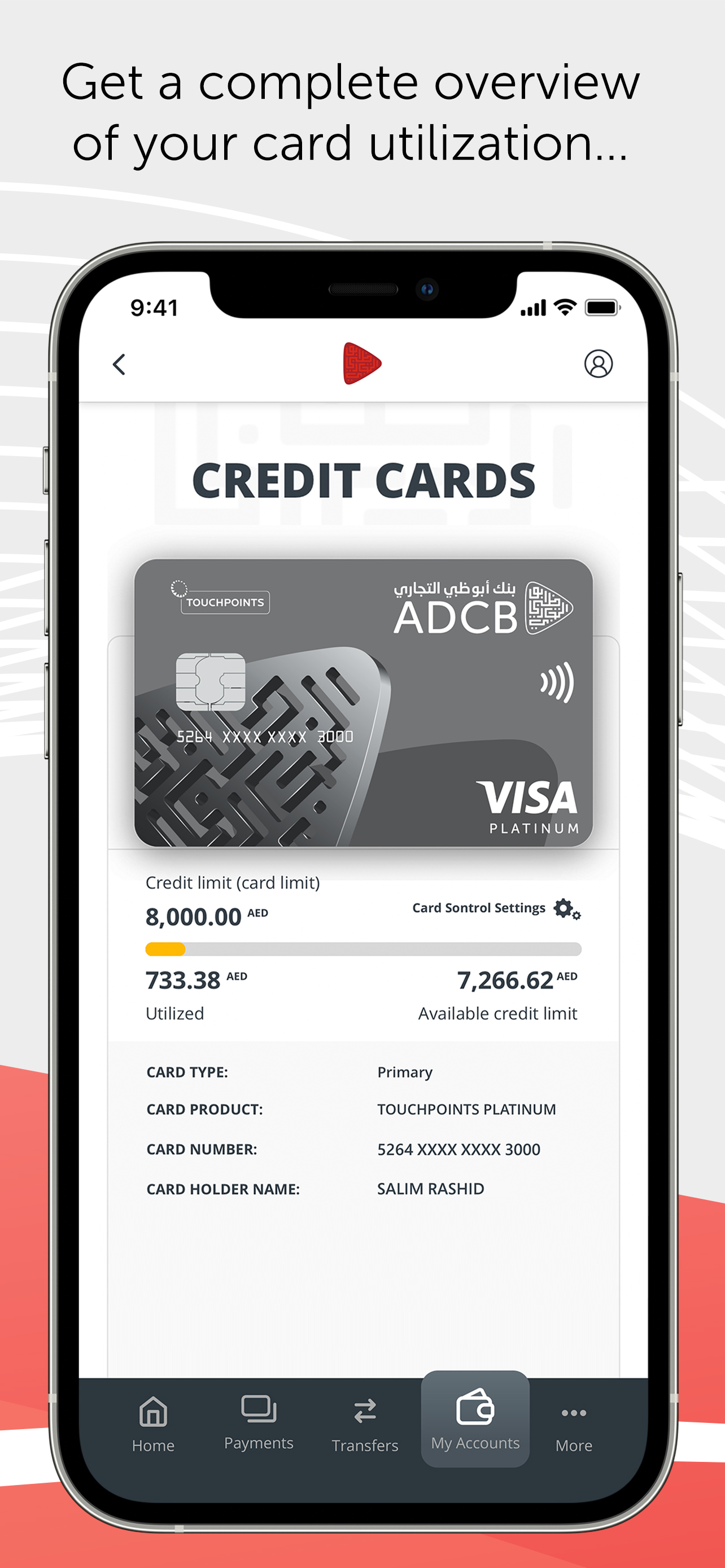
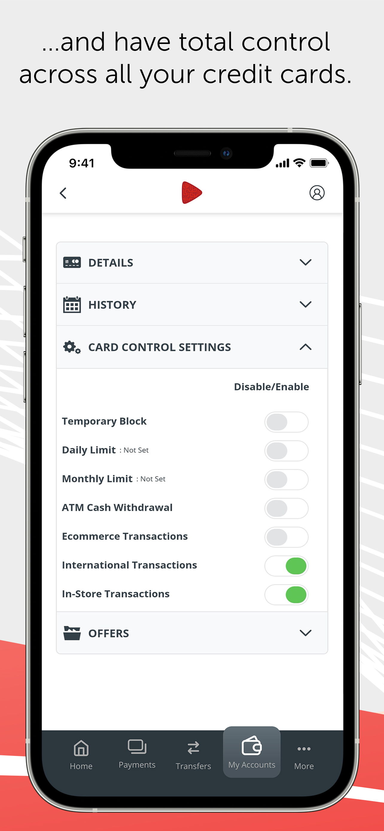
Read the store headline, screenshots and description. What problem is the app promising to solve?
Study the storefront ↗
ADCB · iOS
Explore the ad evidence, study the storefront, and build your next acquisition hypothesis.
01 / Creative research
Read the store headline, screenshots and description. What problem is the app promising to solve?
Study the storefront ↗Explore apps with direct store-link matches. Compare their hooks and formats without assuming the same approach works here.
Browse observed advertisers ↗Store rankings and revenue estimates describe market context. They do not establish ad spend, conversions or ROAS.
Review the market context ↗02 / Storefront & product
Study the product story and store experience behind the acquisition funnel.


03 / Market context
Keep revenue, downloads and store rankings separate from advertising performance.
At a time and age where most of the population depend on online for their banking certainly much more in UAE, this bank still operates as if it’s 1990s. The app is terrible. Don’t let me get started on the website which looks like an HTML with an SQL server back end(very old technology). Is there any interest of developing something remotely responsive to customers needs? If there is, it’s a secret. A well kept secret. Take Emirates Nbd for example, is a national bank, but the experience on the app and the website far exceeds expectations why not to be like Emirates Nbd. Or just aspire to? It is unfortunate that this bank has been operating for years and still fails to meet customers basic needs, do you know what happens to such organizations eventually? Not good.
The app offers a lot less functions and is much slower after the update. The older version, was 10 times more practical and faster. This is a very ill thought update, from someone who clearly doesn’t use the app themselves or they would have known better.
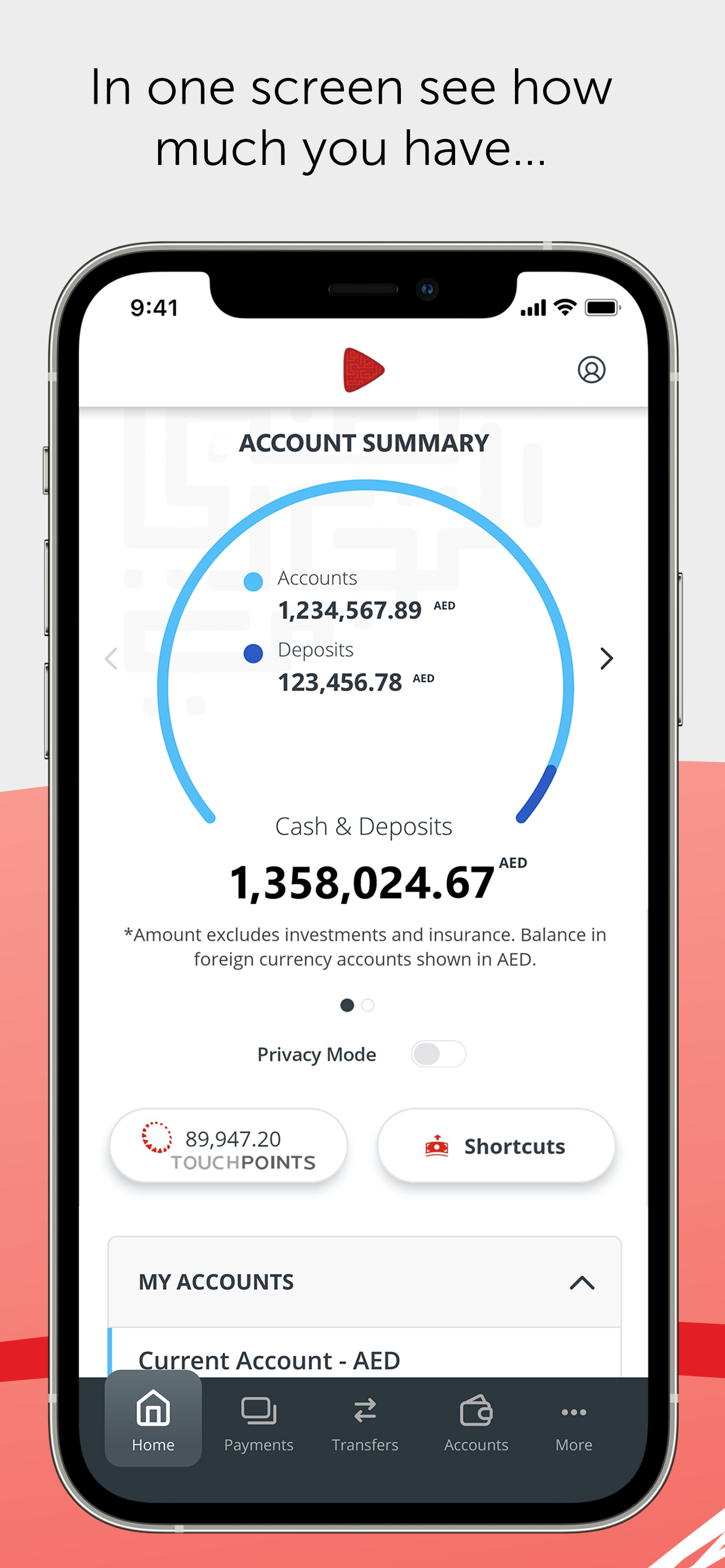
I need the previous version back asap. This version is not only buggy and complex but absolutely horrible and unsafe. Here are the issues:1. It displays total value of your cash and deposits in the main screen in big font, an absolute privacy and security risk if you are opening the app outside your home or in front of your friend. The previous version did no display the balance till you tap on account on fixed deposit. I open the app in restaurants, shopping places to see latest credit card transaction, credit card limit is exceeded or not, or if the current account has sufficient funds for the incoming cheque. 2. Now it is difficult to even navigate to your accounts or make money transfer. Money transfer within adcb accounts has been made unnecessarily complex, requiring many more taps, and non intuitive UI, small fonts where you are unable to clearly see the From/to accounts, exchange rate, balance before or after transfer in accounts, blah blah. Previous version had text fonts bigger enough for clarity, even though the version appeared less polished.3. Scrolling and swiping is buggy, lot of times it hangs when you swipe or scroll. Wonder why these people don’t pre-populate the data before user begins scrolling?Overall, the previous version was a usable and stable app that initially appeared less polished but worked amazing for all your needs. If any polishing was needed, one could simply polish the previous app while preserving the flow and UI. The current “polished” update is buggy and unusable for my needs.
Experience more power at your fingertips. Experience the new and improved mobile banking app from ADCB. Enjoy seamless banking on-the-go with the enh...


