
Check the acquisition promise
Read the store headline, screenshots and description. What problem is the app promising to solve?
Study the storefront ↗
Volo Inc. · iOS
Explore the ad evidence, study the storefront, and build your next acquisition hypothesis.
01 / Creative research
Read the store headline, screenshots and description. What problem is the app promising to solve?
Study the storefront ↗Explore apps with direct store-link matches. Compare their hooks and formats without assuming the same approach works here.
Browse observed advertisers ↗Store rankings and revenue estimates describe market context. They do not establish ad spend, conversions or ROAS.
Review the market context ↗02 / Storefront & product
Study the product story and store experience behind the acquisition funnel.




03 / Market context
Keep revenue, downloads and store rankings separate from advertising performance.
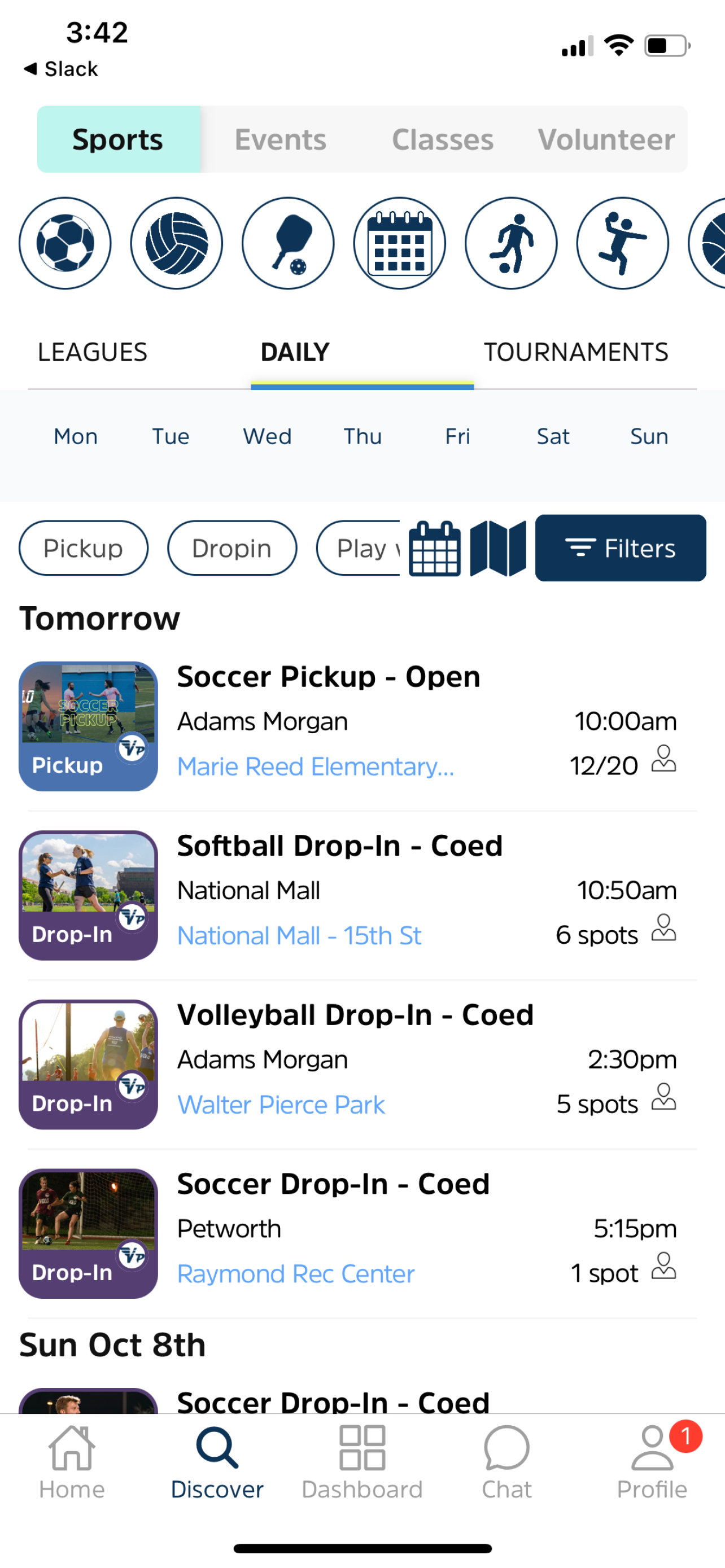
My first Volo league was a competitive 2v2 men’s beach volleyball league. The league signup page said each team required a minimum of 3 players which is strange because competitive besch volleyball is almost always played with a known partner and no alternates. The rules for the league were also copied and pasted from indoor volleyball which has different rules. Other than that, the app is pretty hard to navigate. If I want to filter for beach volleyball locations, I see a full list of 50+ locations in the filter options even though there’s only less than 10 that are relevant to beach volleyball. Similar for pickups, dropins, leagues, tournaments…tab navigation across the top…it doesn’t feel thoughtfully designed. It just seems cobbled together over time and extended whenever something new was needed. Also I recently received an invite link to a tournament and when I opened the link I didn’t get deep linked to the event, it was just the home page of the Volo events are still fun, but the app is cheap.
A lot of the complaints here are about the sports, or shirts, or bugs from a while ago so I just want to say: If they don’t offer your sport in your area, this is not the place to complain. This is a review of the app itself and its functionality and user experience. Same goes if you couldn’t get your shirt color or whatever. As for the UX, yes it had bugs, yes it’s still not perfect, but it’s come a long way in the last year or so and now I have no complaints or issues with the user experience that even comes to mind. I’ve been captaining a team in this league for 4yrs now and can say the app is in a good place, especially compared to all the other options around here in NYC (which I’d argue are probably all of the best options most likely).
When creating a team, you have to pick a team color for the shirts they show you the color name but there’s no visual of the color until after the team is created which has left me having to Google the color associated with the shirt which isn’t very efficient because you come up with many different shades it would be more beneficial to have the visual of the shirt color appear during team creation opposed to after
Plan your season, manage registrations, and view your schedule and standings for softball, kickball, flag football, volleyball, cornhole, and many oth...


