
Check the acquisition promise
Read the store headline, screenshots and description. What problem is the app promising to solve?
Study the storefront ↗
DITU Inc. · iOS
Explore the ad evidence, study the storefront, and build your next acquisition hypothesis.
01 / Creative research
Read the store headline, screenshots and description. What problem is the app promising to solve?
Study the storefront ↗Explore apps with direct store-link matches. Compare their hooks and formats without assuming the same approach works here.
Browse observed advertisers ↗Store rankings and revenue estimates describe market context. They do not establish ad spend, conversions or ROAS.
Review the market context ↗02 / Storefront & product
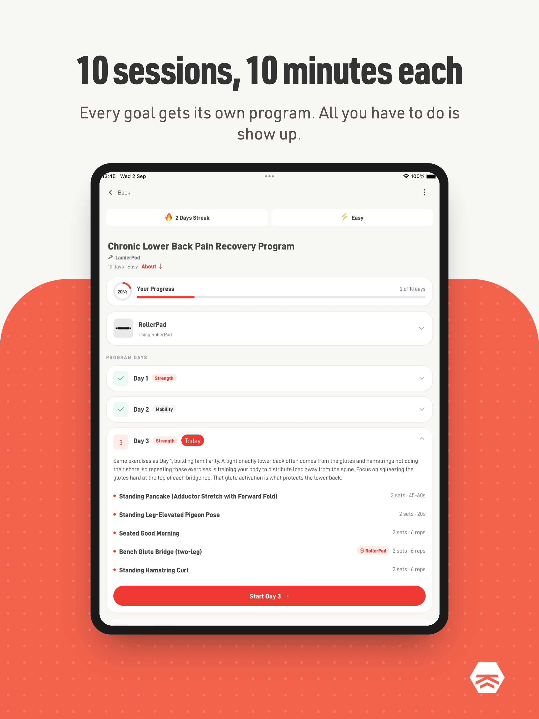
Study the product story and store experience behind the acquisition funnel.


03 / Market context
Keep revenue, downloads and store rankings separate from advertising performance.
The app has a lot of great features. Some things I really like. I can save bookmark individual exercises for later review and practice. The videos and accompanying text are good. Being able to restart any day of a program is a nice feature. Being able to run different programs is very useful as I have multiple ailments. The diagrams for peg placement are clear. Things I’d like to see or hear. Keep the written descriptions, but convert them to audio and add them to the videos. Allow a program to be deleted without completing it. Don’t use the term standing foot. It’s confusing. Some of us are slow and need explicit terms like the foot you are putting on the board. I have had no problems with the app crashing and I’ve found the support team to be very responsive. Frequent updates makes me believe they are interested in making things work.
It gets old having to rate my pain levels at rest, with movement, the exercises themself every time. I forgot to complete the day yesterday, and did it this morning when I wanted to do more. I had to rate a bunch of stuff, and now it says the next day is locked because I just finished yesterdays. Why restrict and require so much input. I just want to see the exercise routine. All of this extra stuff makes it annoying. It should be simple much simpler to see the exercises
Please add a feedback/bug report section in the app. In some workouts I’ve noticed some inconsistencies between the board configuration image and the video. The one example is under Plantar Fasciitis recovery hard, day one under progressive balance. When referencing the included book, the image in the app is of mobility exercise M4 on page 86, but the video in the app is of mobility exercise M3 on page 84. This took me longer than it needed to figure out because the video didn’t include a side view like the book did. However the view comment is super minor once all the correct videos and images links are made and verified. Another issue I have is with the way new programs are displayed. The progress bar shows 0 percent until I complete a full day. That would be fine if the program shows up on the Home Screen under “your programs” before completing one full day. Especially if I already completed part of a day. If I leave a workout I have to click start a new program. Luckily the progress is still saved. Some of the workout descriptions could be a little more clear with body weight distribution throughout the fully range of motion. From the very brief time I had with the app I like it overall. It has great UX design. Very sleek and modern. I’ve also noticed the amount of updates the team is pushing out which is nice to see. Once those issue are resolved and others I may come across I’ll adjust the rating appropriately.
Stop Guessing. Start Recovering. Most people recovering from ankle or foot injuries don't know which exercises to do, how to progress, or when they'...


