Check the acquisition promise
Read the store headline, screenshots and description. What problem is the app promising to solve?
Study the storefront ↗
Shenzhen Qingcheng Wireless Technology Co., Ltd. · iOS
Explore the ad evidence, study the storefront, and build your next acquisition hypothesis.
01 / Creative research
Read the store headline, screenshots and description. What problem is the app promising to solve?
Study the storefront ↗Explore apps with direct store-link matches. Compare their hooks and formats without assuming the same approach works here.
Browse observed advertisers ↗Store rankings and revenue estimates describe market context. They do not establish ad spend, conversions or ROAS.
Review the market context ↗02 / Storefront & product
Study the product story and store experience behind the acquisition funnel.


03 / Market context
Keep revenue, downloads and store rankings separate from advertising performance.
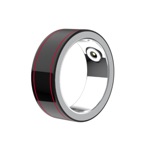
The fact that this ring was marketed as one product and has a different app name is the first red flag. Some of the settings in the app are in a different language. This ring does not track workouts. You can have it track heart rate every 5 mins but expect your ring to die every day. Also they don’t make it clear your ring will take almost a month to arrive. This is a generic smart ring made in china you can get on SHEIN and other cheap sites. The app is very sloppy. It doesn’t track accurately compared to Apple Watch. If you want a charge to last more than 3 days you will have to turn off some of the health monitoring (oxygen, HRV, body temp or heart rate) which defeats the purpose of the ring. I had to turn the heart rate monitoring to every 30 minutes which completely messes up the other stats especially sleeping and your exercise score. For $30 this would have been acceptable but the are high-level fake company websites and selling these are top of the line rings, when the are not. Save your money. But to be honest, if you’re already here reading this, you’ve already purchased the ring. So go ahead and just ask for a refund.
I wear a Colmi Ring and a Fitbit. Steps, heart rate, etc overall track very similar. Using the ring because after buying Fitbit discovered it does not sync with Apple Health. Only really terrible feature is sleep tracking. Measure sleep after waking up for up to an hour. Also if you wake up in the middle of the night it will not notice. When I compare with my Fitbit that measures sleep very well, I have on average 30 to 60 minutes less sleep each night than what the ring measures. Not great also is rest or stress level. Very different values to my Fitbit, and I can feel that my Fitbit is much more accurate in detecting if I trained to much and need rest or if I am stressed overall. So if you goal is tracking steps and heart rate, go with this app and ring, for anything else you will be disappointed.
So yet another developer has decided that a fluffy, useless, dysfunctional change to their UI was the right move to do. This app used to be clean, light white, gave you all the information you could want at your fingertips, or without having to use your finger because all the important current data was on the primary screen. Now, they’ve added meaningless photos to giant cards that in order to see all of your information you have to scroll down several screens stopping at each one. You cannot get a quick overview of what’s going on with your body in one place. I would give this app zero stars if Apple, would let me. I don’t know if this is one guy in his mom’s basement writing this app, or if there’s some team somewhere who went out drinking one night and decided to screw up a good thing. Hey developers, let’s be clear, this is an app for biometric data, no one cares about fluff, no one cares about how pretty your little pictures are, what we care about is getting to our data. Now, maybe what you want to be focusing on is getting accurate data rather than data that never seems to match up with what Apple, collects on their medical grade watches. When you do that, then you can screw around with your UI, but until then, leave well enough alone. At the very least, give us the privilege and right to choose which display we want. Let it run for a year or two and then shows statistics on who chose what and then maybe you decide. My guess is you don’t care what users want, you only care what you did. Prove me wrong.
QRing - Your Ultimate Fitness Tracker Elevate your fitness journey with QRing – the comprehensive fitness tracker that goes beyond counting steps. QR...