
Check the acquisition promise
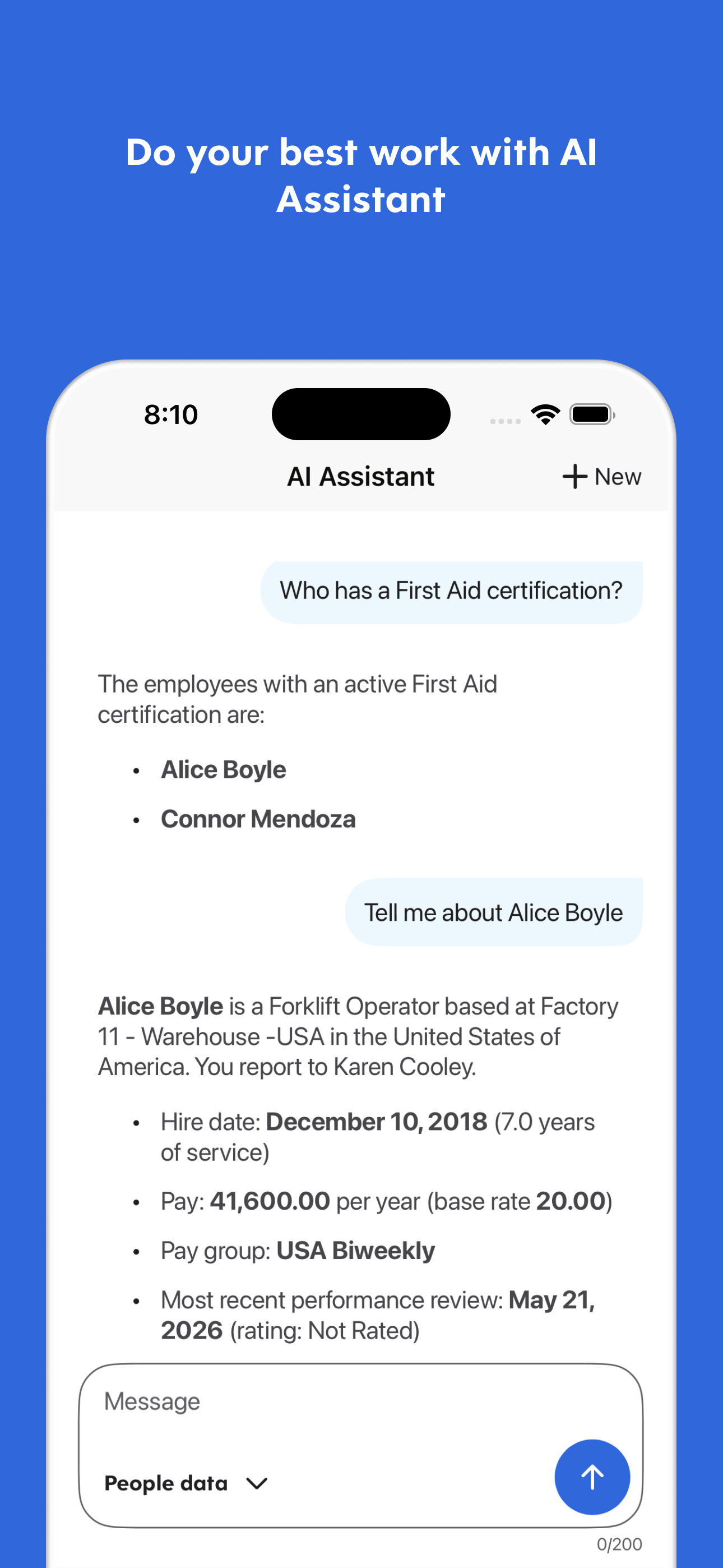
Read the store headline, screenshots and description. What problem is the app promising to solve?
Study the storefront ↗
Dayforce Corporation · iOS
Explore the ad evidence, study the storefront, and build your next acquisition hypothesis.
01 / Creative research
Read the store headline, screenshots and description. What problem is the app promising to solve?
Study the storefront ↗Explore apps with direct store-link matches. Compare their hooks and formats without assuming the same approach works here.
Browse observed advertisers ↗Store rankings and revenue estimates describe market context. They do not establish ad spend, conversions or ROAS.
Review the market context ↗02 / Storefront & product
Study the product story and store experience behind the acquisition funnel.



03 / Market context
Keep revenue, downloads and store rankings separate from advertising performance.
I and multiple people I know have either been late or missed a shift because of the recent UI change. Whoever’s idea it was to have a separate dot under the dates on the calendar that you work UNLESS IT’S DAY OF, in which case there is no dot, making it look like you don’t work that day, should have whatever 10 week UI program certificate they earned revoked and shot into a fire place. The icing on the cake is now after the update, you can select different days which highlights them in a blue or grey circle. The days that you work are by default highlighted in a blue circle, but if you click them to see the details of the shift it makes the blue circle gray. Additionally, if you select days that you don’t work it by default highlights the days is THE SAME GRAY COLOR. So selecting days that you don’t work highlights them in gray, and days that you do work also highlights them in gray while also removing the blue dot below them to signify you work, which by the way has been made nearly unrecognizably different from the small green arrow that appears below if someone else’s shift is available to pick up. Btw thanks for that, not like tons of people are blue-green colorblind. SOUND CONFUSING? It is. The architect behind this new layout owns me and many people I know money for the time we lost being late/in my case not realizing I worked a day that I definitely did EVEM THOUGH I’d been on Dayforce multiple times that morning trying to decipher the beyond clunky shift trade mechanism. Shame on you.
I can check my schedule from anywhere at any time. I used to have to be at work or call during business hours to get my schedule. I also like that I can check it on my lunch break from to see exactly when I clocked out if I forgot to notice at the time. And I no longer have to sift through a stack of schedule requests to see if my has been approved or denied yet. The only reason I took off a star is that If I clock in a second before or after my start time (say 8:59:59 or 9:00:01 if my start time is 9:00:00, I get a message that I am either too early or late. So it’s virtually impossible to punch in without a digital scolding. The time clock doesn’t show seconds so you can’t even try to time your fingerprint verification to the second. It’s not like we get in trouble for it but it’s sorta annoying and completely defeats the purpose of the notification. Seems like a pretty dumb oversight on the part of the people who made it.
We’ve have been using this app to clock in, clock out, and do a labor transfer in order to be compensated under the correct pay. The first of many infuriating problems with this app is that this app is really inconsistent and unreliable when you wanna do anything with your time clock. Whenever I or any of my colleagues want to clock in, clock out, start or end our lunch, or even labor transfer we are 95 percent sure that we are going to be hit with an error. What frustrates me even more is that the app doesn’t even tell what the problem is instead it just says “An unknown error has occurred” this frustrates me so much because even the app doesn’t know why our time clock interactions isn’t going through. Another major flaw is the labor transfers and the timesheets. My job especially, in my position, we must transfer between two different pay rates and looking at the time sheet it doesn’t even say our transfers went through. So either the timesheet or the labor transfer is not working properly and this may affect my pay. At this point I do not recommend this app. The desktop version is better than this and the desktop version doesn’t hit you with errors and works all the time. I’ve completely stopped using the features the app was made for since it doesn’t work and just use it to look at my schedule and that’s it.
The Dayforce app helps you do the work you’re meant to do by putting you in charge of your work and life - anytime, anywhere. With the Dayforce app,...


