
Check the acquisition promise
Read the store headline, screenshots and description. What problem is the app promising to solve?
Study the storefront ↗
KVAT · iOS
Explore the ad evidence, study the storefront, and build your next acquisition hypothesis.
01 / Creative research
Read the store headline, screenshots and description. What problem is the app promising to solve?
Study the storefront ↗Explore apps with direct store-link matches. Compare their hooks and formats without assuming the same approach works here.
Browse observed advertisers ↗Store rankings and revenue estimates describe market context. They do not establish ad spend, conversions or ROAS.
Review the market context ↗02 / Storefront & product
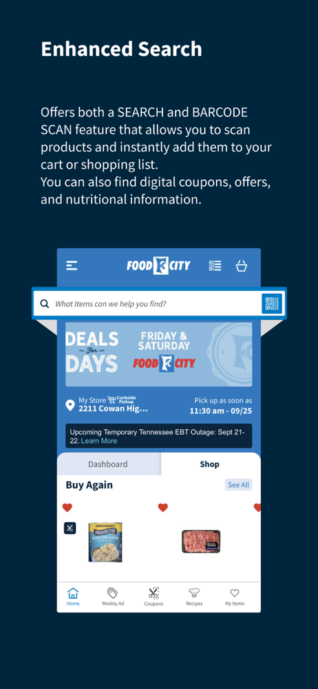
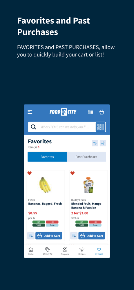
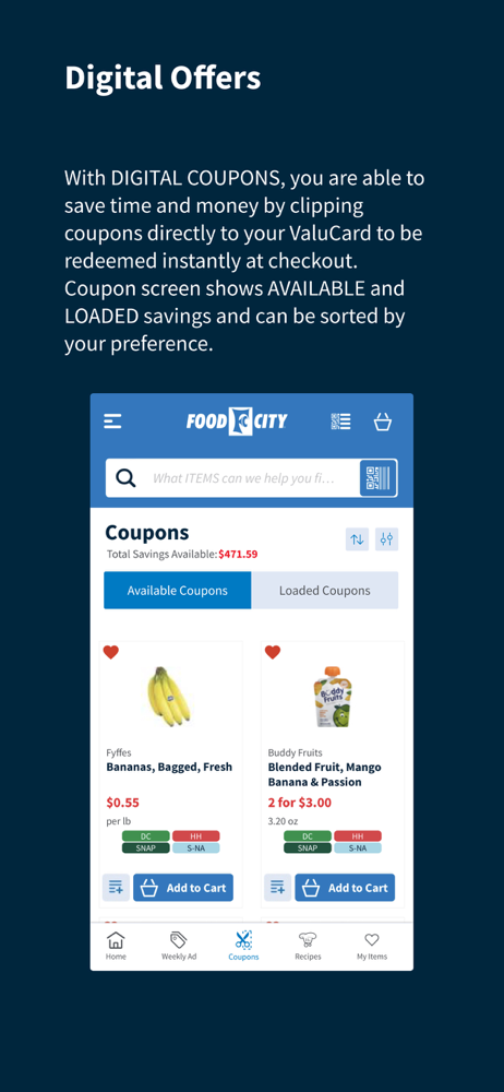
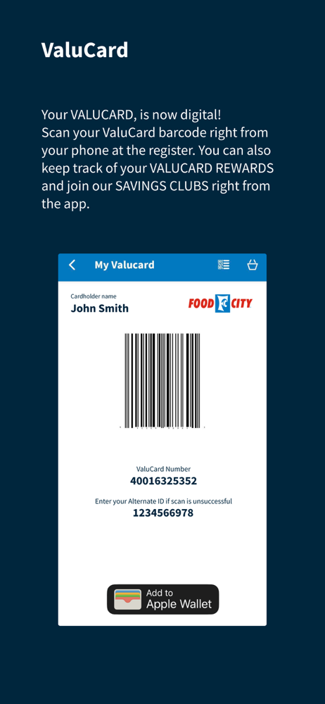
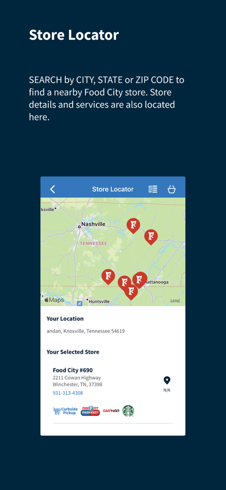
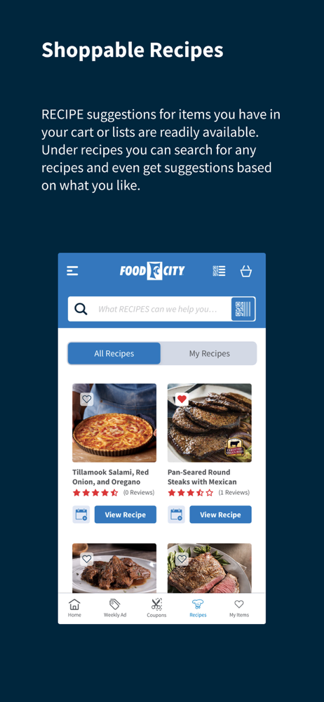
Study the product story and store experience behind the acquisition funnel.


03 / Market context
Keep revenue, downloads and store rankings separate from advertising performance.
So many additional clicks and digging through different menus to find commonly used features. Viewing sale items is extremely cumbersome. To get to BOGO items is 6 clicks and then every variety shows so the list takes a long time to fully display. This would be better if the category was displayed and then the user could expand. It should also not require 6 clicks to get to such a valuable section. The shopping list function is equally clunky. When shopping in store regardless of how I sort the list, which only list a portion of the aisles, it doesn’t list them in any sort of order. The list goes back and forth across the store. I also can’t see an easy was to clear my list when I’ve shopped it. Right now I have to click on each item. Select Delete Item and then be asked each time if I’m sure. I should have the ability to remove all checked items and then receive a delete confirmation. I would suggest the product manager try to shop using this app. Maybe check out Publix app. It’s come a long way over the years and has become quite user friendly.
The search functionality works fair. The biggest issue is with the favorites and shopping list items. Neither seem to reflect todays price and typically shows the price the day the items were placed in the lists. Next is the issue with deleting the items off the list; you have to go through 3-4 steps to totally remove an item from either list. Lastly, when you declare you’re “Shopping in the store”, less than half the items indicate which aisle the product is located. I’ve patronized your business since before you moved to the current location so I generally know where items are located however, some items roll to the bottom of the list and I have to “double back” to pick up the missed items. Have your developers check out your competitions app, (Kroger’s), they have an app with better functionality. Don’t worry, I still use your establishment 90% of the time…..
I I shop eat both Food City and Kroger online. Your website is so much more difficult to navigate than theirs. I figure you’re paying to have it built and operated but you definitely need to take a look at Kroger’s website. It’s just so much simpler to navigate and it holds much more of your history so it’s much easier to reorder old favorites . It takes so much longer for me to place my order on the FC site. I love FC and the lady that does the GO Cart in Seymour TN is so sweet. I just wish it was easier to place the order. H th and you.A
Welcome to the Food City App! The Food City app offers a smooth, fast, and intuitive experience, making your grocery shopping journey easier than eve...


