
Check the acquisition promise
Read the store headline, screenshots and description. What problem is the app promising to solve?
Study the storefront ↗
Diamond Credit Union · iOS
Explore the ad evidence, study the storefront, and build your next acquisition hypothesis.
01 / Creative research
Read the store headline, screenshots and description. What problem is the app promising to solve?
Study the storefront ↗Explore apps with direct store-link matches. Compare their hooks and formats without assuming the same approach works here.
Browse observed advertisers ↗Store rankings and revenue estimates describe market context. They do not establish ad spend, conversions or ROAS.
Review the market context ↗02 / Storefront & product
Study the product story and store experience behind the acquisition funnel.




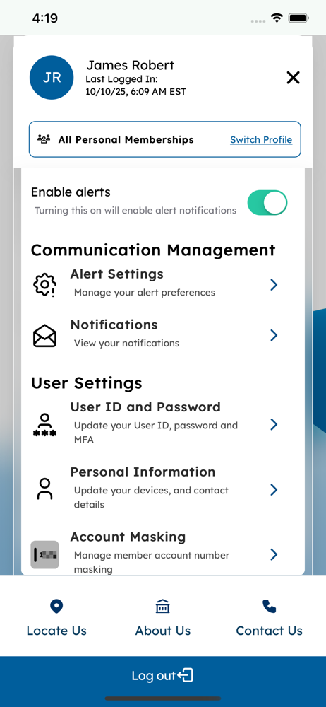


03 / Market context
Keep revenue, downloads and store rankings separate from advertising performance.
DCU’s new app and website interface is atrocious. I don’t know who to complain to about it. The old interface and old app was so much better. The new interface is very clunky. The design is bland. The labels on the buttons don’t make sense. I went from an application/website where I could navigate with ease and muscle memory, to requiring too much cognitive thinking to find and use the simple tools which leads to frustration. For example: Transferring funds. This use to be obvious and simple and was a feature present on your main page and app. Now this is hidden in a. “Transfer & Pay” button. When you click on it, you are inundated with sub-categories that are not obvious to the user. My first experiences led me to believe I would want to “Transfer Accounts” when moving findings from checking to savings. But really I want to use “My Diamond Acoounts.” Previously, I could look up all my automated scheduled transfers all at once. Now if you click into Scheduled Transfers, I can only view them from the origin account. I have to select it, or I won’t see it. There is only one single advantage that the new (current) app and interface has over the old one, and that’s the ability to look at all accounts at the same time (Joint and Personal), without having to log in and out. Aside from this, literally every other feature I have used, is significantly worse than its previous version. I don’t know who needs to hear it. I don’t know whose decision this was. But this was an epic fail in my personal opinion.
I like the new features of the app, it is taking a little to get used to but I’m exploring it and learning more. I like how you can manage cards, open a new card or account and transfer money between members and non members. One feature I wish it had was a budgeting section to help budget bill and other monthly expenses.
The new app update is such an improvement! I feel it loads much faster. It’s easy to use, I love that I can control my debit card on/off, spending limits, etc all from the app. It’s really easy to transfer money, pay bills and loans and depositing a check by taking a picture is a huge time saver! The new design with both light mode and dark mode really pop. I’d love to see a watch app companion in the future maybe just for quick balance and app notifications. Maybe even a “hey siri, what’s my checking direct balance” to promote safe driving when using voice commands in the car. But really this app is so much more improved!
The Diamond Credit Union Mobile Banking App is enhanced, secure, and gives you the freedom to manage your finances anytime, anywhere. Enjoy easy acces...


