
Check the acquisition promise
Read the store headline, screenshots and description. What problem is the app promising to solve?
Study the storefront ↗
Kyle Ryan · iOS
Explore the ad evidence, study the storefront, and build your next acquisition hypothesis.
01 / Creative research
Read the store headline, screenshots and description. What problem is the app promising to solve?
Study the storefront ↗Explore apps with direct store-link matches. Compare their hooks and formats without assuming the same approach works here.
Browse observed advertisers ↗Store rankings and revenue estimates describe market context. They do not establish ad spend, conversions or ROAS.
Review the market context ↗02 / Storefront & product
Study the product story and store experience behind the acquisition funnel.




03 / Market context
Keep revenue, downloads and store rankings separate from advertising performance.
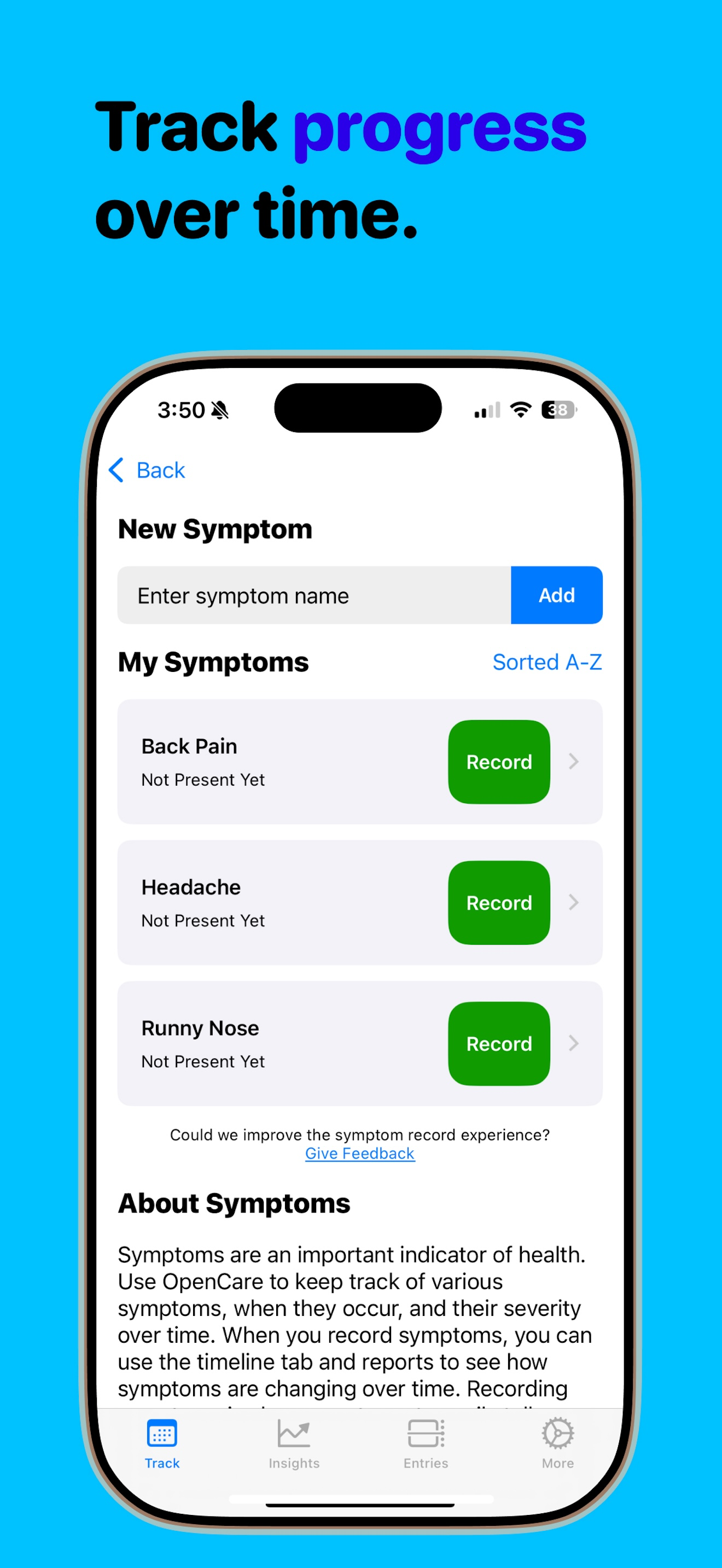
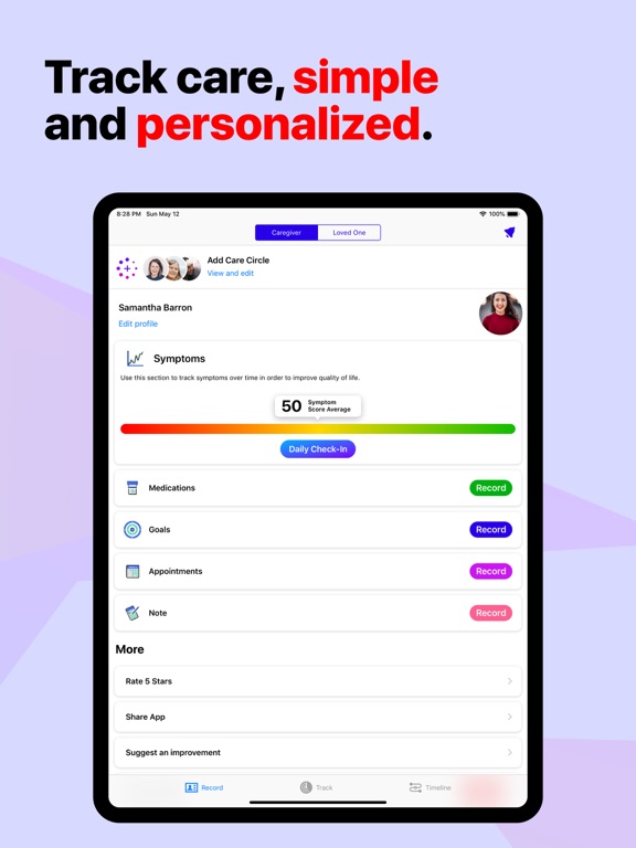
The functionality of this app and its purpose is quite important: having a consolidated platform track symptoms and medical history for yourself or for a loved one is important. However, after using the app, I have some recommendations: 1. having an onboarding process for the app. Although the app does feel very easy to use for me, someone who has been familiar with using iOS apps for some time now, would it also feel easy to use for someone less experienced with technology/smartphones? Looking at this app from that point of view, there were some functionalities that could seem ambiguous - having an onboarding process could be important to bridge that accessibility gap. 2. As medical care is something that pervades someone’s life, I think it could be really important to allow integration with at least Apple Calendar. Looking at the “appointments” tab, the only functionality is to write the name of the appointment. Then what? You need Opencare+ to add photos from the visit and you can record the time it happened, but aside from that, I see little functionality; this can be improved with the ability to export to a calendar so that the caregiver/user can be reminded of the appointment if needed. Overall I thought this was a great app that really does serve a greater purpose! I would recommend it.
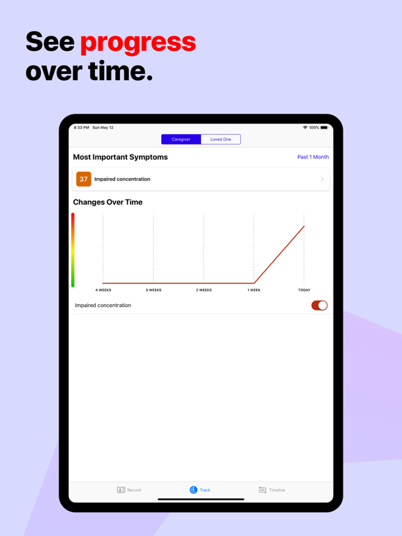
As a design student and a first time user, I like the concept and the purpose of this app. This app makes it easy to take care of your health and your loved ones (my favorite feature). Having a section for your loved one is thoughtful and beautiful. Some design and user interface elements could be improved and simplified. For example, in the timeline feature, I don’t think it is necessary to repeatedly mention “no records for this month...” under each month of no record when it is already said on top that I have “0 records in ___month”. I think some information like that doesn’t need repeating, keeping it concise and simple can make it more clear to the users. The calendar can also be more packed together or have it so only one month is visible on the screen and then you can swipe horizontally to the next month so not too much space is wasted and this will also require less scrolling. Nonetheless, overall the app is clean with white background and visually interesting with pop of colors. I enjoyed the functionality of the app. I love the purpose and how this app can help you improve your lifestyle and look out for your loved ones as well.
I just got this app today and after examining the different capabilities, I’m really impressed. The interface is clean and intuitive, simple to use and allows for logging in great detail. Takes a lot of the burden ofd patients’ shoulders (especially those with memory difficulties) and lets them easily record symptoms as they occur, and the logging of dosage information and reminders is so great for this too. Few small things UX wise that could be improved is the “dismiss” button—this makes sense but “close” is more industry standard. Accessibility wise, adding a visual confirmation in addition to the physical pulse upon logging an entry may be a good idea. I find that once I log a lot of symptoms, the Timeline view gets quite difficult to navigate, as they all stack below the monthly calendar and make it hard to jump to previous months without lots of scrolling. Implementing an option where all the symptoms begin collapsed with maybe just a preview or summary and then expanding when tapped is a good idea, similar to how other calendar apps like Moleskine implement expanding info.
The easiest way to track the hard things. OpenCare is your personalized symptom tracker, designed for chronic illness management and daily health trac...
| Name | Price | Type |
|---|---|---|
| OpenCare+ Monthly | $4.99 | Monthly |
| OpenCare Plus (Monthly) | $4.99 | Monthly |
| OpenCare Plus (Monthly) | $5.99 | Monthly |


