
Check the acquisition promise
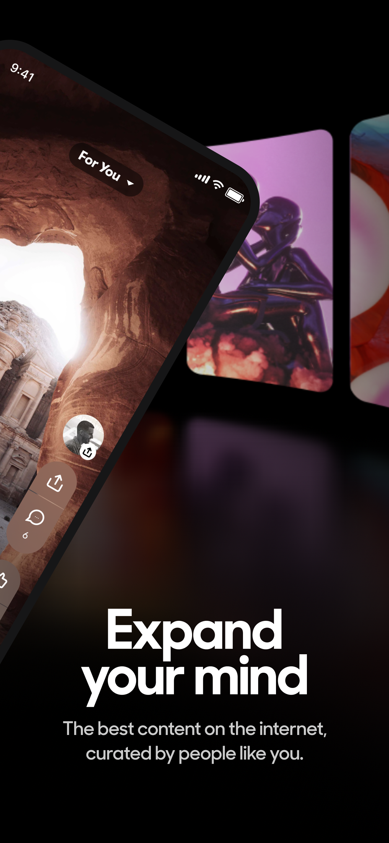
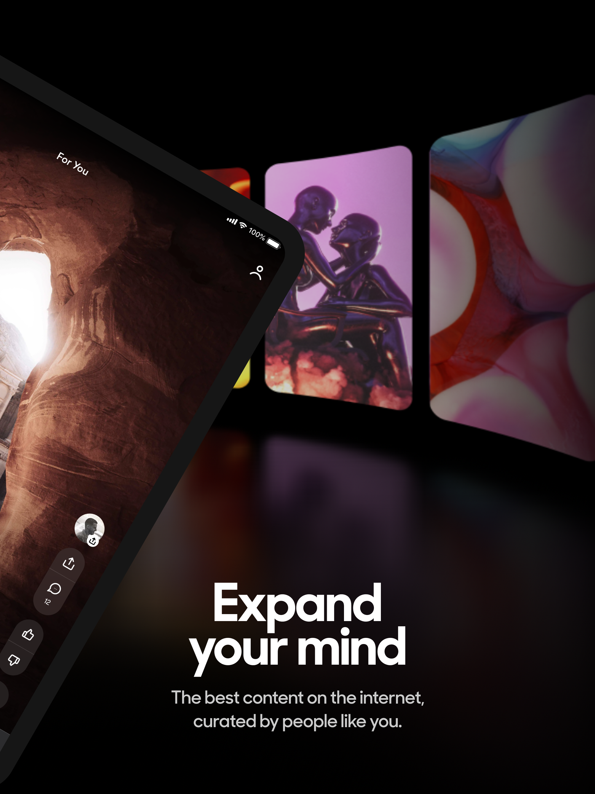
Read the store headline, screenshots and description. What problem is the app promising to solve?
Study the storefront ↗
Mix Tech, Inc. · iOS
Explore the ad evidence, study the storefront, and build your next acquisition hypothesis.
01 / Creative research
Read the store headline, screenshots and description. What problem is the app promising to solve?
Study the storefront ↗Explore apps with direct store-link matches. Compare their hooks and formats without assuming the same approach works here.
Browse observed advertisers ↗Store rankings and revenue estimates describe market context. They do not establish ad spend, conversions or ROAS.
Review the market context ↗02 / Storefront & product
Study the product story and store experience behind the acquisition funnel.




03 / Market context
Keep revenue, downloads and store rankings separate from advertising performance.
I was a dedicated, frequent user of StumbleUpon and was devastated that the original iteration of StumbleUpon is wiped from the internet. I was (and still am to a degree) really bothered by it like, probably overboard to be honest. It was really a super special fun thing to be a part of. That being said, while Mix is definitely a “spiritual” successor more so than a close reiteration of SU, I think there is definitely something cool under the surface. I have to acknowledge that I am not *completely* dissatisfied with it like I was expecting. Definitely still shows you interesting cool things and it’s good. If there was only one single thing I would change/add to make this app perfect, it would be to add “Websites” as a media category in the ‘for you’ drop down box and allowing submittals of interesting unique websites into the feed and category tags. For real, the lack of a “websites” category is the ONLY thing stopping me from giving this a perfect score. It would literally add 2 full stars to have that category. Not holding my breath, but IMO Mix is SO CLOSE to greatness it’s right at the tips of their fingers. I hope they would be willing to consider looking into that.
I love the exotic and rare or even “far out” images and the feeling of gaining a substantial experience every time I get to use this app. MIX is for me a replacement of what (showing my age here) use to be paging through LIFE MAGAZINE, NATIONAL GEOGRAPHIC, and LOOK MAGAZINE: Seems that I am enjoying seeing amazing photographic essays, or simulated visual essays, and in my 80 years on this planet, now I have access to the whole world, and everything in it. Well, I like this app more than most. It outlived most apps as many are deleted and cancelled but MIX is always a clear choice when I want to refresh my mind. It is also my purpose in writing this review to recommend this app to anyone who likes photography, and INFP Meyers-Briggs type, and just a way of telling anyone who wants to know, this retired psychiatric social worker, novelist, and retired college professor, and meditation teacher, practitioner of Zen since 1969. I find nothing offensive in this app, and recommend it to you fully, but will write a more practical review in a few months more using it, or in a year. In the meantime, I believe you can benefit intellectually and maybe spiritually using this app. I don’t love it,, but I am glad to be known as someone who uses this.
StumbleUpon needed to be redone. It was designed to an older style of internet and honestly couldn’t keep up when websites started to flood in. Mix managed to make a more streamlined process for a wider variety and more organized system of websites but lacks any real usability. Isn’t an intuitive app. The explore/share/profile tabs are just strange choices. Share and profile aren’t pages, they’re options and settings. So nest “share” within each post as just a share button.. and profile should just be hidden in the top corner somewhere. Your explore page needs to be redone as well. Why do I have to view by specific interests? Why isn’t there just an endless way to scroll once I’ve set my interests? The way you introduce catagories was strange as well. “Science”?? And then if you select one of this vague topics and later check your subcategories, it breaks it out into tiny subcategories like nasa and psychology.. but those are vastly different. Maybe make the bottom tabs “explore” (to just scroll and have an algorithm slowly learn what people like and recommend new categories to like) and another tab called “topics” or “genre” “categories” whatever. Maybe a 3rd way to view too. Definitely keep the list/grid option in explore. Anyways still better than stumbleupon so I definitely plan on continuously using the app, I just wish it didn’t fight me
Mix is an AI-powered social content app that finds the most interesting content on the web and delivers it in a personalized feed for you to scroll ev...


