Check the acquisition promise
Read the store headline, screenshots and description. What problem is the app promising to solve?
Study the storefront ↗
Gray Television Group, Inc. · iOS
Explore the ad evidence, study the storefront, and build your next acquisition hypothesis.
01 / Creative research
Read the store headline, screenshots and description. What problem is the app promising to solve?
Study the storefront ↗Explore apps with direct store-link matches. Compare their hooks and formats without assuming the same approach works here.
Browse observed advertisers ↗Store rankings and revenue estimates describe market context. They do not establish ad spend, conversions or ROAS.
Review the market context ↗02 / Storefront & product
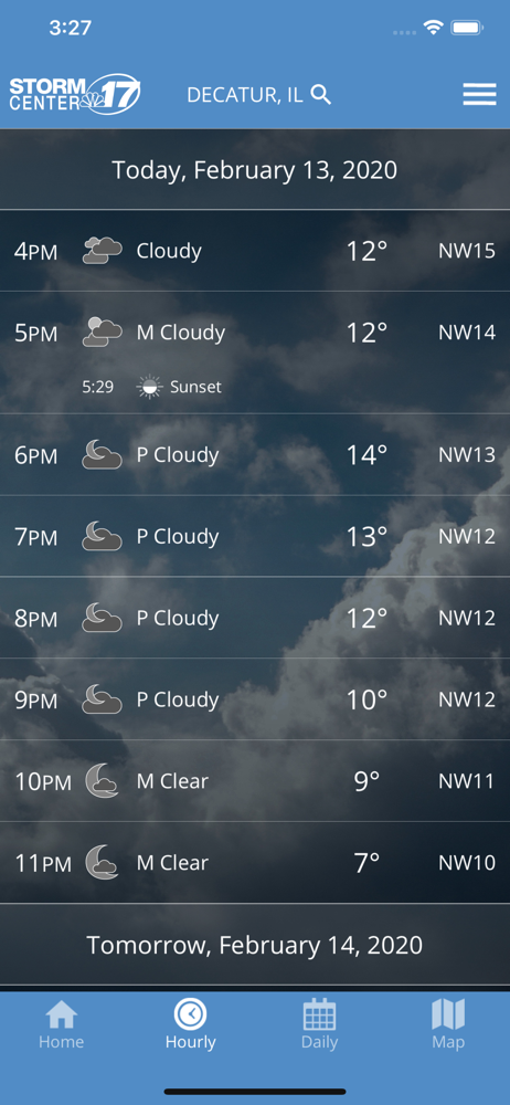
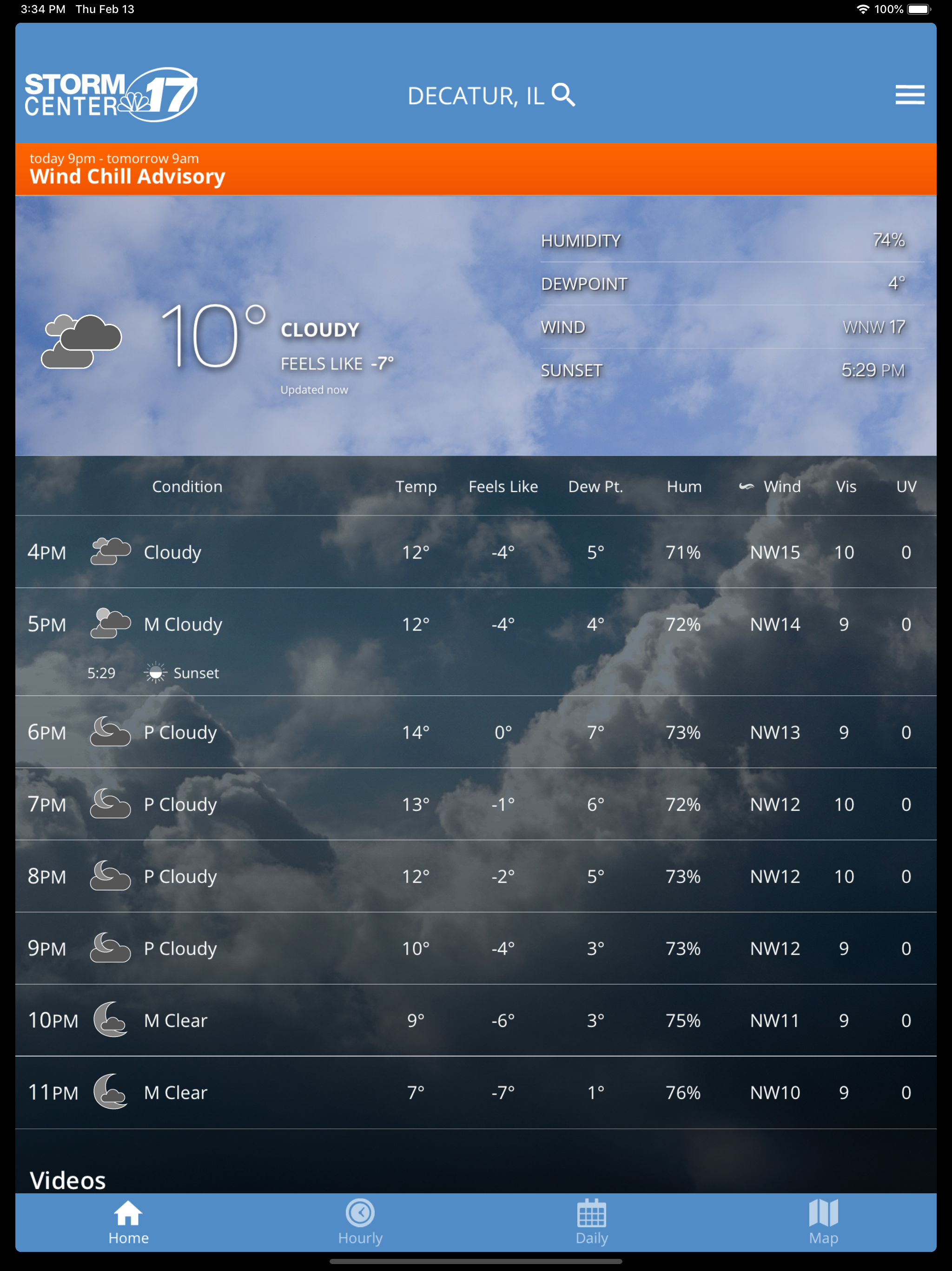
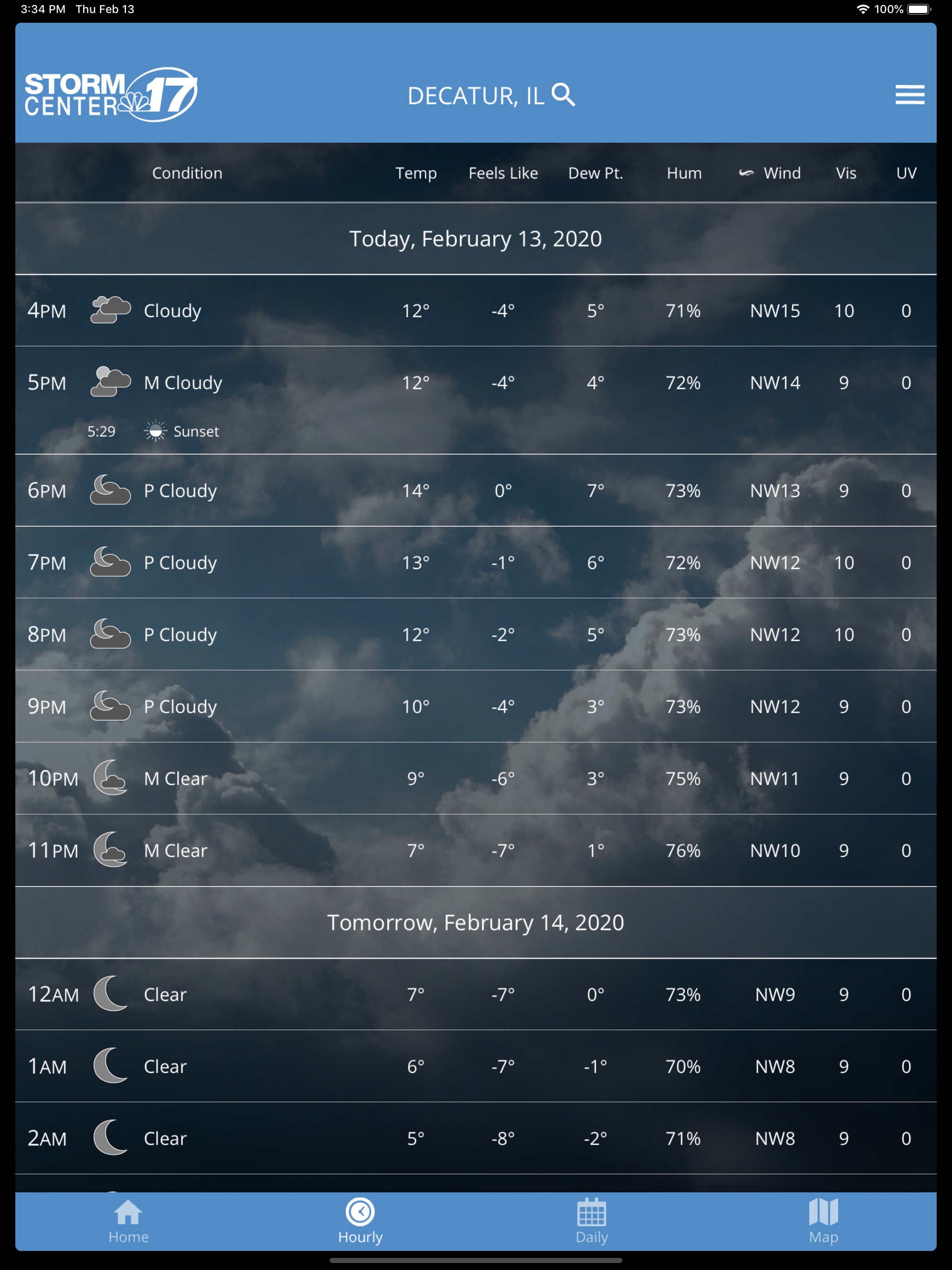
Study the product story and store experience behind the acquisition funnel.



03 / Market context
Keep revenue, downloads and store rankings separate from advertising performance.
Do yourself a favor and get WICS or FOX or WCIA’s app because this has full screen ads that deploy and block view for seconds when trying to navigate. This app had banner ads at one time, but then they decided to deploy full screen ads that prevent usage until you click it or they expire. In an app that you use in emergency situations this is absolutely not ideal, in fact, I find it rather gross. I swear I wrote a review about this the other day, yet now I can’t find it. I was going to update the original review to include alternatives that offer the same content but without the full screen ads, but I can’t find it; so I’m writing another review to let people know they can get the exact same functionality without using this app.
The latest update is terribly hard to read. I loved the app before this update. I don’t mind the new scrolling feature, but the font color is too light. And I liked the old format for the weekly forecast (left to right instead of up and down). Please make some changes quick, before I get used to another app!
This used to be our favorite weather app. Please put it back to the way it was 2 versions ago. The all-in-one scrolling content is annoying. Forecast video should be an option, not a standard feature (we never use it). The light-colored map is much worse than the old darker one. The white text on gray and white clouds is very hard to read. If you have to keep that awful new look, at least give users the ability to customize which screen (i.e. the map) comes up by default.
WAND Stormcenter17, is proud to announce a full featured weather app for the iPhone and iPad platform. Features • Access to station content spe...