Check the acquisition promise
Read the store headline, screenshots and description. What problem is the app promising to solve?
Study the storefront ↗
Siren Tech, LLC · iOS
Explore the ad evidence, study the storefront, and build your next acquisition hypothesis.
01 / Creative research
Read the store headline, screenshots and description. What problem is the app promising to solve?
Study the storefront ↗Explore apps with direct store-link matches. Compare their hooks and formats without assuming the same approach works here.
Browse observed advertisers ↗Store rankings and revenue estimates describe market context. They do not establish ad spend, conversions or ROAS.
Review the market context ↗02 / Storefront & product
Study the product story and store experience behind the acquisition funnel.




03 / Market context
Keep revenue, downloads and store rankings separate from advertising performance.
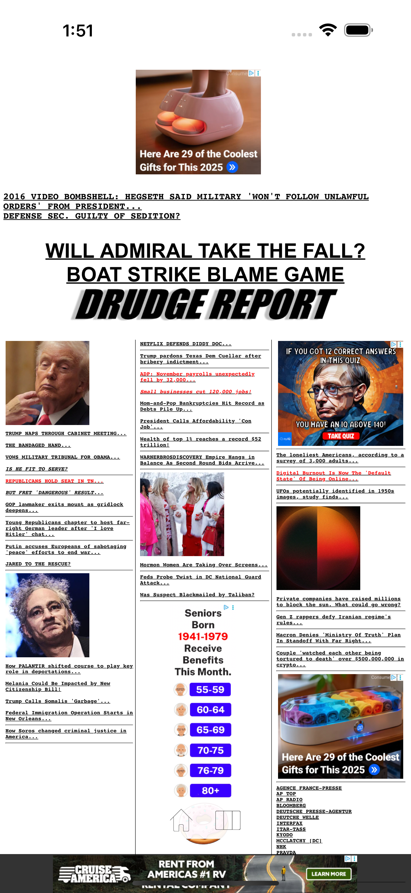
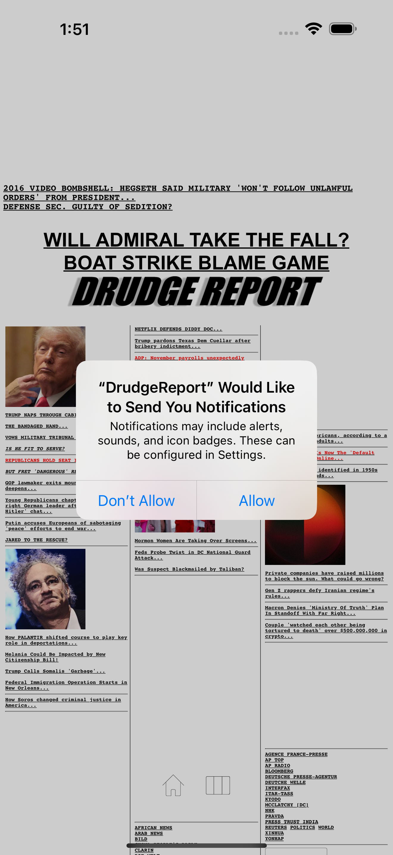
I’ve looked at drudge for years. But this new update is so so bad. Here’s why: by default it shows you the entire web page in a frame just completely zoomed out and you have to pinch zoom to see anything. Then when you click on things, these full screen ads pop up with practically no tappable area to close them. If you use the columns mode to try to get it how it used to be (one long narrow scrolling view), it takes up 1/3rd of the screen with an ad and doesn’t show the top of page headline articles. We are living in the future, we have access to AI robot programmers that can do autonomous coding from just a prompt… and yet we get this 1980s janky experience that adds all this friction to just seeing a simple list of hyperlinks. Get it together guys.
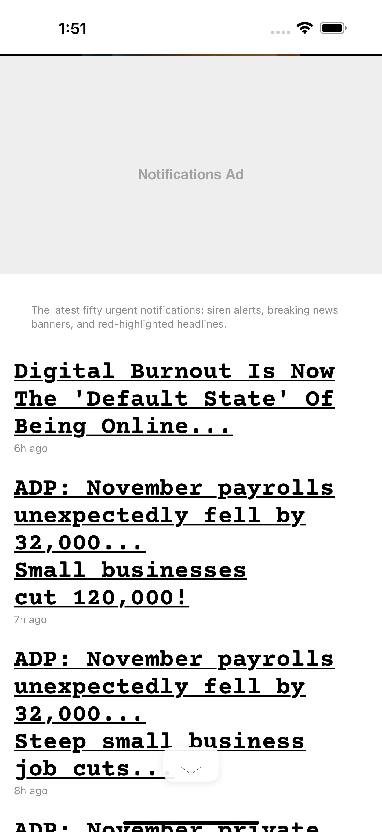
Where do I start in reviewing this dumpster fire? 1) The user interface defaults to the desktop view of all three columns at once. Maybe ok on a 13” iPad, but absolute trash on a phone. Sure I can switch it to one column at a time, but there’s no way to have a single column containing all the article links like we’ve been used to for years. 2) The ads. Ads at the top, ads at the bottom, a third of the dang SETTINGS page covered in ads. And heaven forbid you actually tap a link; there’s a good chance you will get an ad so large that it covers the entire screen even after zooming out. And you can’t close the ad. You literally have to force quit the app, relaunch, and hope you can open a link without the ad. 3) Content. This isn’t specific to this version of the app, per se, but it seems worse than before. The most click-baity headlines from UK gossip rags I’ve ever seen. Sites that are 80% ads and 20% AI slop articles. 4) Timely updates are a joke - Did you read about the quake in Japan yesterday? No? Because it never made the headlines despite every other news source covering it. We get stale headlines that sit there for 24 hours+ If you want news I recommend any other app out there. If you want to give your phone cancer from garbage sites, all while lining Matt’s pockets with ad revenue then, by all means, use this new app.
Drudge was supposedly sold off to a Chinese-linked corporate interest several years ago. It’s why they link to the most clickbaity, nonsensical “news” they can find. It’s hard to even call it left wing because I think it’s purely about rage baiting right wingers and getting clicks. For example, just the other day they linked to a story, and the link said “JD VANCE ADMITS HIS MARRIAGE IS UNDER PRESSURE JUST AFTER HIS WIFE IS SEEN WITHOUT RING”. But then you click on the link, read the story, and realize that the story states that JD Vance said “We laugh at the rumors. Our marriage has never been stronger.” One of my favorite headlines from Drudge over the past 5 years was “THE NIGHT IT ALL ENDED” after the Trump vs. Kamala debate, implying that he lost the election that night. That didn’t age well, did it? Then, just before Election Day, they were hyping up that nonsensical Selzer poll showing that Trump was losing Iowa (they constantly shill biased polls and act like polls matter, despite the past 10 years being evidence to the contrary). It’s basically just a Trump Derangement Syndrome/TMZ aggregate at this point. I miss the days of old when Drudge was actually a quality collection of news articles. 0/5 stars
The Drudge Report desktop look-and-feel you know enhanced with native app power. COLUMNS Tap the Columns button to cycle through Left, Center, and Ri...