
Check the acquisition promise
Read the store headline, screenshots and description. What problem is the app promising to solve?
Study the storefront ↗
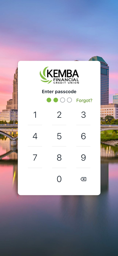
KEMBA Financial Credit Union · iOS
Explore the ad evidence, study the storefront, and build your next acquisition hypothesis.
01 / Creative research
Read the store headline, screenshots and description. What problem is the app promising to solve?
Study the storefront ↗Explore apps with direct store-link matches. Compare their hooks and formats without assuming the same approach works here.
Browse observed advertisers ↗Store rankings and revenue estimates describe market context. They do not establish ad spend, conversions or ROAS.
Review the market context ↗02 / Storefront & product
Study the product story and store experience behind the acquisition funnel.



03 / Market context
Keep revenue, downloads and store rankings separate from advertising performance.
I’ve been a member of Kemba and have been utilizing its mobile app for some time now. While the app is convenient it also serves as the most banking app I use often. I was happy when they came up with the new app but to be honest the whole new app is nothing but below par. It didn’t bring anything new but instead took away much features. For instance when it comes to bill pay(ments) there is no way you can see or view any or all scheduled payments, make changes or even cancelling a payment altogether. I hope the developers of the app can go back and correct these errors for its a very inconvenient part of the app.
I tried to give it a month to get used to it before leaving a review. The app certainly looks nicer but they definitely prioritized form over function here. I don’t love that all credit cards show up as a loan advancement. There are so many more steps to actually go through now to check a single credit card transaction. Also, the transfer is frustrating to use. I use savings accounts as sinking funds, so I do several transfers each month. I preferred the old way, when I never accidentally made a transfer that was only 1% of the intended transfer amount. And yes, I recognize that I should double check before submitting transfers, but that doesn’t mean that it’s not a crappy way to enter the transfer amount. Finally, the way the accounts are listed on the home screen makes it difficult to actually check balances quickly. As I stated before, I use savings accounts as sinking funds, so I have to scroll through three times to view all of my accounts. Even more frustrating, the location of each account on this list seems to change, so I can’t just quickly scroll through a few times to check my balances. Just because checking was on the second scroll last time doesn’t mean it will be there this time. Very frustrating user experience.
My biggest complaint is that all the category tags and notes I had made on what the charges were for are now lost. Lost forever. Nearly a year’s worth of being able to monitor my spending on specific items, charitable donations, everything now lost. Such an irresponsible thing for Kemba to do. No warning that all tags and notes would be lost. Had they done their research on this upgrade they could have warned us to print off information that would be lost. I’ve now lost the ability to see at a glance what my VISA charges were. Why are they listed as loan advancements? If you have to list them that way, list the merchant first then add the loan advancement. Did you ask any members their opinion of this update? Any trial runs to see what bugs could have been corrected? And I didn’t like having to give you my full SSN in order to create a new account for this unacceptable upgrade. I’m sure as I continue to work my way through this upgrade I’ll find more things to complain about.
The KEMBA Financial App is a better way to keep track of your finances, making it easy and convenient for you to access your accounts how you choose...


