
Check the acquisition promise
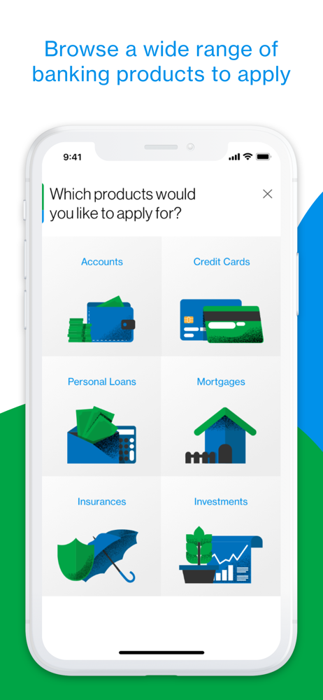
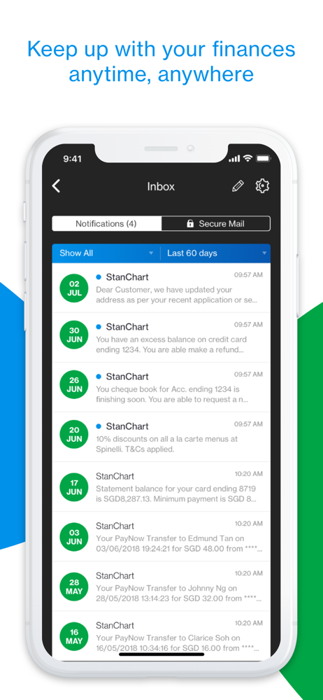
Read the store headline, screenshots and description. What problem is the app promising to solve?
Study the storefront ↗
Standard Chartered Bank · iOS
Explore the ad evidence, study the storefront, and build your next acquisition hypothesis.
01 / Creative research
Read the store headline, screenshots and description. What problem is the app promising to solve?
Study the storefront ↗Explore apps with direct store-link matches. Compare their hooks and formats without assuming the same approach works here.
Browse observed advertisers ↗Store rankings and revenue estimates describe market context. They do not establish ad spend, conversions or ROAS.
Review the market context ↗02 / Storefront & product
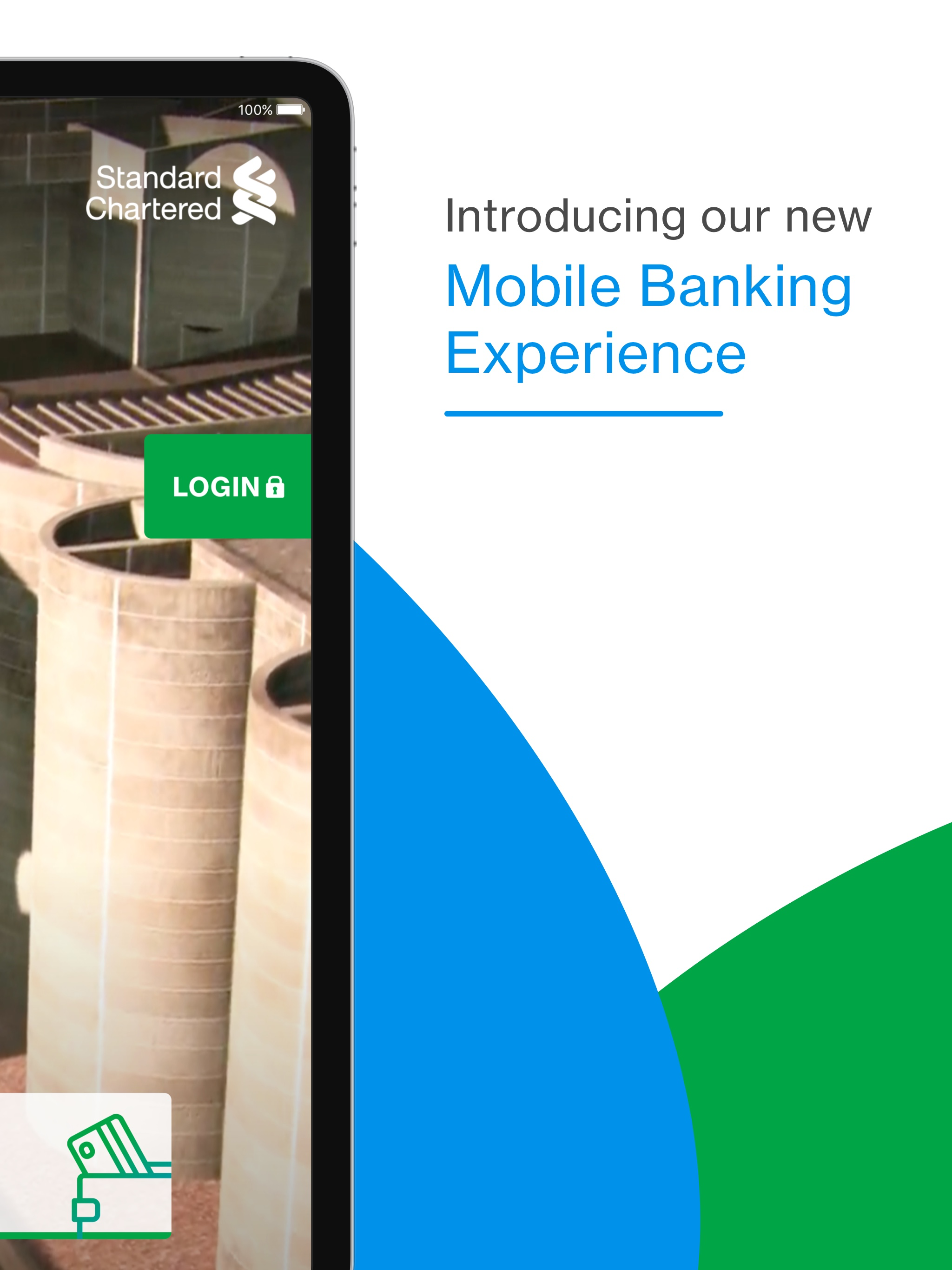
Study the product story and store experience behind the acquisition funnel.





03 / Market context
Keep revenue, downloads and store rankings separate from advertising performance.
I am extremely disappointed with the SCB mobile banking app for retail users. Compared to almost every other banking app, including those of government-owned banks, it falls far behind in terms of performance, design, and usability. The app loads very slowly, the interface looks outdated, and the overall user experience feels like it belongs to a much older era. Navigation is not intuitive, and many basic tasks take longer than they should because of the app's poor responsiveness. For a multinational bank with SCB's reputation, providing such an outdated and inefficient mobile banking experience is simply unacceptable. Customers expect a modern, fast, secure, and user-friendly app that meets today's banking standards. I sincerely hope SCB takes customer feedback seriously and invests in a complete redesign and significant performance improvements.
App Performance: I have noticed significant loading times immediately upon opening the app. This appears to be a software performance issue that affects the initial user experience. - Privacy and Security: Currently, the app displays my full account balance immediately after login. This is a security concern when using the app in crowded places. I suggest hiding the balance by default and allowing users to view it manually by clicking a "show balance" button. - Navigation: I have encountered several pages within the app that lack a clear "back" button. While there is a sidebar, navigating through multiple options often leads to pages where it is difficult to return to the previous screen. - Home Page Interface: To make the app more user-friendly, I recommend adding quick-access icon buttons on the home page for features such as Transfer Money, Send Money, View Offers, QR Payments, and Transaction History. - Card Management: It would be helpful to have a card-like interface for debit and credit cards that displays the respective balances within that view. and view statements options. I believe these updates would make the application much more intuitive and enjoyable for all customers. Thank you for taking the time to consider this feedback.
The user interface (UI) does not seem user-friendly; in fact, it feels outdated. Additionally, there are several bugs present in the UI. Furthermore, there is a significant security concern: the app uses the device's default keyboard instead of its own. Most banking apps use a custom keyboard for added security. Another issue is App take too much time for loading data.
SC Mobile was designed with you in mind. It combines an intuitive interface with powerful features, which means you get a simple way to control your f...


