
Check the acquisition promise
Read the store headline, screenshots and description. What problem is the app promising to solve?
Study the storefront ↗
Healthie Inc · iOS
Explore the ad evidence, study the storefront, and build your next acquisition hypothesis.
01 / Creative research
Read the store headline, screenshots and description. What problem is the app promising to solve?
Study the storefront ↗Explore apps with direct store-link matches. Compare their hooks and formats without assuming the same approach works here.
Browse observed advertisers ↗Store rankings and revenue estimates describe market context. They do not establish ad spend, conversions or ROAS.
Review the market context ↗02 / Storefront & product
Study the product story and store experience behind the acquisition funnel.




03 / Market context
Keep revenue, downloads and store rankings separate from advertising performance.
I strongly preferred the previous interface for tracking Goals and Sub-Goals. The old design was much more intuitive and functional. Sub-goals had circular indicators that you could tap to mark them complete, and you could immediately see what had been accomplished and what was still outstanding. It gave you a clear visual sense of progress. The new Goals interface in the Healthie app feels like a significant step backward. Goals cannot be edited or deleted from the app, and the way Sub-Goals are handled is especially frustrating. When you mark a Sub-Goal as complete from the main screen, there is no clear visual indication afterward that it has actually been completed. For a feature designed around goal tracking, being able to quickly see progress is essential. I would strongly recommend bringing back the functionality and visual feedback of the previous interface: allow users to edit and delete Goals within the app, make Sub-Goals individually actionable, and provide an obvious visual indicator when each Sub-Goal has been completed. The previous circular check-off design was simple, intuitive, and made progress easy to see. The new interface may look different, but from a usability standpoint, it is considerably less effective. Also, the food tracker does not properly tally up the total macros on the Home screen. If I view details, the actual macro total correctly.
As a small private practice of registered dietitians there are no shortage of barriers. Thankfully, Healthie offers a cost effective and user friendly app for both our providers and clients. Their support team is exceptional to work with and always takes feedback well. We know there’s room for improvement, and it’s been nice to see our requests come to life as we’ve brought them up in our meetings with Healthie. Highly recommend considering Healthie and encourage other private practices to set up an interview with them to learn more.
I find this app to be completely unacceptable, not just the user experience but the entire system. Every update introduces new bugs with no added features. These bugs, such as comments not being entered while the keyboard is up and comment entry styling randomly changing; are simple things that should have automated tests. As an application architect and enterprise security engineer I also find it impossible to believe the data storage is actually kept within HIPPA compliance standards. As a user I find that even the good features are lacking in usability. One especially bothersome component is the mood selection when entering a food journal. There happens to be more than five human emotions and if that number can’t change for whatever reason they should at least be the five core emotions. The UX engineer needs to be replaced, the QA and testing departments need complete restructuring and probably get rid of everyone else in the process and leave application development to actual professionals. Thanks
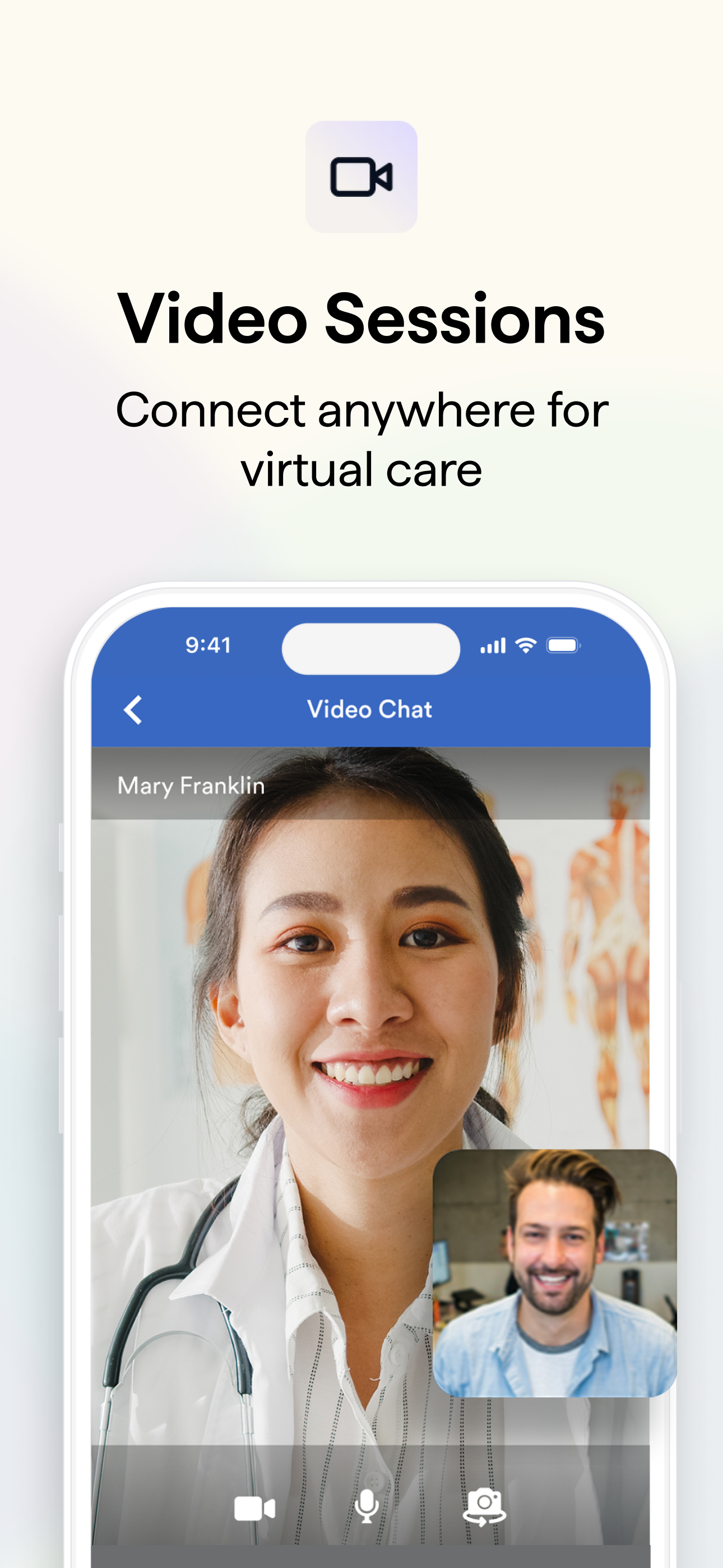
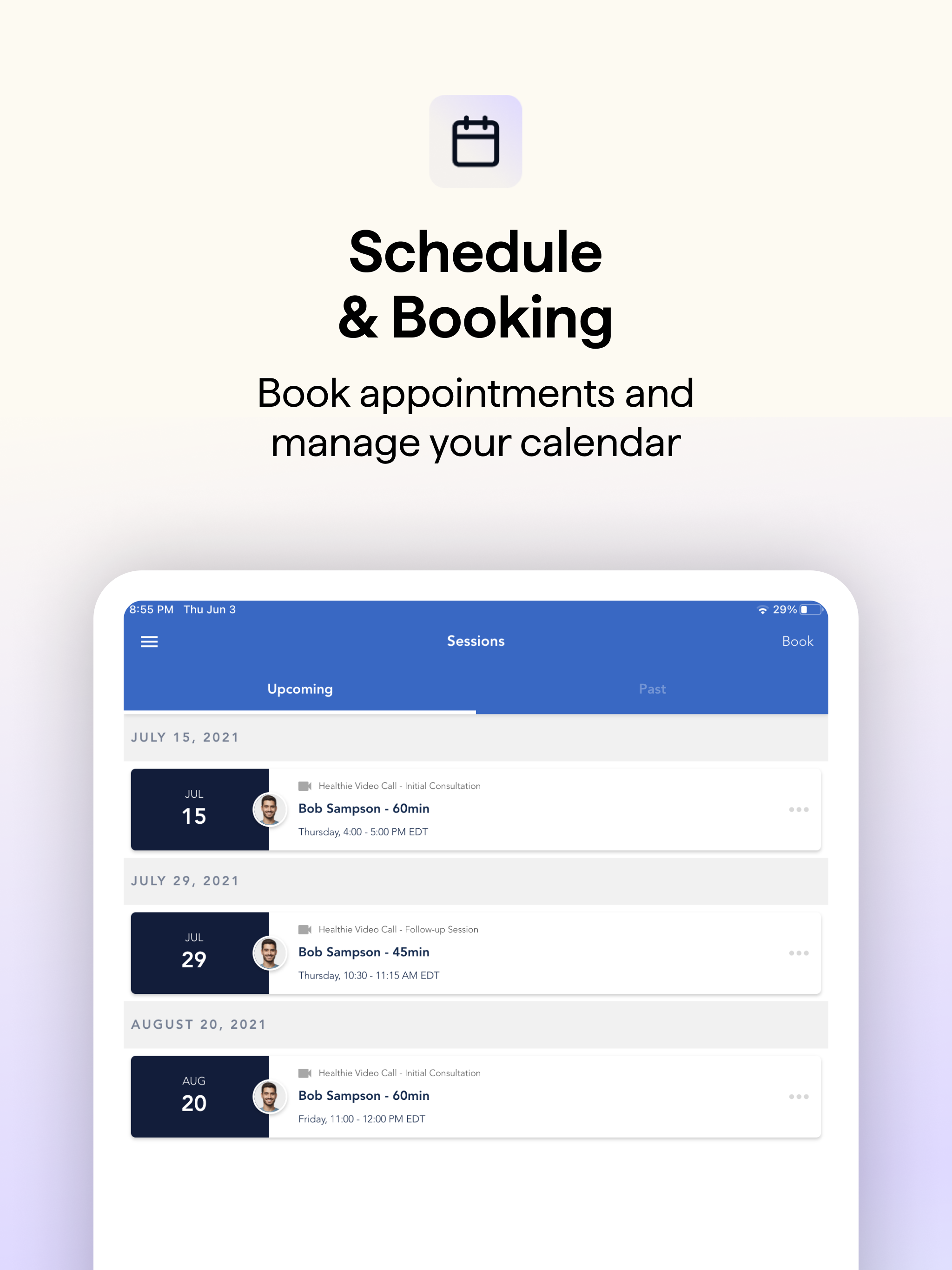
Meet Healthie: the wellness platform that connects clients and providers for on-the-go care. Healthie provides a secure, HIPAA-compliant place for car...


