
Check the acquisition promise
Read the store headline, screenshots and description. What problem is the app promising to solve?
Study the storefront ↗
ALTAONE FEDERAL CREDIT UNION · iOS
Explore the ad evidence, study the storefront, and build your next acquisition hypothesis.
01 / Creative research
Read the store headline, screenshots and description. What problem is the app promising to solve?
Study the storefront ↗Explore apps with direct store-link matches. Compare their hooks and formats without assuming the same approach works here.
Browse observed advertisers ↗Store rankings and revenue estimates describe market context. They do not establish ad spend, conversions or ROAS.
Review the market context ↗02 / Storefront & product
Study the product story and store experience behind the acquisition funnel.



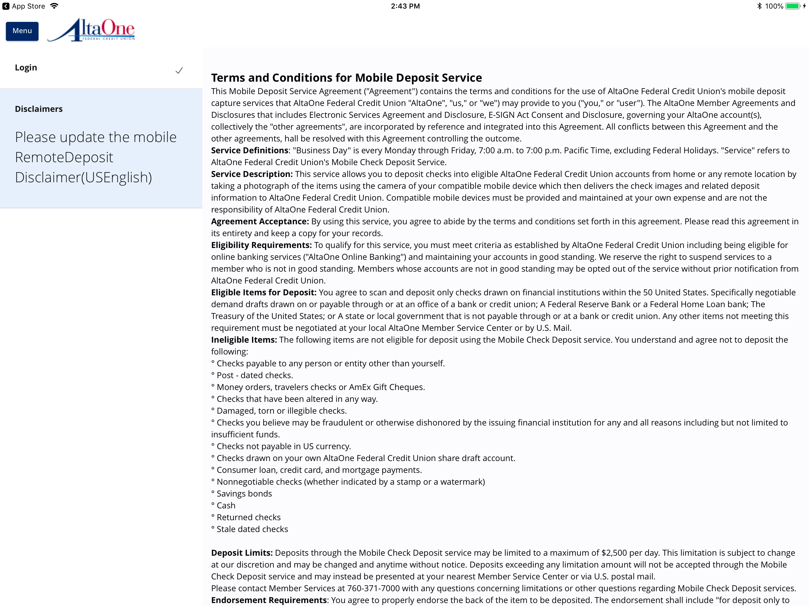
03 / Market context
Keep revenue, downloads and store rankings separate from advertising performance.
Whether I’m just checking my latest activity or depositing checks or paying bills or transferring funds, this app does it all. There are only a couple “navigation” things that should be fixed or I’d have rated five stars: like an option to just go back to the prior page from where you’re at. Right now, for example, if you are in “Paying Bills,” your only options, and there are two buttons to do it, is to go all the way back “Home” to account selection. There is no option to just go back to the prior page and stay within the account you already selected.
I appreciate the redesign! I believe it would enhance the user experience even further if you could consider merging the banking app with the card control app. Currently, the card control app has some functionality issues, and integrating it with the main banking app could significantly improve usability. Additionally, while I understand that updates are ongoing, a comprehensive UI overhaul would be beneficial to make the interface more streamlined and easier to navigate. Thank you for your efforts!
The app is almost perfect. It is a very, very good banking app. Don’t get me wrong, but there are a couple things that I would do to improve my personal experience, making the interface a little bit more user-friendly when money comes out whether it be from a transfer or a purchase somewhere having a little minus sign next to the money that came out and for a deposit having a little + next to the deposit amount, possibly having the letters and numbers a little bit bigger as to know when your account goes into the negativewhat color is red and what color is black for people like me who have a little bit of trouble differentiating between the two that would be the main things that I personally would change besides a couple, odds and ends, but all in all, this is a very good banking app
Our mobile banking application allows you to check balances, transfer funds, view transactions and check messages from anywhere, anytime. It’s fast, f...


