
Check the acquisition promise
Read the store headline, screenshots and description. What problem is the app promising to solve?
Study the storefront ↗
Prashant Shevgaonkar · iOS
Explore the ad evidence, study the storefront, and build your next acquisition hypothesis.
01 / Creative research
Read the store headline, screenshots and description. What problem is the app promising to solve?
Study the storefront ↗Explore apps with direct store-link matches. Compare their hooks and formats without assuming the same approach works here.
Browse observed advertisers ↗Store rankings and revenue estimates describe market context. They do not establish ad spend, conversions or ROAS.
Review the market context ↗02 / Storefront & product
Study the product story and store experience behind the acquisition funnel.




03 / Market context
Keep revenue, downloads and store rankings separate from advertising performance.
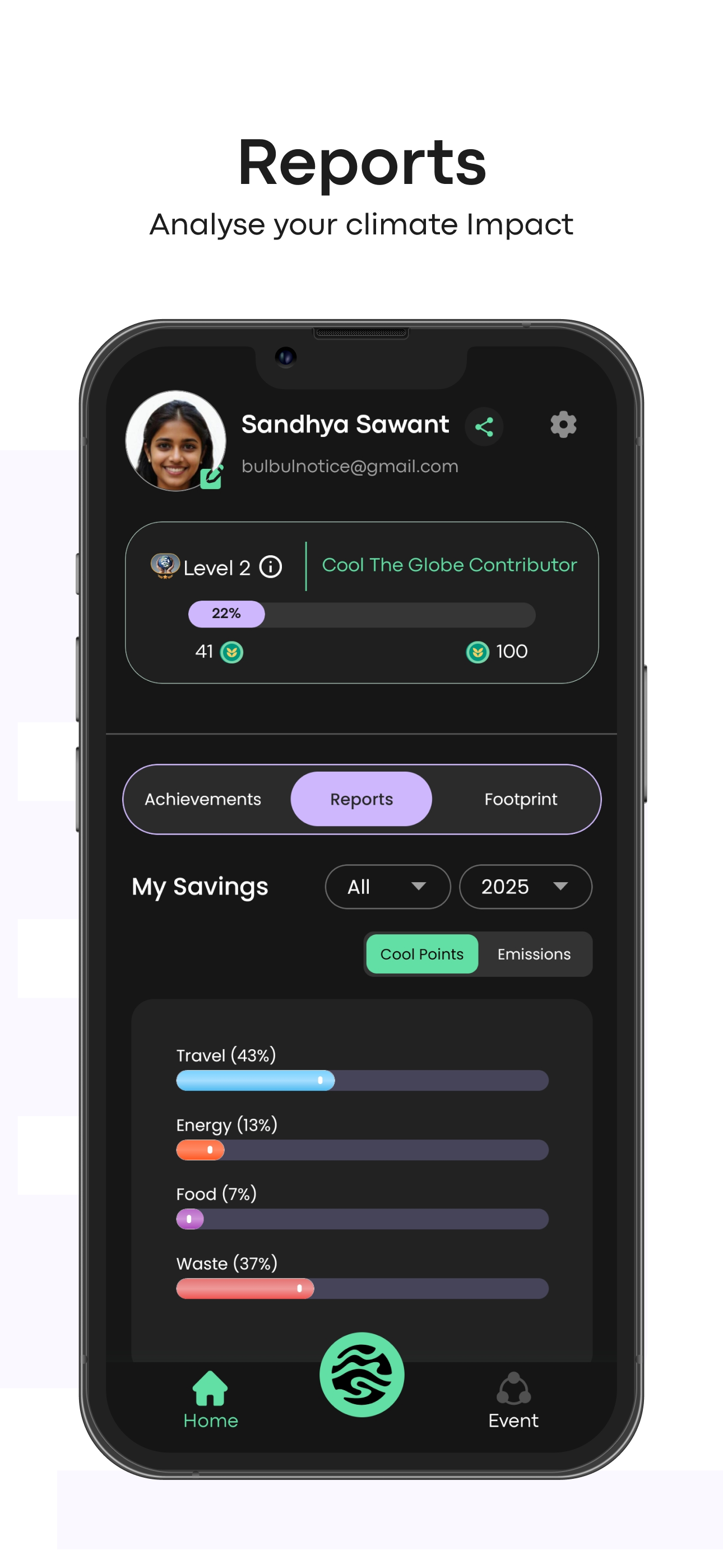
I saw you on shark tank India and got this application. As an avid user and developer of mobile applications, I appreciate when an app combines functionality with a clean and intuitive design. Unfortunately, this is where cool the globe falls short. The current user interface (UI) is a labyrinth of features that, while robust, are presented in a way that feels cluttered and overwhelming. Navigating through the app's various functions is a challenge due to the lack of clear visual hierarchy and inconsistent design elements. The color scheme, though vibrant, does little to differentiate between interactive and non-interactive components, leading to confusion. Moreover, the typography choices contribute to the clutter, with varying font sizes and styles that disrupt the user's flow. The app's complexity might cater to tech-savvy individuals, but for the average user, it's a daunting task to perform even simple actions. This steep learning curve significantly hampers the overall user experience. **Recommendations:** - **Simplify the layout**: Adopt a minimalist approach that focuses on user's most frequently used actions. - **Improve navigation**: Implement a more intuitive navigation system that guides users through the app with ease. - **Harmonize visual elements**: Establish a consistent design language that unifies colors, fonts, and iconography. In conclusion, cool the globe possesses the potential to be a powerhouse in its category. However, without major UI improvements, it risks alienating a significant portion of its user base. A redesign focused on simplicity and usability could transform this app from a diamond in the rough to a polished gem. --- I hope this review encapsulates the concerns regarding the UI and provides constructive feedback for improvement.
Cool The Globe began with a simple question: What can I do about climate change? Today, citizens from across the world are making small changes to th...


