
Check the acquisition promise
Read the store headline, screenshots and description. What problem is the app promising to solve?
Study the storefront ↗
Colorado Credit Union · iOS
Explore the ad evidence, study the storefront, and build your next acquisition hypothesis.
01 / Creative research
Read the store headline, screenshots and description. What problem is the app promising to solve?
Study the storefront ↗Explore apps with direct store-link matches. Compare their hooks and formats without assuming the same approach works here.
Browse observed advertisers ↗Store rankings and revenue estimates describe market context. They do not establish ad spend, conversions or ROAS.
Review the market context ↗02 / Storefront & product
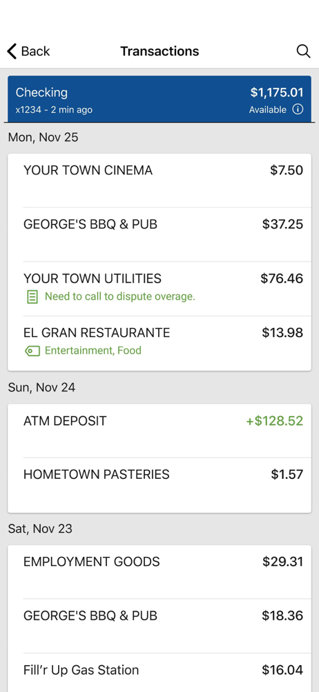
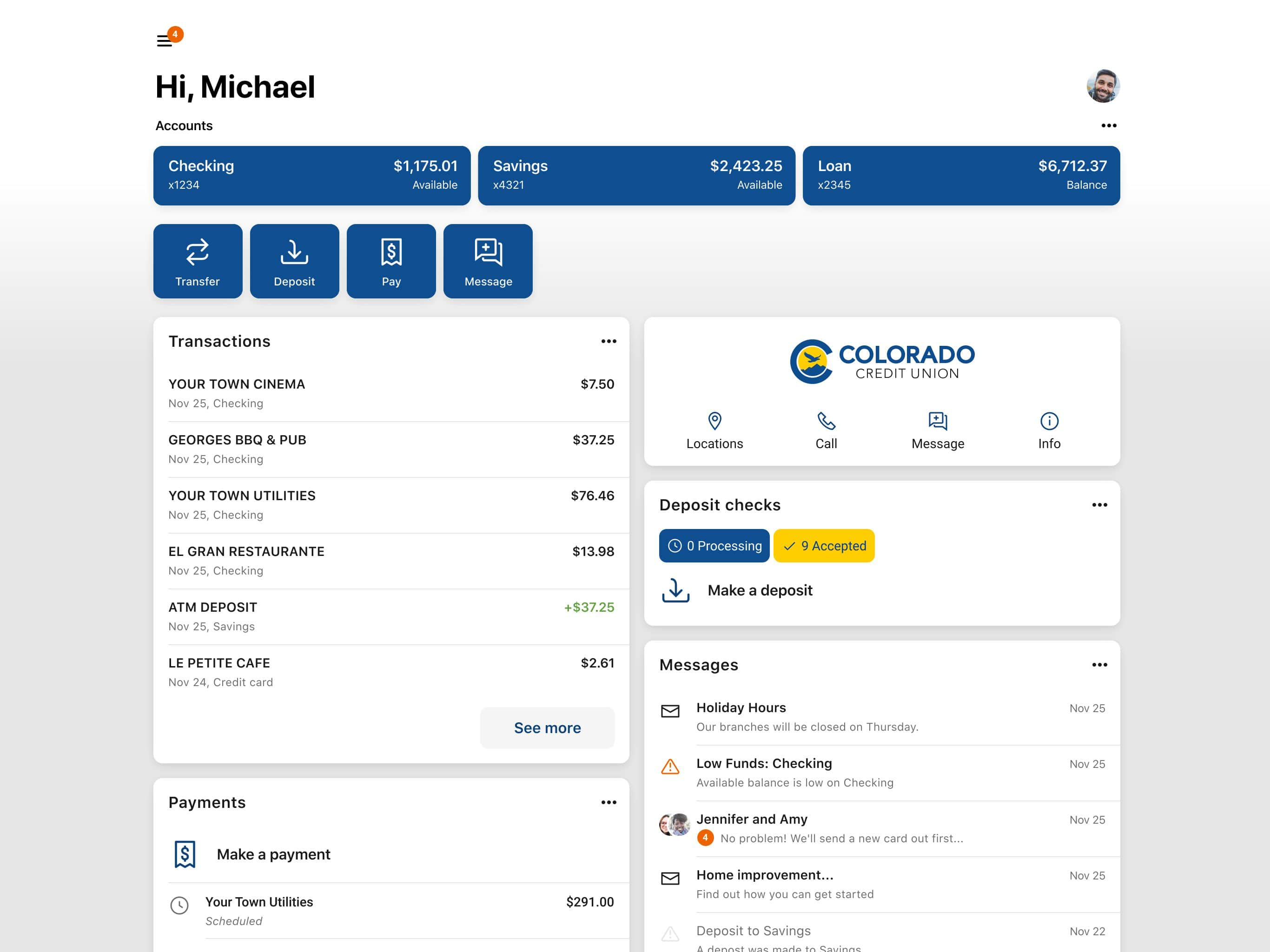
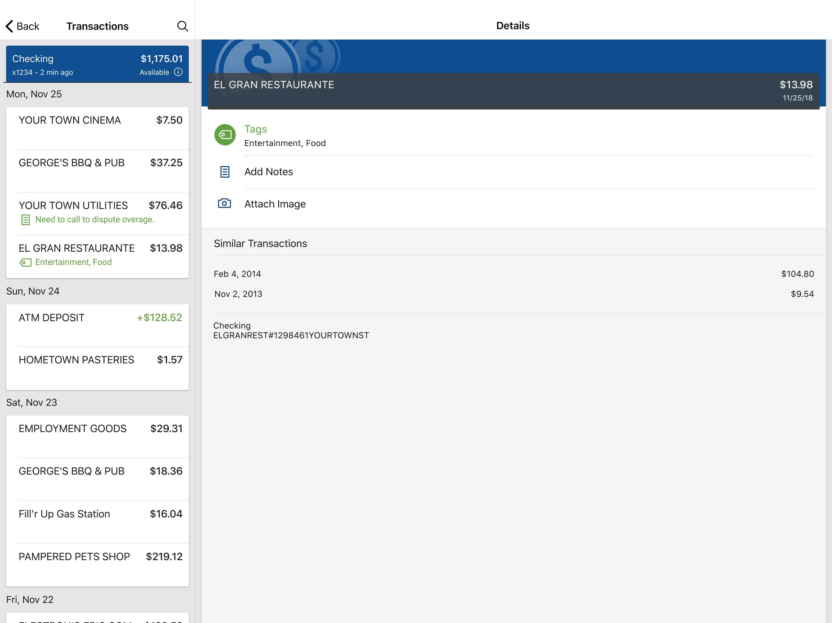
Study the product story and store experience behind the acquisition funnel.



03 / Market context
Keep revenue, downloads and store rankings separate from advertising performance.
It’s wonderful —and rare these days— to be able to call a bank and have a human answer and resolve whatever question/issue I have within minutes. No hours on hold, no getting transferred dozens of times And the humans who answer are helpful and knowledgeable!
My family has used Colorado Credit Union since its inception. It has always been a place of people being helpful, friendly, and just down right kind. The services they provide are way above what other “banks” provide. I like that I deal with a credit union that knows me and my family members. Whatever questions arise I can be sure that they will do their best to resolve and answer questions in a timely fashion and friendly helpful manner. Thank you for your continued service!
Update: I lowered from 2 stars to 1 star. Before the major app overhaul I could easily click on a check deposit and see a picture of the check, I do not see that anywhere. With the new update, under card management, I can no longer control the daily limit or update with travel notices. I still don’t like how confusing and cluttered it is, and I use the app daily! Why change something so drastically that wasn’t broken before? I liked how before you can see all your accounts and loans at once, stacked on each other. It’s a bother to swipe in between them. Bring that back, and then right underneath have all the other stuff. It also takes a while to show a transfer right away, or even a checking account to show up, which is a huge NO in my book. I had to reload the page three times for things to show up. I even panicked and thought one of my accounts was emptied out and deleted. I never had that issue with the old app. I do like that the transactions are shown, you can add external account balances, and the quick buttons are all there on the “landing page”. I think most people like to see all their accounts and loans at once rather than swiping. Once those hiccups are fixed, I will update my review.
ColoradoCU is your personal financial advocate that gives you the ability to aggregate all of your financial accounts, including accounts from other b...


