
Check the acquisition promise
Read the store headline, screenshots and description. What problem is the app promising to solve?
Study the storefront ↗
Deltek, Inc. · iOS
Explore the ad evidence, study the storefront, and build your next acquisition hypothesis.
01 / Creative research
Read the store headline, screenshots and description. What problem is the app promising to solve?
Study the storefront ↗Explore apps with direct store-link matches. Compare their hooks and formats without assuming the same approach works here.
Browse observed advertisers ↗Store rankings and revenue estimates describe market context. They do not establish ad spend, conversions or ROAS.
Review the market context ↗02 / Storefront & product
Study the product story and store experience behind the acquisition funnel.




03 / Market context
Keep revenue, downloads and store rankings separate from advertising performance.
As confirmed by the large number of negative reviews and my personal experience, the app is really gross from a UI perspective. It seems as if instead of doing much about it, the developer just makes sure to engage with each review. Likely thinking “well ive reached out to see what can be improved…” If the developer doesn’t see or experience what is fundamentally an issue with the UI then leaning on the users to point out the problems to the developer is yet another sign of how much a mess this whole situation is. I’ve worked on teams of interns that are able to produce an app that has a better interface than this. This app seems like it was a bunch of database developers that paid someone’s nephew 20$/hr to build an app on top of their database system. And they constantly just fixed each issue in a linear fashion. Never actually spending any time on the experience as a whole. I’m convinced that their thoughts are “well it seems to work in most if not all test cases, therefore we have a good app”. And that folks is why it’s a terrible app. It is possible to get most things done in the app. But the experience of getting them done is painful and gross. The sad reality is they probably paid a significant amount or have actual developers building this app only to end up with this 🤲🏿 Folks. Spending any time and effort looking for a better app will yeild positive results. Do what you can to not use this system and their software. There are so many better options out there. I get the feeling Deltek remains in business due to companies being locked into their system and simply don’t want to deal with the headache of transitioning to a new system.
Just downloaded this app to start using on my iPad that I have situated next to me at all times at my desk. There are a few first impression improvements I would make right off the bat. 1) Optimization for iPad users: the text, icons, and input fields are very small on iPad - the Submit - Save - New Line buttons in the bottom right corner are tiny and I accidentally tap submit when trying to save. 2) Optimization for iPad: I use an Apple Magic Keyboard attachment for my iPad that has a trackpad - for some reason or another, the app doesn’t allow me to click anything using the trackpad/cursor, I have to use my finger for everything. 3) Scroll Wheel for time selection: Allow users to type in the type directly instead of using the scroll wheel selector, or better yet, allow both input methods. 4) An autosave feature. I find myself closing out of the app (which is easy to do on iOS devices unintentionally) without saving and have to reenter time.
The app itself is fine, I’ve never had any issues with it. I wish you were able to view your payroll information on the app. Because of password changing policies I can never remember what mine is to log in on my browser to see, I would rather be able to use Face ID to log in easily to see pay information.
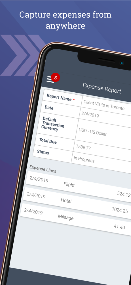
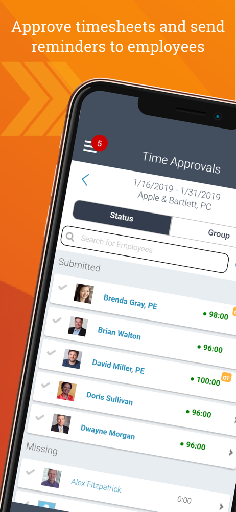
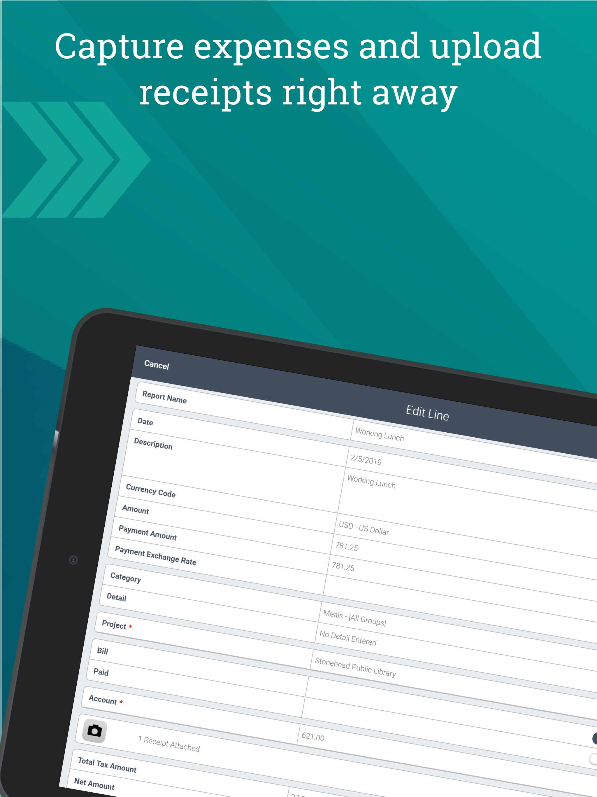
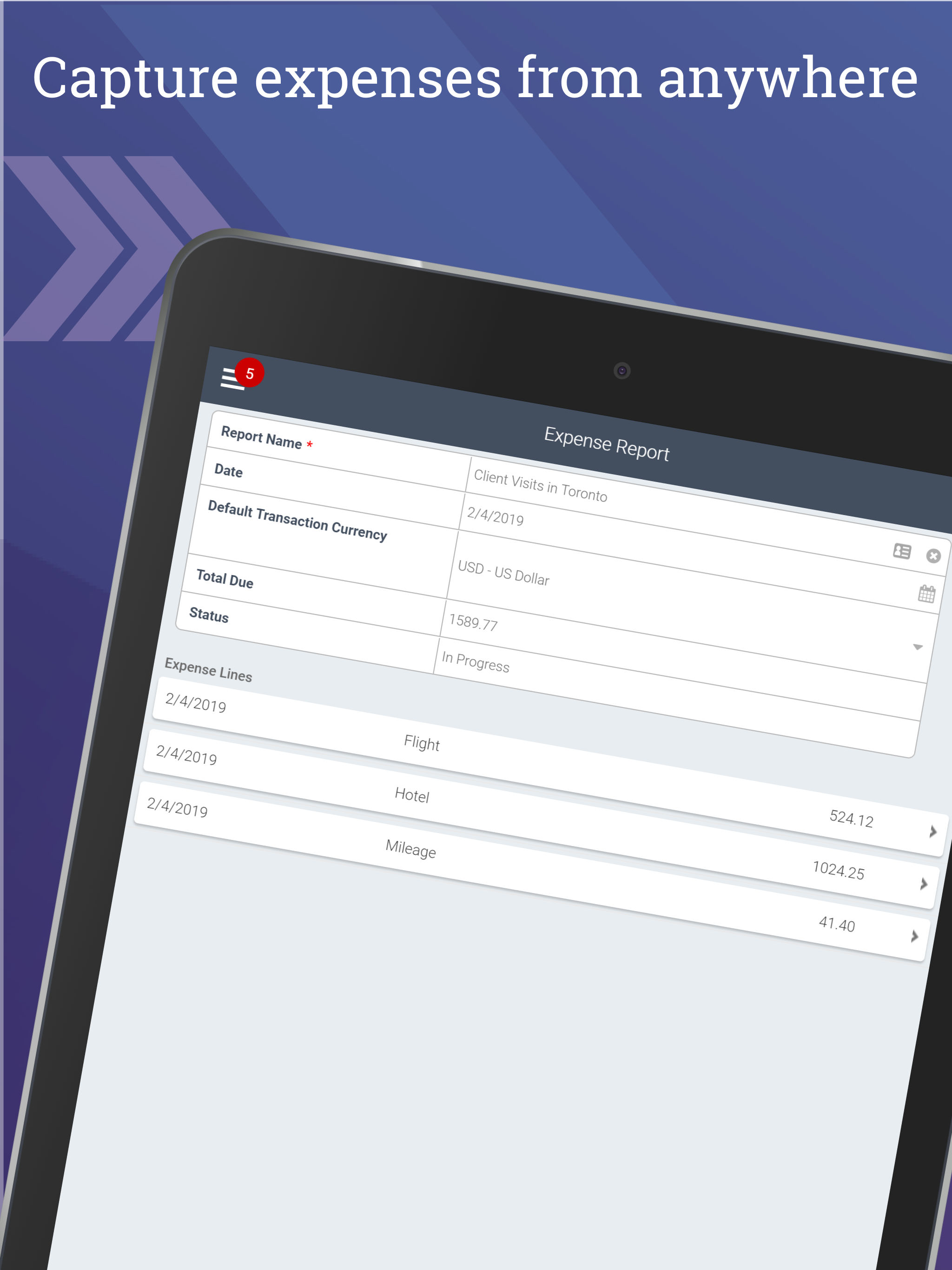
Entering timesheets and expenses is never fun, but it’s now easier than ever with Deltek Time & Expense for Vantagepoint. Deltek T&E for Vantagepoint...


