
Check the acquisition promise
Read the store headline, screenshots and description. What problem is the app promising to solve?
Study the storefront ↗
Deltek, Inc. · iOS
Explore the ad evidence, study the storefront, and build your next acquisition hypothesis.
01 / Creative research
Read the store headline, screenshots and description. What problem is the app promising to solve?
Study the storefront ↗Explore apps with direct store-link matches. Compare their hooks and formats without assuming the same approach works here.
Browse observed advertisers ↗Store rankings and revenue estimates describe market context. They do not establish ad spend, conversions or ROAS.
Review the market context ↗02 / Storefront & product
Study the product story and store experience behind the acquisition funnel.




03 / Market context
Keep revenue, downloads and store rankings separate from advertising performance.
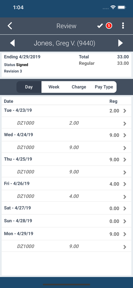
In a pinch the app works, but if at all possible use the web interface as it is a bit more usable (not great, but better). Be careful that it is on the right date before entering time as I’ve often found that it goes to the wrong date in the past instead of today’s date. For example, just today I opened the app and instead of starting off on 1/29 (Mon), it defaults to 1/20 (Sat). This behavior persists between application reloads as well. Otherwise, like the subject says, it works though it looks like something out of the late 80’s / early 90’s.
I manage a team of about 100 employees and all they really need to do is enter hours under a couple different project IDs. This app itself isn’t toooo bad, but the overall experience between their desktop program and this app is incredibly annoying. This program must have been made strictly by engineers without a single UI professional in sight. I understand that some businesses need a ton of steps available, but maybe this program could have a simplified version for people that are doing the same work each day and only need to enter a few details at most. It takes a while to get used to the interface as it’s not very intuitive. We used to have ADP, and I definitely miss it.
Because with Costpoint on the phone app, I can't see the hours being input after I put 2 or more tasks in… so I have to save when I can't see them, in order to see them.. then, on top of that, it also changes the hours that I input after I saved it… for instance I put in 3 hours on a task, saved, went back and looked at my hours, it said 1 hour for all the tasks that day? Really weird behavior from a business app that is charging for use? Fix your app!
Employees can enter hours to a timesheet, view previous time in summary, view leave balances and see timesheet related pending tasks on an easy to use...


