Check the acquisition promise
Read the store headline, screenshots and description. What problem is the app promising to solve?
Study the storefront ↗
ESRI · iOS
Explore the ad evidence, study the storefront, and build your next acquisition hypothesis.
01 / Creative research
Read the store headline, screenshots and description. What problem is the app promising to solve?
Study the storefront ↗Explore apps with direct store-link matches. Compare their hooks and formats without assuming the same approach works here.
Browse observed advertisers ↗Store rankings and revenue estimates describe market context. They do not establish ad spend, conversions or ROAS.
Review the market context ↗02 / Storefront & product
Study the product story and store experience behind the acquisition funnel.




03 / Market context
Keep revenue, downloads and store rankings separate from advertising performance.
I have a GIS degree. I’ve had the displeasure of using this app for the past 7 years for work both collecting field data and configuring forms for others. It’s a simple app that somehow remains very difficult to use due to numerous bugs, battery drain, lag, crashing, authentication loops, etc. These issues get exacerbated in areas of poor cell service, causing errors that only resolve by force quitting the app and re-opening in airplane mode. There have been basically no improvements to this platform or support which make the predatory pricing practices of ESRI even more egregious. A billion dollar company that can’t make a simple app functional.
This app is awesome when designed well by the team who is customizing it. Many of the bugs reported by others are due to how it was customized, not due to Esri. Also they are constantly improving it! You can’t beat the ease of translations and ability to add offline maps to be viewed in the field, even while disconnected from the internet.
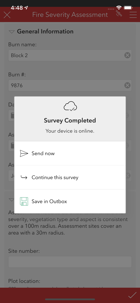
The app works well overall. BUT, needs an update and improvement for the ending of the survey. What i mean is when users are using the keyboard to enter in a field, when they scroll down the checkmark is not available. They have to try and “push” keyboard down and away to allow check mark to appear. Very clunky, checkmark should always be a banner on the bottom. Also, the checkmark should be changed to a submit button, mostly for the older generations that cant see the check mark easily.
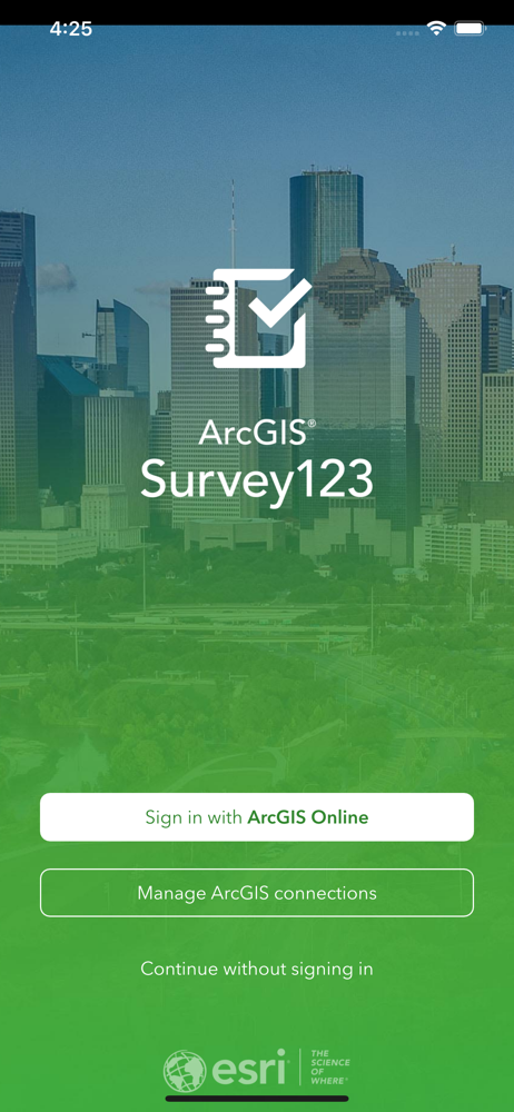
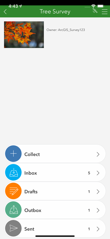
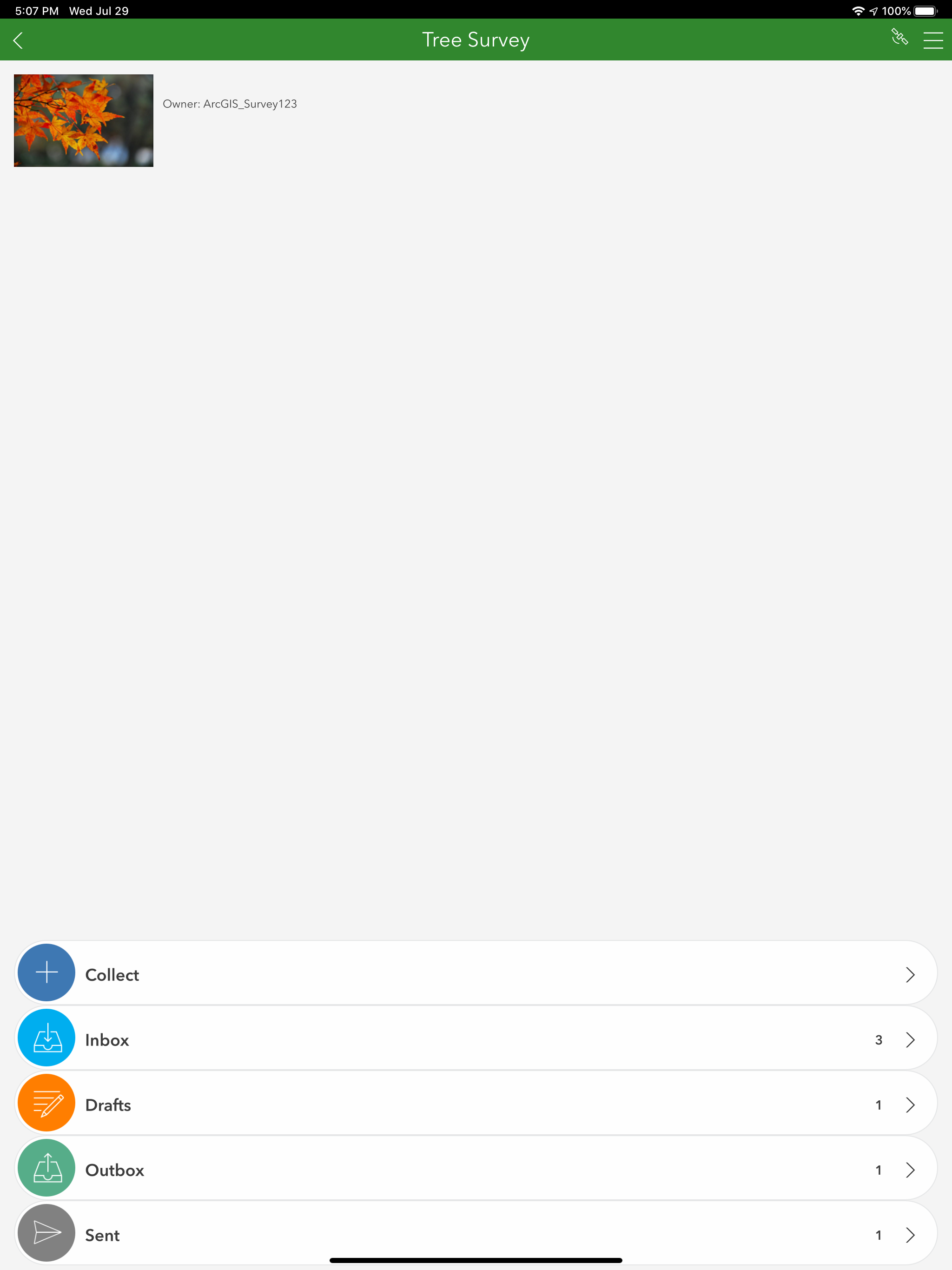
Smart forms and surveys for digital data collection. ArcGIS Survey123 helps mobile workers collect field data with speed and precision. Capture locat...