
Check the acquisition promise
Read the store headline, screenshots and description. What problem is the app promising to solve?
Study the storefront ↗
Applications by Design, Inc. · iOS
Explore the ad evidence, study the storefront, and build your next acquisition hypothesis.
01 / Creative research
Read the store headline, screenshots and description. What problem is the app promising to solve?
Study the storefront ↗Explore apps with direct store-link matches. Compare their hooks and formats without assuming the same approach works here.
Browse observed advertisers ↗Store rankings and revenue estimates describe market context. They do not establish ad spend, conversions or ROAS.
Review the market context ↗02 / Storefront & product
Study the product story and store experience behind the acquisition funnel.




03 / Market context
Keep revenue, downloads and store rankings separate from advertising performance.
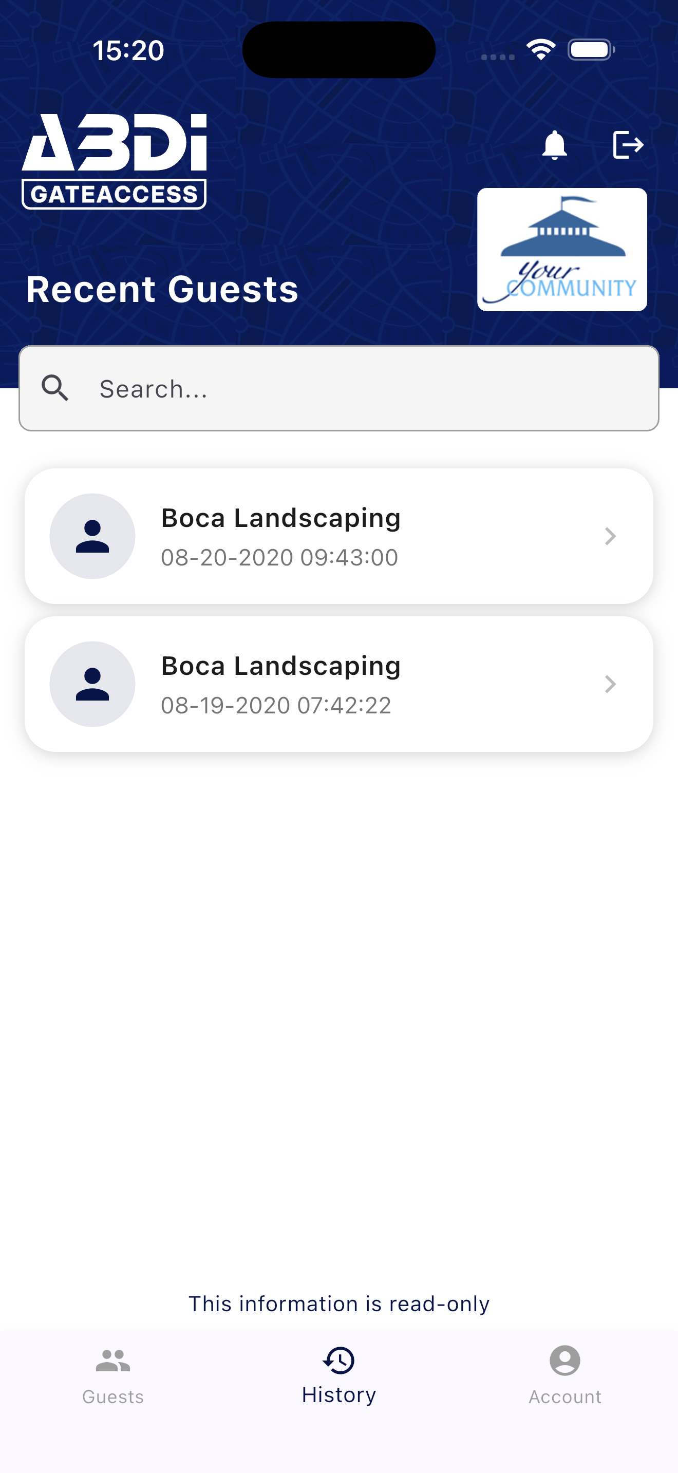
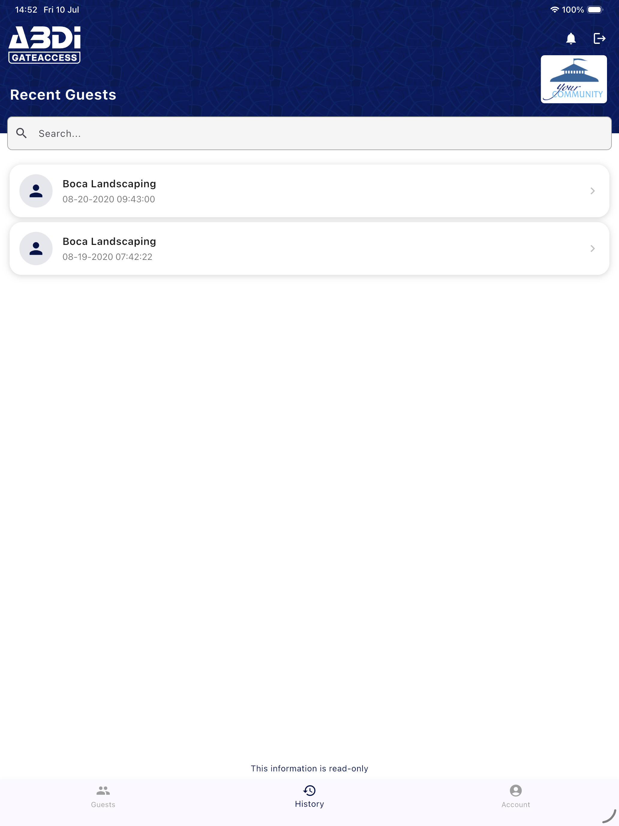
I’ve used this app for more than 5 years and it gets better in very tiny steps. It has several problems: 1) editing an existing entry forces you to reselect the dates 2) selecting date ranges frequently chooses multiple dates when only wanting a single date 3) existing entries “slide” to reveal other options when not actually touching them 4) we have multiple gates in our neighborhood but notices don’t specify which gate a person enters through (this may be due to other parts of their system but it’s really annoying) UPDATE FOR V4.0.0 The issues listed above have mostly been addressed (thanks) however with v4.0.0 they have introduced new usability issues. 1) the guest listing is now so large that I can see only 3 entries at once where previously I could see about 15. The entries could easily be half or one third the size to show more. 2) the “add guest“ button is now very small and at the top of the screen with other buttons making it hard to see and harder to tap. For me, this is the primary function of this app and now it’s been made much less important in the UI. “Show expired guests” is given way more screen space which could be used for “add guest “ and a sort option (see below) 3) guest additions that are temporary are highlighted as “future” but only if they are for upcoming days. All guests are future so removing the word “future” makes sense and helps to unclutter the UI. The highlight color is a nice addition though. 4) A sort option would be nice for the guest list. “By date”, “temporary or permanent”, “by name”, etc. 5) Showing which gate someone enters through when multiple neighborhood gates exist would be nice to know.
Our family appreciates the convenience of the PML gate online access. It’s a great security feature. We hope gate charges will decrease or at least not go up - we get complaints from guests about that regularly and occasionally I have to pay them or stand to lose that booking. If you must charge could you give each guest a coupon discount booklet at least for the charge - suggest PML (equestrian, golfing etc) and The Grill, to promote business and generate more income for businesses, PML and tax $ for our County! Bet they’d all love PML for this idea! Call me if you want more ideas to create tourist friendly partnerships for PML. 😊 I’m just a homeowner and Airbnb operator - who wants to promote PML!
The Guards are nice people but too many times unable to find a registered guest either by first or last name, when I am sure they are registered . So they are forced to call the house phone and it cancels the benefits of ore registration. Maybe a portable microphone connected to the PC into which the guest speaks his/her own first and last name and the program finds them. I did that for another HOA and it worked fine.
The GateAccess app is a free mobile companion to your community's GateAccess.net subscription. With the app, you can securely access and manage your g...


