
Check the acquisition promise
Read the store headline, screenshots and description. What problem is the app promising to solve?
Study the storefront ↗
YMCA360 Studios · iOS
Explore the ad evidence, study the storefront, and build your next acquisition hypothesis.
01 / Creative research
Read the store headline, screenshots and description. What problem is the app promising to solve?
Study the storefront ↗Explore apps with direct store-link matches. Compare their hooks and formats without assuming the same approach works here.
Browse observed advertisers ↗Store rankings and revenue estimates describe market context. They do not establish ad spend, conversions or ROAS.
Review the market context ↗02 / Storefront & product
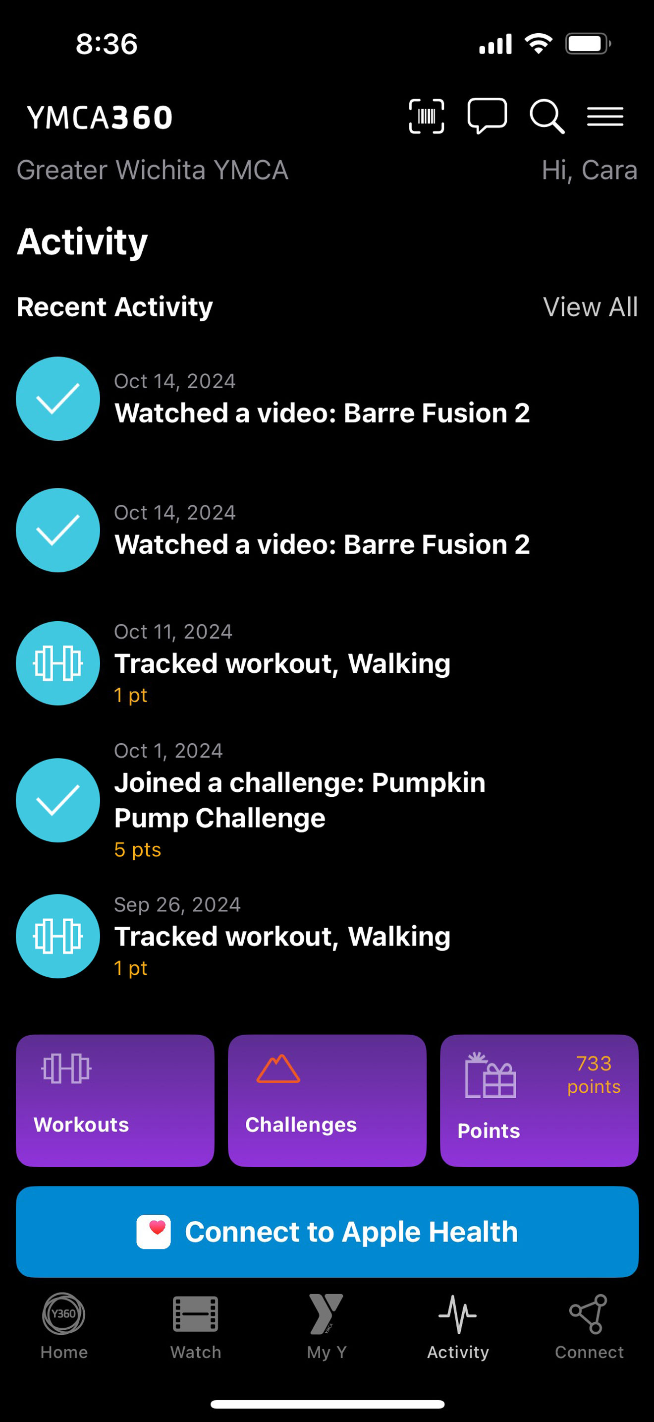
Study the product story and store experience behind the acquisition funnel.



03 / Market context
Keep revenue, downloads and store rankings separate from advertising performance.
While this “app” is a slight improvement, it’s certainly not self-contained nor able to function independently—no WAY this should be assumed that you can get everything done here. It’s like the developers stopped short of actually finishing it, releasing it mid-swim. It’s little more than a general landing page of sorts with limited functionality that serves only to circuitously get you back to the frustrating, browser-based, 1990s nightmare that is Daxko the moment you want to look or sign up for programs or events. I sure hope YMCA isn’t paying actual money for Daxko: “Dark Ages” comes to mind. The fact that YMCA360 leads users BACK to Daxko is little more than a lazy bait and switch back to where we were BEFORE you launched this app. I often try to imagine older members attempting to navigate EITHER of these two poorly designed, non-intuitive platforms (Y360 or Daxko)…my guess is that they give up and ask the front desk clerk to help them. Do better soon, please. Surely there’s a generous and talented app guru out there who would like to donate their skills to help your local, non-profit YMCA?
This app gives you the bare minimum. The only thing it has going for it is it allows you to check in with your phone, but my previous YMCA app let you do the same thing while also allowing you to add a membership card to Apple wallet. All buttons for class registration and schedules are hyperlinks that open in browser. Other than that, I see no real point in this app existing, unless you watch the YMCA fitness channel provided.
I’m glad the Y finally centralized their mobile app and check in process. The app is nice, although there’s a lot of unrelated content in there that clutters the UI and all the useful things I need related to my gym are nested and harder to find. Example: how to craft videos are on my homepage, but to find the group fitness schedule I have to click on My Y and then scroll all the way to the bottom to find a time labeled schedules. As a feature request, please add the location to the calendar entry when I click to add a class to my calendar. Our old app used to do that. It also allowed to add the series, not just an individual class.
Introducing the all-in-one YMCA app designed specifically for YMCA members! This innovative platform goes beyond just fitness, offering engaging featu...


