
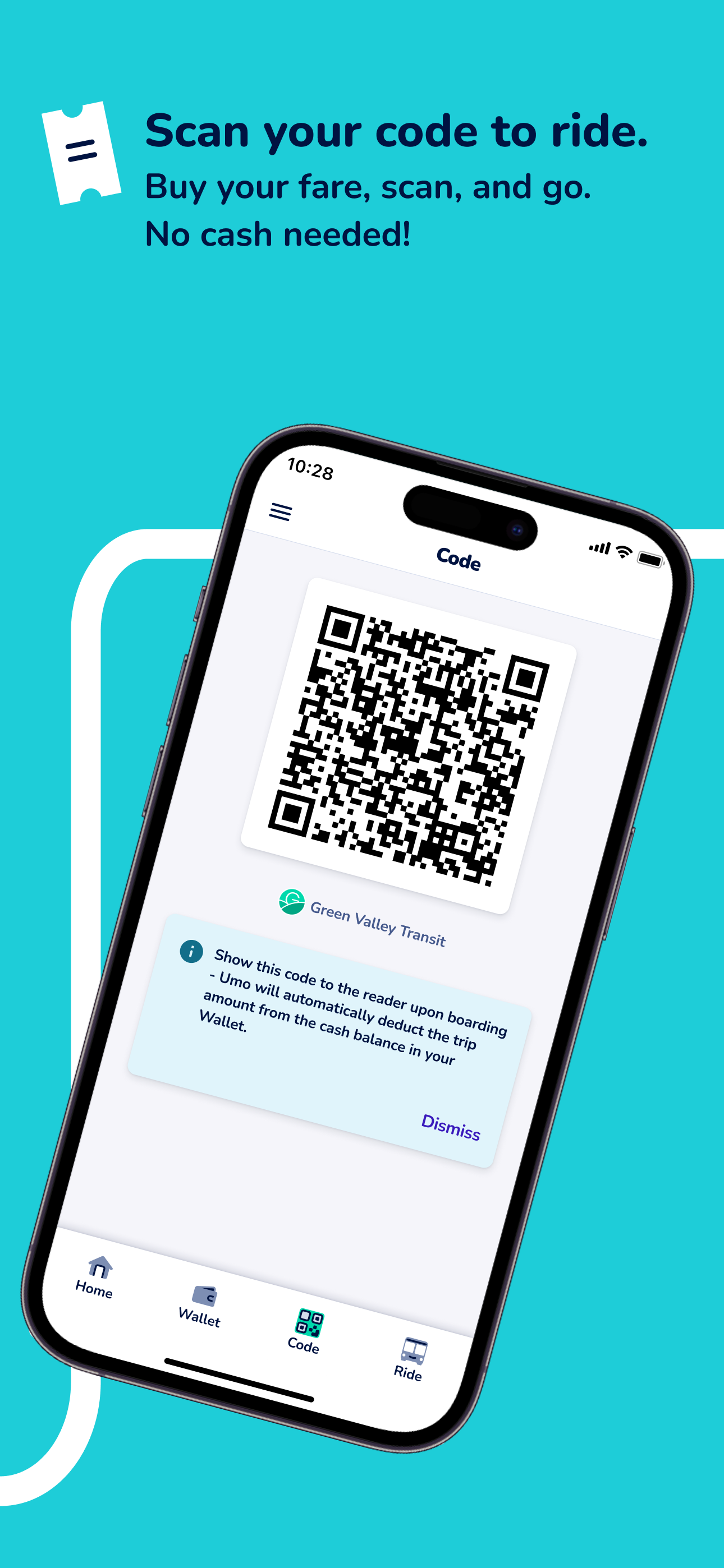
Screenshots


How Much Does Umo Mobility Make?
Platform Performance
Rating Distribution
Top Countries
Rankings
Reviews (3)▼
There are some serious UX issues. It doesn't show your progress towards fare cap, only that you've hit fare cap. Day capping applies on your second ride, but you'd have to get out your calculator or a spreadsheet to see month capping progress. But that's not all: it doesn't display any indicator of fare capping on the main page, only on the transaction page. So not only do you have to go to another screen to check if this ride is going to cost you or not (and this is not a speedy app), but if you're fare capped and your wallet is at zero, it will say that you DON'T have fare or passes and need to add money to ride. Which is false. You need to add money once the cap expires. Maybe in an ideal world everyone would have money all the time, but a lot of people who ride the bus are poor and might need to wait until payday. Anyway, I'd much rather use the physical reloadable card, but another downgrade from the app my transit authority used to use is that you can't manage the card through the app. You have to use a different system... but don't worry, they cancel out the card if you have the app because screw riders if their phones die I guess 🙃 There's no way to contact them for app issues, only my local transit authority. But my transit authority isn't the one making the poor decisions about this interface, I'm pretty sure. If there were a better option, I'd use that. But unfortunately it's the only game in town.
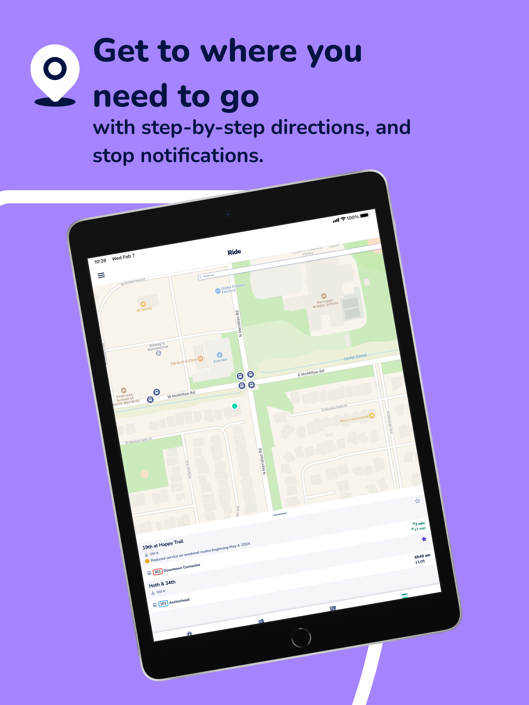
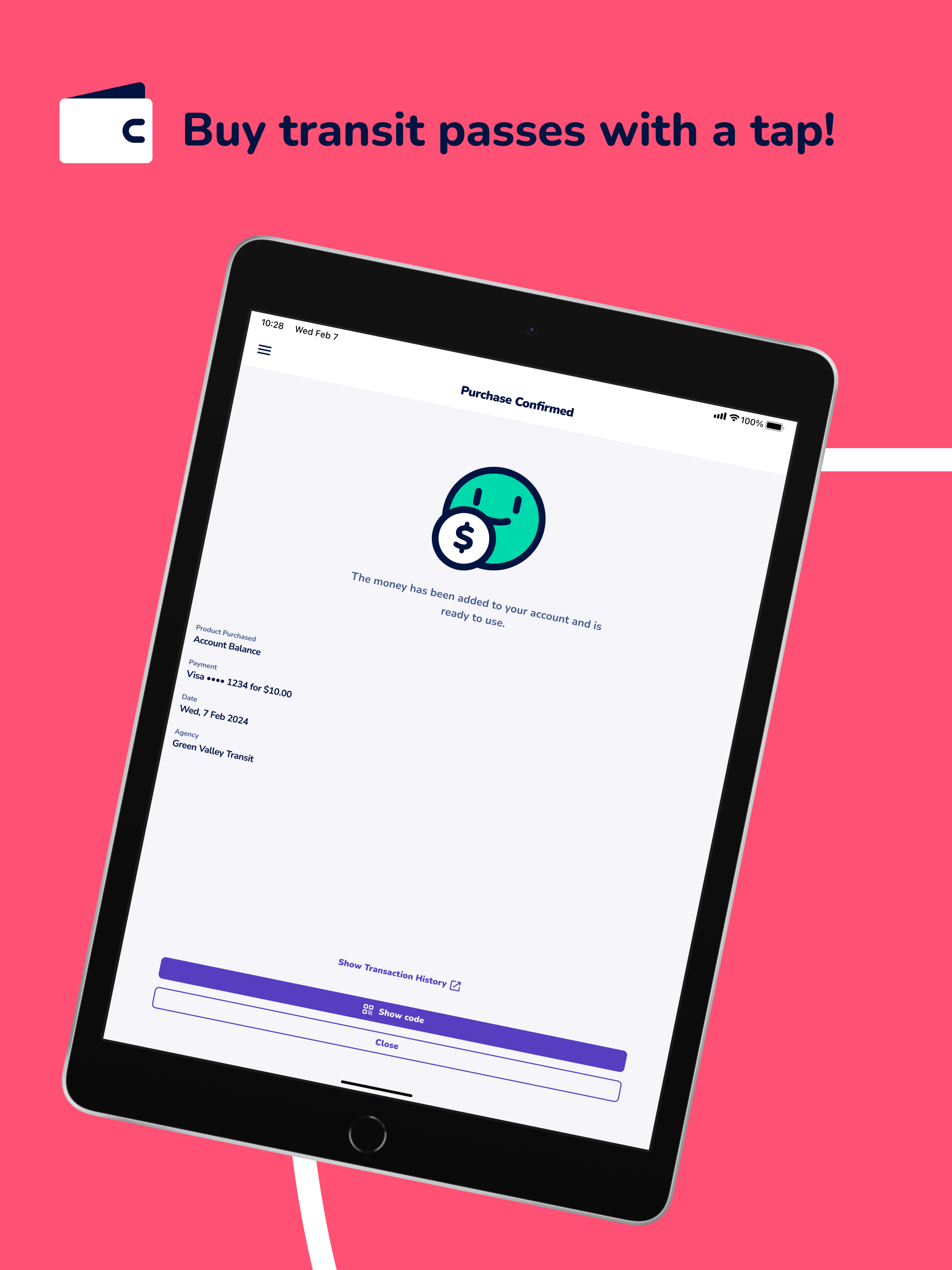
App honestly worked great. It gave me good route planning and live updates and it was pretty easy to load money into. It was also nice that i could load an exact amount and it didn’t make me put $10 in just to do a $1.25 fare. Much better than a lot of other transit apps I’ve used
The transition to this app was a disaster. No information was sent to me. Accounts were not automatically transferred. Money was not transferred. This surprise meant I walked home. The UI is terrible. No user research or testing. As other reviews state, features have been removed or degraded. One thing that violates basic design principles is the “Ride” tab. If you tap on a pre-populated result, it gives you the schedule. If you tap the search and tap the same result in the autocomplete options list, you get a series of steps (like a maps app) to get you to that location. Tapping the same thing in the same place with the same heading should do the same thing. They do not. Hire real designers that can do user research. Hire real developers that can do a basic email verification flow that actually works the first time. I’m petitioning my councilman to get rid of this app as soon as possible. A real usability improvement would be something like the MTA. You tap to pay. No app. No account. Same rate capping. Adding money to a balance that is rate capped is the same as or worse than day/week/month passes. You either add the same amount as a pass, but you have to look it up instead of selecting a simple option, or you pay more than a pass up front and hope you use what’s left after the cap is hit. If you don’t, the money is stuck there.
Version History (29)▼
Available In (3 Countries)▼
Supported Languages (3)▼
App Details▼
Umo: Your travel companion. Umo is your travel companion, an all-in-one transit app that lets riders at agencies that utilize Umo buy transit passes...
Similar Apps


