Check the acquisition promise
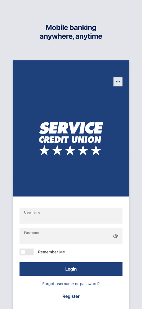
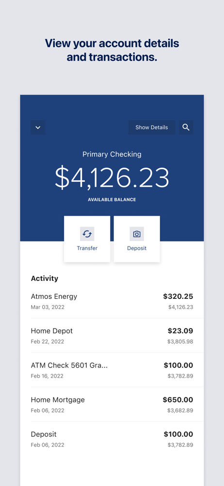
Read the store headline, screenshots and description. What problem is the app promising to solve?
Study the storefront ↗
Service Credit Union · iOS
Explore the ad evidence, study the storefront, and build your next acquisition hypothesis.
01 / Creative research
Read the store headline, screenshots and description. What problem is the app promising to solve?
Study the storefront ↗Explore apps with direct store-link matches. Compare their hooks and formats without assuming the same approach works here.
Browse observed advertisers ↗Store rankings and revenue estimates describe market context. They do not establish ad spend, conversions or ROAS.
Review the market context ↗02 / Storefront & product
Study the product story and store experience behind the acquisition funnel.



03 / Market context
Keep revenue, downloads and store rankings separate from advertising performance.
I miss the feature to see amounts on hold and the release date. I miss seeing all of my accounts in one location. I am no longer able to use the secure chat feature. I am not sure if it went away, and it is solely messages only. I also miss the Zelle feature depositing and sending funds instantly. It takes a day or so for funds to be available and for it to reflect on my account. This is also the same issue when transferring money to internal accounts such as loans and savings. This is extremely stressful. Especially, since I do not live near a branch. I love the account colors, but I don’t like the fonts. I disabled Snap shot thinking I would get the old view of my accounts back but nope. I miss the fab that showed you tools and consolidated skip a pay, apply for a loan, secure chat, contact us, and more. Since the new app it has been a living nightmare and I’m a millennial! Am I getting old? Don’t answer that. Please reassess and push out a new update that still allows the older features with a few improvements. This update is just too much and it is not user friendly or convenient.
I really liked the former ap for on line banking and feel it is not just a matter of getting used to this new one. This new one is not as user friendly and behaves in an unpredictable way. My first attempts to get comfortable with it took some time, but even now that I know what it should do, it doesn’t perform reliably. I use bill pay often and it just isn’t working well. Recently I got locked and attempted a chat, which was less than satisfactory. I tried to call in to speak to someone about specific issues the chat couldn’t resolve and wasn’t able to reach anyone at the branch. Very frustrating.
With the new update, if I choose to turn on Snapshot, all my account balances is the first thing I see when I open up the app. Who thought that was a good idea?? The old snapshot that was accessed by sliding down from the top of the app was more secure/private. I want snapshot turned on, but I don’t want my account balances to pop up & stay there immediately I open up the app. I still don’t understand who would have thought that was a good idea. How about you make the login screen the app’s first page and place the snapshot icon at the bottom of the screen so we can access our snapshot IF needed. If you were showing all the balances as xxxx and giving me the option to show or hide each one, that would have possibly been tolerable. But the way it is right now, my only option would be to turn off snapshot, which is very frustrating cause I use it a lot. I would love to be able to come back & update this review to a 5 star if changes are made.
With our mobile app, managing your money has never been easier. Check your balances, transfer funds, pay bills, deposit checks remotely, add bill paye...