
Check the acquisition promise
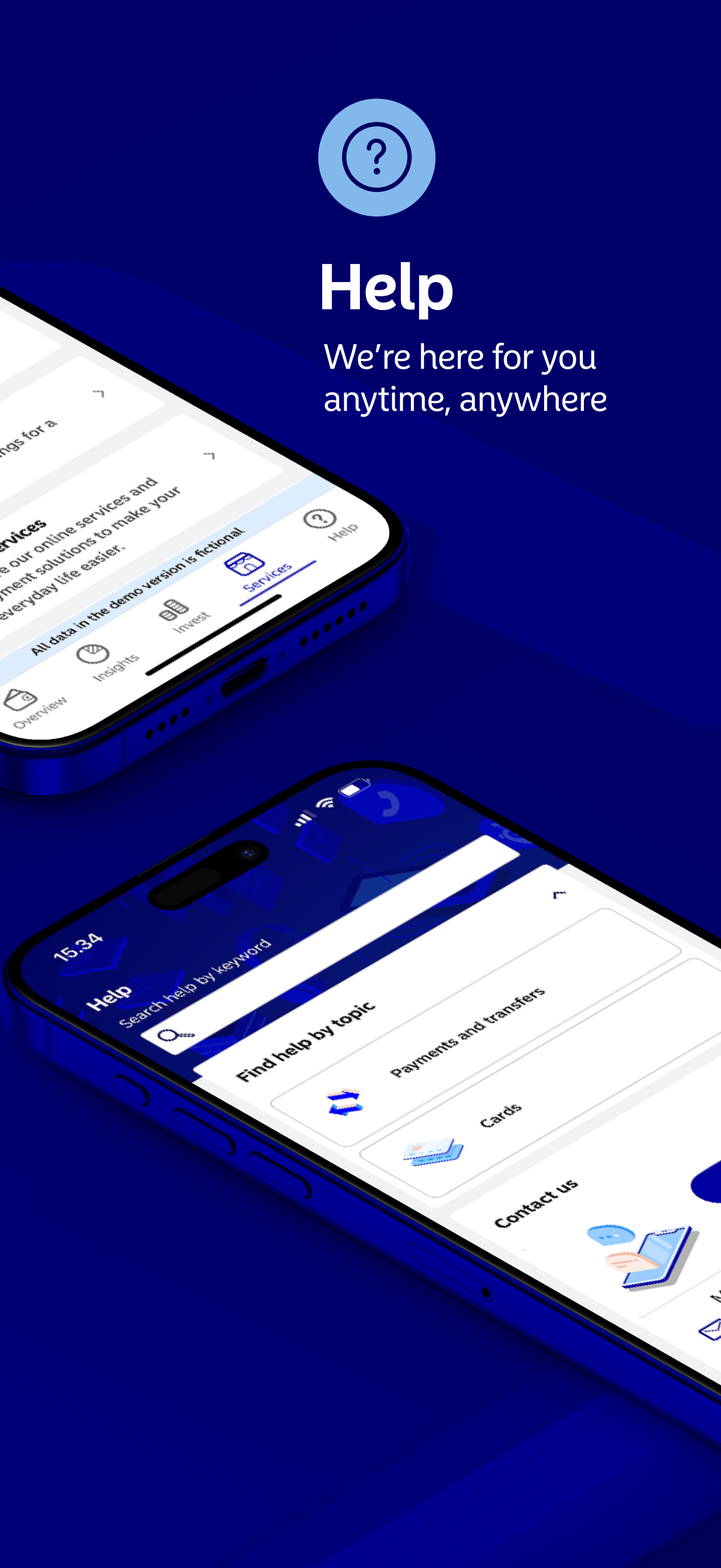
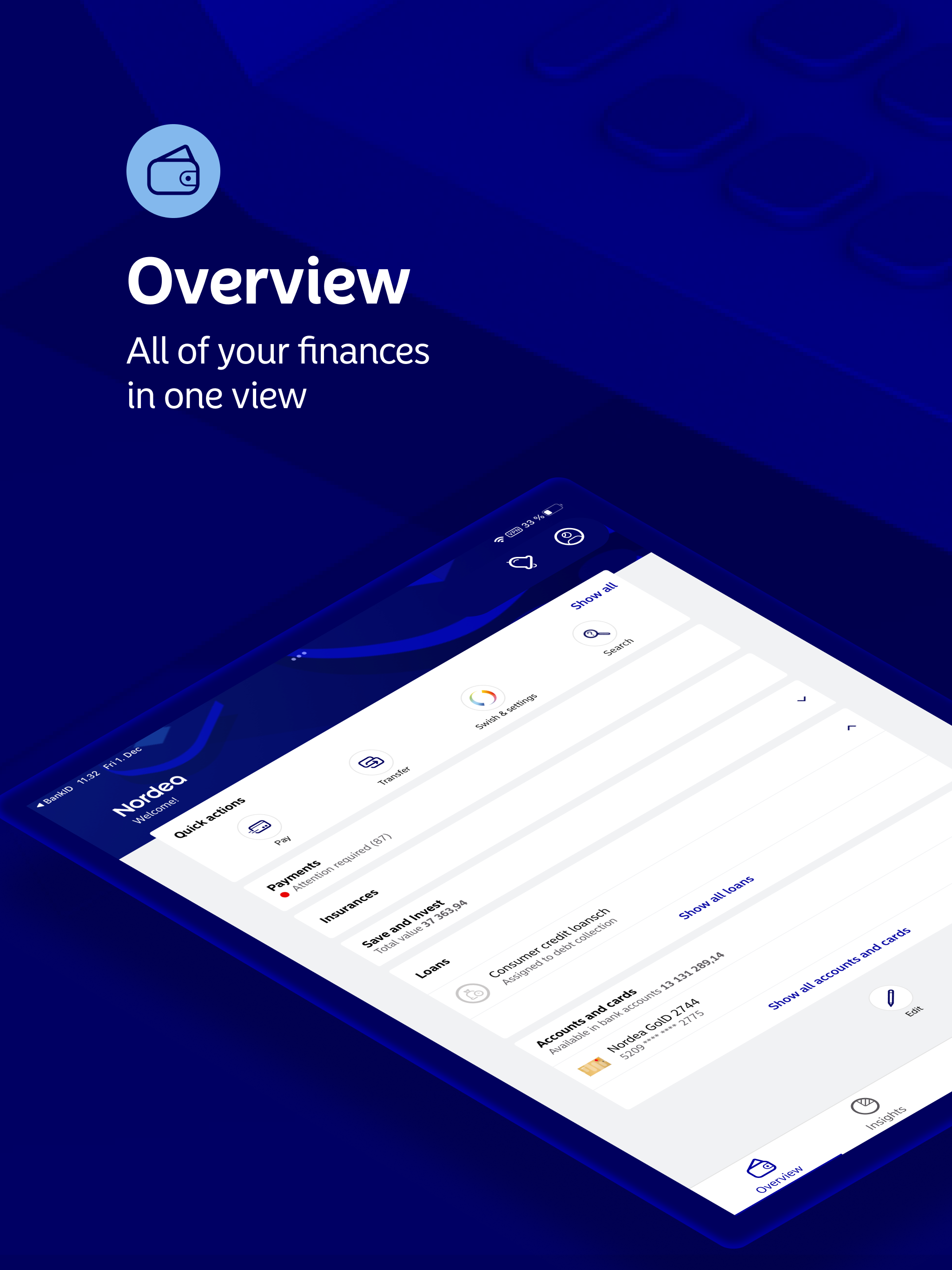
Read the store headline, screenshots and description. What problem is the app promising to solve?
Study the storefront ↗
Nordea Bank Abp · iOS
Explore the ad evidence, study the storefront, and build your next acquisition hypothesis.
01 / Creative research
Read the store headline, screenshots and description. What problem is the app promising to solve?
Study the storefront ↗Explore apps with direct store-link matches. Compare their hooks and formats without assuming the same approach works here.
Browse observed advertisers ↗Store rankings and revenue estimates describe market context. They do not establish ad spend, conversions or ROAS.
Review the market context ↗02 / Storefront & product
Study the product story and store experience behind the acquisition funnel.




03 / Market context
Keep revenue, downloads and store rankings separate from advertising performance.
Couldn’t live without this app. A mist have if you bank with Nordea.
Very convenient way to pay bills. When the invoice arrives you can immediately open the app and be done in minutes. No risk of putting it off until you are near your computer and then forgetting.
I feel like this app went a step back in this update. While I understand the need to streamline the color scheme with the bank's colors, this really takes the cake. Using the bank's color scheme in the tool bar and buttons completely destroyed the look and feel and took the app back to the 19th century. The color is stunningly eye catching for all the wrong reasons - it screams "ugly" in every sense of the word. There's no reason to spoil this functional app with this color. Simply keeping the logo this color is enough and hanging the color of the buttons and title bar to something less dazzling and neutral would restore this app to its former glory. But then, what do I know? I'm not a UI expert.
Welcome to Nordea! The app puts the entire bank in the palm of your hand, enabling you to do most of your banking swiftly, smoothly and securely. Yo...


