
Check the acquisition promise
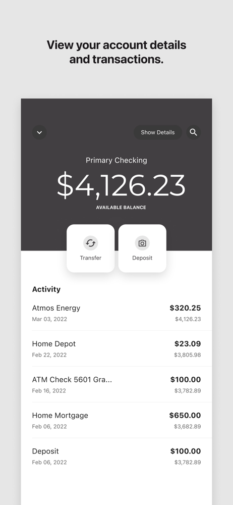
Read the store headline, screenshots and description. What problem is the app promising to solve?
Study the storefront ↗
PREMIER MEMBERS CREDIT UNION · iOS
Explore the ad evidence, study the storefront, and build your next acquisition hypothesis.
01 / Creative research
Read the store headline, screenshots and description. What problem is the app promising to solve?
Study the storefront ↗Explore apps with direct store-link matches. Compare their hooks and formats without assuming the same approach works here.
Browse observed advertisers ↗Store rankings and revenue estimates describe market context. They do not establish ad spend, conversions or ROAS.
Review the market context ↗02 / Storefront & product
Study the product story and store experience behind the acquisition funnel.




03 / Market context
Keep revenue, downloads and store rankings separate from advertising performance.
Tried to get on page after discovering that I needed to check balance after hours in an effort to not be held responsible for a mistaken deposit into a possible deposit into the wrong account after the writing of and make sure the right account was credited and, if necessary , put a correction online by transferring from account to the correct account, even though I tried man times to get on website, could not make transaction due to the fact that I was not able to get on at all. Please help? Customer since the time Credit Union located in Boulder and it seems that the service has become extremely unreliable when trying to get online to make any type of transaction. Please advise!
They have always treated me well I’ve been a customer for many years. Never had any problems with anything. They’ve always taken care of issues right away.
This is not like fine wine, it gets worse with age. Each major update provides new problems but doesn’t fix the old. It’s such a mess now. With multiple accounts you’re just scrolling to look for the correct one. It’d be nice to have a drop down to select the account I want to look at and this option could include “all” for those that does enjoy this view. To transfer it takes about three additional steps. The layout looks like it was setup in the 90’s. It isn’t user friendly. For loan payments I used to be able to click directly on the loan and a payment button was right there, my life was easy however, it’s a challenge now as that too is also taken away. Have to transfer and once I click I want to transfer I once again have to click I want to transfer because it takes you to a history screen. Let the history screen be an option and just take me to my transfer in one click please.
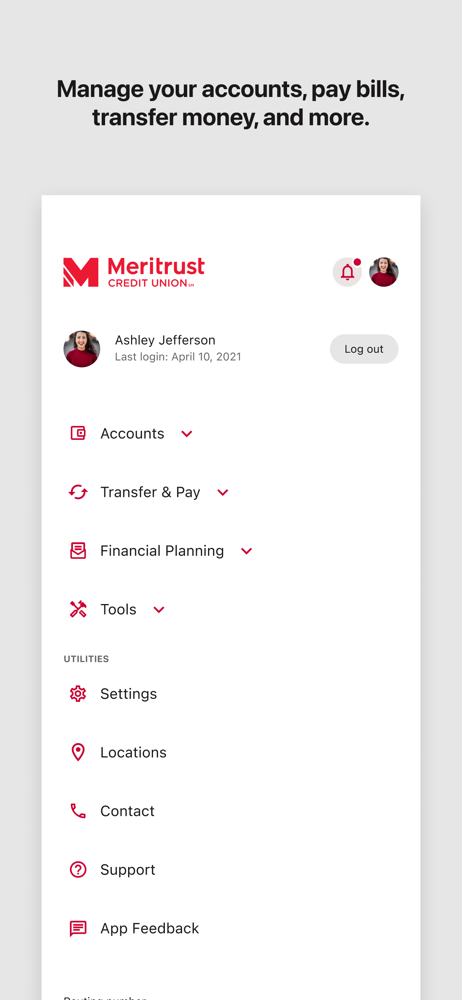
Like your favorite neighborhood branch in an app. Manage your accounts, pay bills, transfer money, and more. It’s easy and secure. Just what you expec...


