Check the acquisition promise
Read the store headline, screenshots and description. What problem is the app promising to solve?
Study the storefront ↗
Thirsty Nellan Productions · iOS
Explore the ad evidence, study the storefront, and build your next acquisition hypothesis.
01 / Creative research
Read the store headline, screenshots and description. What problem is the app promising to solve?
Study the storefront ↗Explore apps with direct store-link matches. Compare their hooks and formats without assuming the same approach works here.
Browse observed advertisers ↗Store rankings and revenue estimates describe market context. They do not establish ad spend, conversions or ROAS.
Review the market context ↗02 / Storefront & product
Study the product story and store experience behind the acquisition funnel.
03 / Market context
Keep revenue, downloads and store rankings separate from advertising performance.
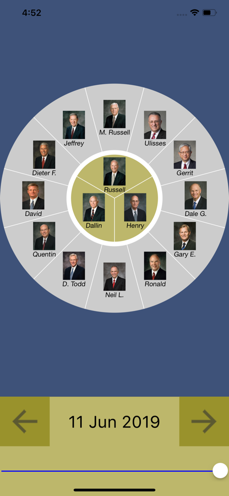
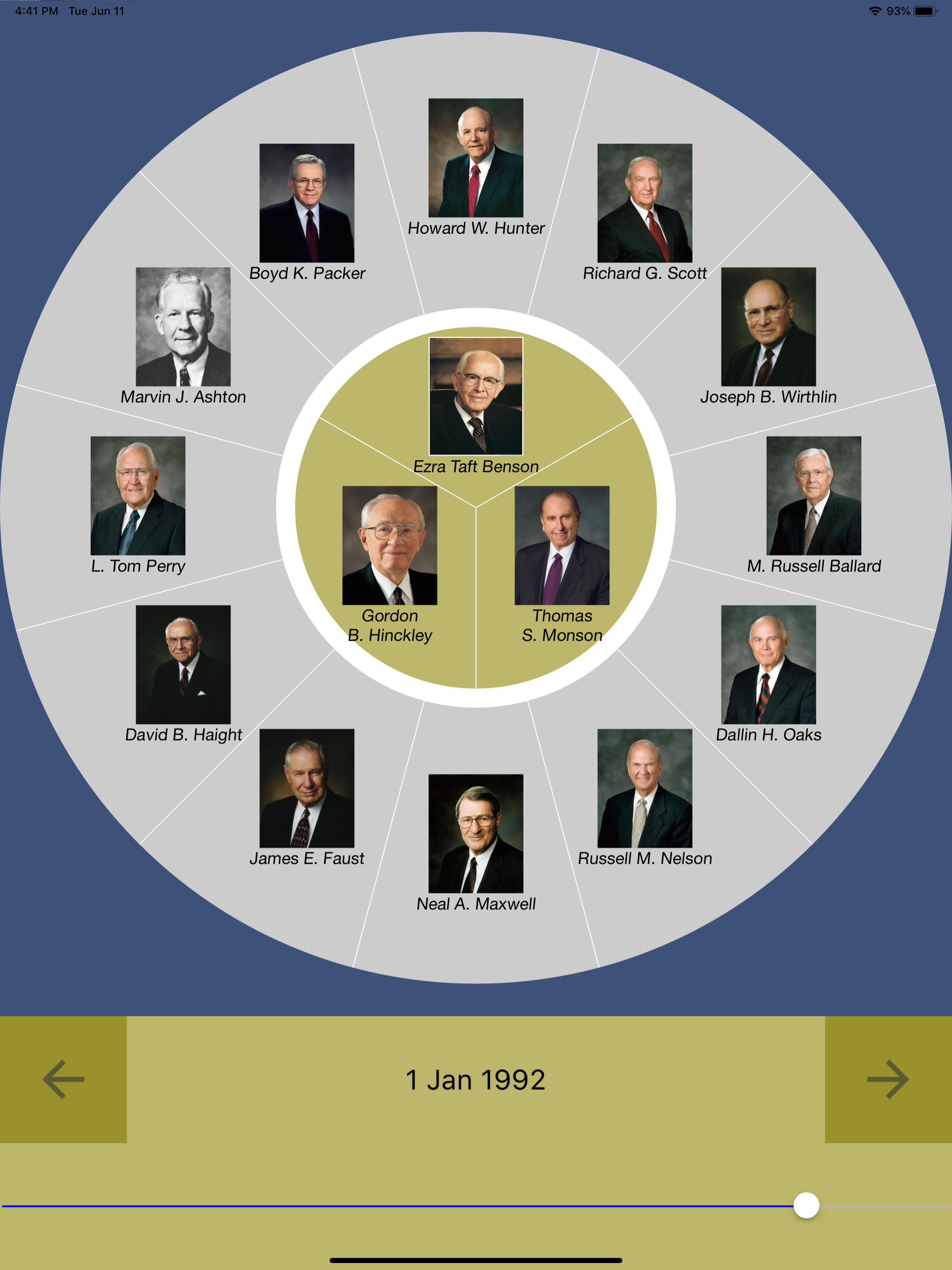
I really love this app. However, when I try to click on certain apostles’ pics, it rewinds back a few dates to which the apostles’ information I’m trying to access, makes it impossible. I really would like to be able to view their bios. I would also like to have more information about them than just the basics. I’d be willing to pay for an app that had such information. Thanks for all the hard work in designing this app. There are too many people that are over critical of apps, especially of those apps that are free. That makes no sense to me. “You get something for free and then expect it to be perfect, and when it’s not you flood the internet with negative reviews”. - makes no sense to me. Anyway thanks again for the app!!
Finally there are jump/step buttons to move more precisely through the line. It was frustrating to try to fine an individual change, now it is easy, thanks! Next suggestion is when you click on a picture, make it larger along with the info. I am trying to teach my children and the pictures are so tiny they complain they cannot see them.
When it first came out, there was an arrow one could tap, moving it from year to year. This has been removed. That seemed to work much better than the current slide bar approach. I’m using an iPhone and it’s difficult to slide from one year to the next, even if I rotate my phone to landscape. What happens is it jumps two or often more years at a time. So the real purpose of the app, seeing changes from year to year, is lost. Again, go back. There is no shame. I’ve worked in the software industry. The mentality is often, “We never go back; always forward.” If a mistake is made, admit it and go back to a better version. Users will love you for it. Would you please respond to this review? Thank you for the app. Love the idea. So much great information is presented in a “visual” way. Love the idea.
Explore Church History from a new perspective! "Latter-day Apostles" lets you see what the First Presidency and Quorum of the Twelve Apostles looked...