
Check the acquisition promise
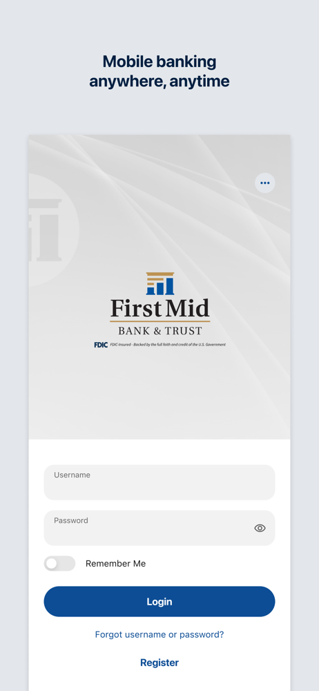
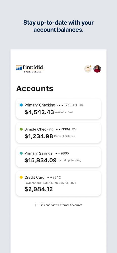
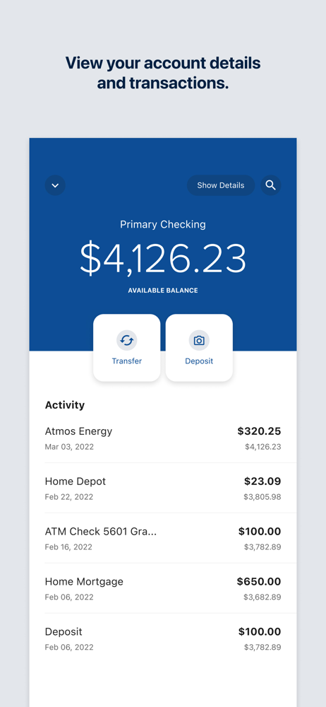
Read the store headline, screenshots and description. What problem is the app promising to solve?
Study the storefront ↗
First Mid Bank & Trust, N.A. · iOS
Explore the ad evidence, study the storefront, and build your next acquisition hypothesis.
01 / Creative research
Read the store headline, screenshots and description. What problem is the app promising to solve?
Study the storefront ↗Explore apps with direct store-link matches. Compare their hooks and formats without assuming the same approach works here.
Browse observed advertisers ↗Store rankings and revenue estimates describe market context. They do not establish ad spend, conversions or ROAS.
Review the market context ↗02 / Storefront & product
Study the product story and store experience behind the acquisition funnel.


03 / Market context
Keep revenue, downloads and store rankings separate from advertising performance.
Honesty i loved older version of the app and not this garbage they have now. I used to be that i could open up my bank account and immediately see the transactions i made within the last minute of a purchase so i could keep myself up to date on what i was buying what bills i paid, etc. Now my payments are all scattered everywhere. I have bill payments showing at the top i’ve made 2 weeks ago and payments i just made that don’t even show up at all. Like you legitimately have to wait days for the payment to even show up in your account and even then it doesn’t show it as taken out of your account balance. It just shows it as “pending.” I don’t like this. How am i supposed to know if someone steals my card info or something? They can make all these purchases and it wouldn’t show up for 2 to 3 days when before it would be instantly. Why did they downgrade? Please fix this because i’m sure nobody else likes this new setup either. It’s garbage.
The display and everything looks a lot better and is more polished but theres some annoying things about the update. Like everything has a transition when you press a button. Its just pretty annoying.
They just decided to force everyone into installing a much worse version of their app. There is no dark mode so when it’s late at night and you have to check your bank account your eyes will burn off. The UI is horrible and they don’t require face ID to login to the app anymore, so now whoever wants to open the app and view your balance can see it and is only prompted for face ID when they want to look at your transaction history. When you go into settings you used to be able to swipe out of it but now you literally have to go out of your way to press the back arrow. How convenient. This is 2025 by the way. The “tools” and “settings” buttons use the exact same icon which is just poor graphic design choice. Actually there are two separate buttons for going to your settings, but they both lead to the same thing. Oh but don’t worry, you can change the color of your account now! For no reason! It does nothing and no color actually changes anywhere. The deposit check page is actually pretty good. Thank goodness I wrote down my account and routing number somewhere because my routing number has just disappeared off my account page where it used to be because it should be that easy access for you. Please change this app and everything about it. Add dark mode please.
Enjoy secure and convenient banking on the go with the First Mid Bank Mobile app. Check balances, view account history, transfer funds, pay bills, dep...


