Check the acquisition promise
Read the store headline, screenshots and description. What problem is the app promising to solve?
Study the storefront ↗
DynaDev Software, Inc · iOS
Explore the ad evidence, study the storefront, and build your next acquisition hypothesis.
01 / Creative research
Read the store headline, screenshots and description. What problem is the app promising to solve?
Study the storefront ↗Explore apps with direct store-link matches. Compare their hooks and formats without assuming the same approach works here.
Browse observed advertisers ↗Store rankings and revenue estimates describe market context. They do not establish ad spend, conversions or ROAS.
Review the market context ↗02 / Storefront & product
Study the product story and store experience behind the acquisition funnel.


03 / Market context
Keep revenue, downloads and store rankings separate from advertising performance.
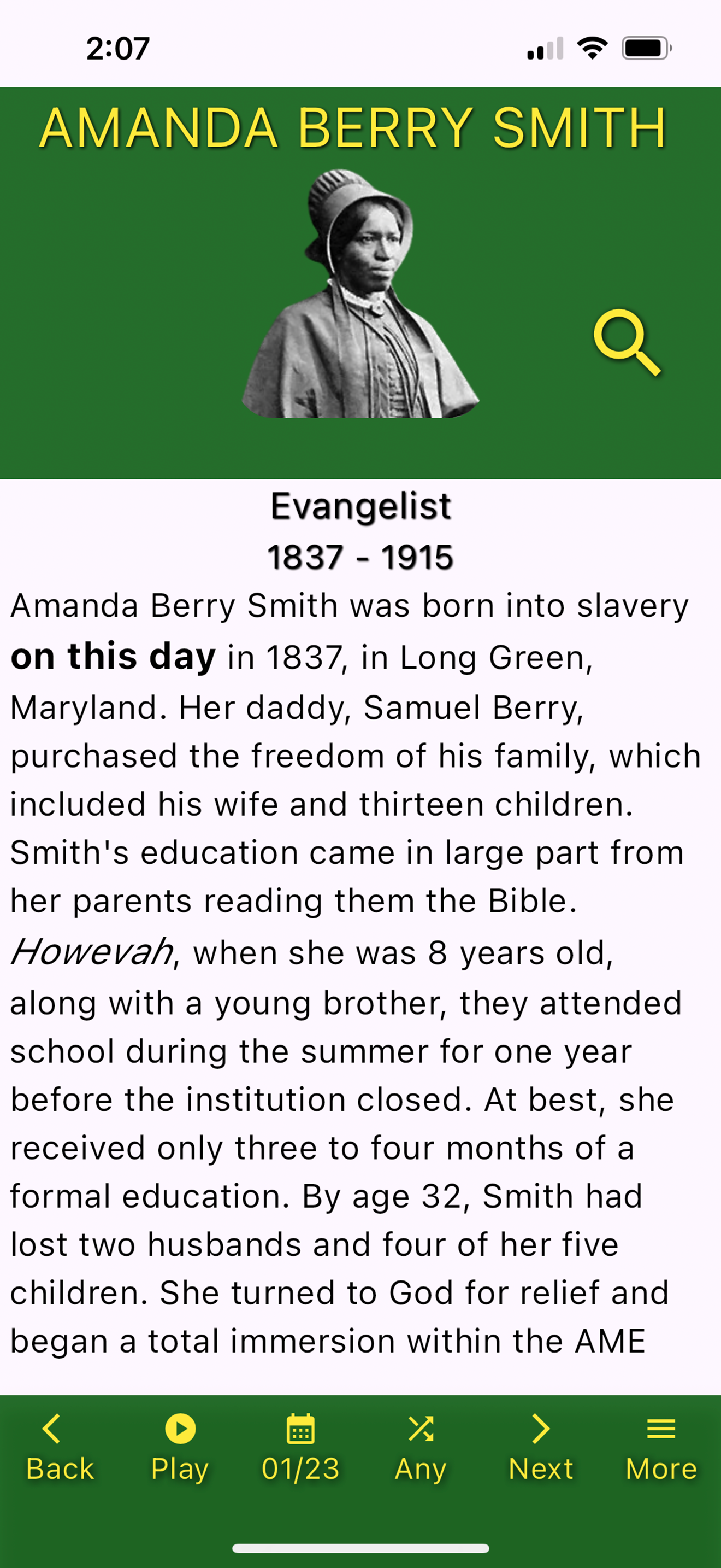
I love this app because of the unique readings that are being covered. I LOVE LEARNING!!! Sometimes it covers people (that I have never heard of!) and many times it covers events (I’m not aware of). For me, Carl Mack and his works are synonymous with Excellence, Wisdom, Knowledge and Education. (Excellent Vocal skills) I especially love the “play” option, as it allows me to listen as I multitask. I like that I’m able to listen to or read multiple segments. I highly recommend this awesome learning tool! Many times when I’ve listened to or read a segment, I’ve then done further research. THIS APP IS AN AMAZING GIFT!!! PLEASE WATCH AND SHARE!!!
I’m learning so many things that I wasn’t taught in school. I can’t wait to see what I will learn each day. This App should be on every Black person’s phone. Our history is the Truth and it is so rich and awesome!Love this App. Thank you, thank you to the creators!!
Love the concept! I’ve just spent a few mins with the app… and here’s my immediate feedback, and some things to consider: — The dark green doesn’t provide good contrast, reducing visibility for visually impaired people, or folks who have other accessibility needs that higher contrast would help. — the images should also be larger, providing a more ascetically pleasing visual. — Generally stay away from yellow type— especially on green background. Unfortunately black and white work best for most type applications. — use the same format for each entry. Example: On this day, (then add the date) March 20th in 1867… consistency makes for a better user experience. — provide a little margin around the text… it’s better visually, in design is called “white space” ironically… but it allows for easier reading and gives the eye an opportunity to rest. This space also allows for quicker recognition and enhances the reader to digest what they’ve read. — content is good 🥰 keep it going!! Great job!
Black Heritage Day app was developed by CodeBlack Academy in junction with Dr. Carl Mack, the former head of NAACP Seattle branch. Over the years, Dr....