
Check the acquisition promise
Read the store headline, screenshots and description. What problem is the app promising to solve?
Study the storefront ↗
Nicolet National Bank · iOS
Explore the ad evidence, study the storefront, and build your next acquisition hypothesis.
01 / Creative research
Read the store headline, screenshots and description. What problem is the app promising to solve?
Study the storefront ↗Explore apps with direct store-link matches. Compare their hooks and formats without assuming the same approach works here.
Browse observed advertisers ↗Store rankings and revenue estimates describe market context. They do not establish ad spend, conversions or ROAS.
Review the market context ↗02 / Storefront & product
Study the product story and store experience behind the acquisition funnel.




03 / Market context
Keep revenue, downloads and store rankings separate from advertising performance.
Whenever I open the app it tells me there’s an update. When I try to update it tells me the app isn’t available in my country and takes me to the App Store. I then have to manually search for it and open the app from there. Happy to amend my review when this is fixed. It’s been a problem for a year now.
App has taken basic info such as pending outbound payments, account features such as bill pay, statements etc into a wonderland adventure if possible to find this important info through multiple layers, hidden button locations, poorly labeled actions to make it almost impossible to find what your looking for. I call this change for change sake, because we can’t leave something that works along without screwing it up. Update: thank you for your kind words. I appreciate the effort you have taken to respond to my first post. My point is this, when you sit at your desk to redo the interface, you can’t design things without identifying the critical elements. Why may it so difficult on the landing page to select what function you’re looking for? Buttons can be designed to allow the user to quickly navigate to pending payments, account balances, the ability to pay bills without having to navigate 4 layers into the app for what should be a primary function, the same should be said for pending payments. There is no way on the site to see pending payments without selecting a payee which then makes this info 5-6 layers into the app, and you still can’t see all the pending payments you may have entered without another multi-layered search to find them. Again, I believe this is caused by a calendar driven need to change to feel if the site to keep it fresh. The problem with that approach is you’re always finding ways to make the simple complex instead of the other way round. I believe that the first question one should be asking in any redesign, are we making this easier to use or are we just doing this for something different? If it’s the latter, stop and think about how you want to make it simpler. Think about and incorporate these things into your basic engineering thoughts and simplify and make it easier for you CUSTOMERS to use. And then you’ll be golden.
Over weekend 3/1 to 3/2 the app was “unplugged” from me as a consumer. It was frustrating as I was unable to transfer from one acct to another to purchase a pair of shoes! I couldn’t do anything for about 3 days. I would have appreciated knowing how disconnected I would be for that weekend. Communication,and people online to help would have let me foresee how bad the change would be so I could plan accordingly. In this time we live in, we already have enough to worry about, BEK
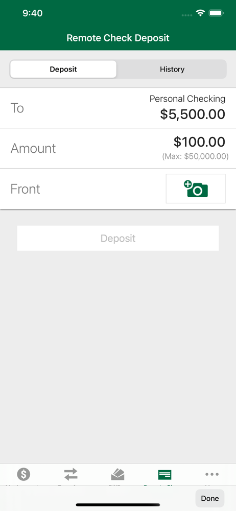
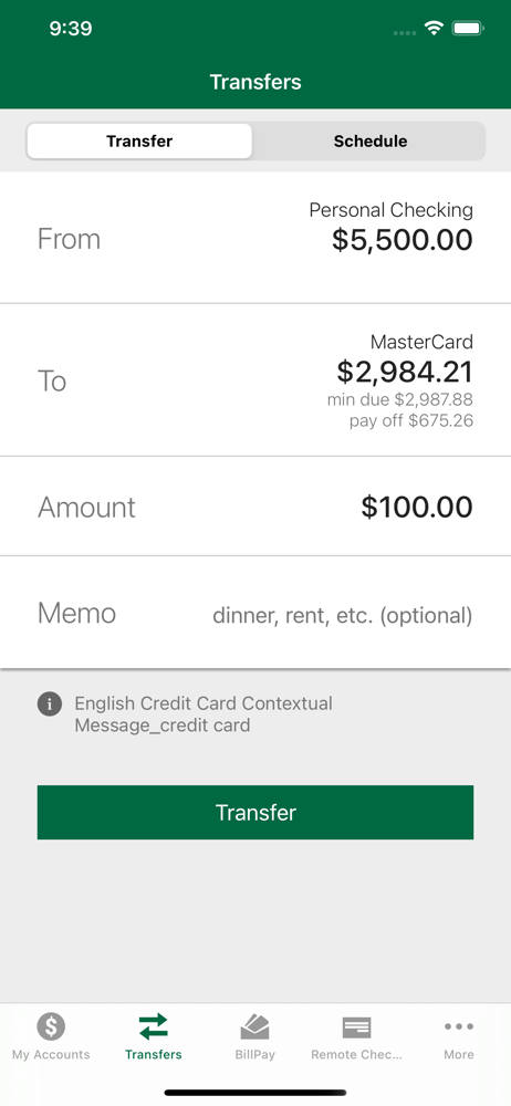
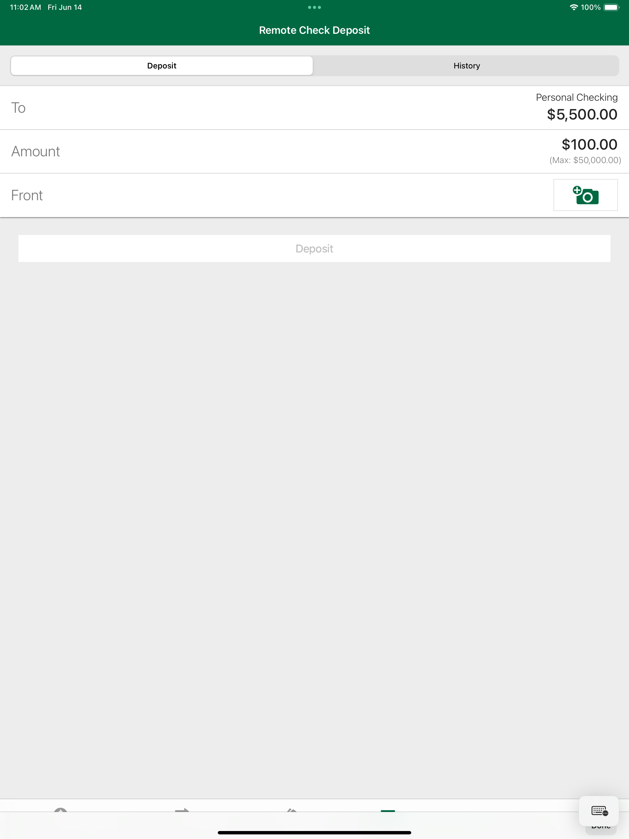
Nicolet Bank Digital is a free mobile banking app for Nicolet National Bank customers to provide secure 24/7 account access from your mobile device....


