
Check the acquisition promise
Read the store headline, screenshots and description. What problem is the app promising to solve?
Study the storefront ↗
Quip · iOS
Explore the ad evidence, study the storefront, and build your next acquisition hypothesis.
01 / Creative research
Read the store headline, screenshots and description. What problem is the app promising to solve?
Study the storefront ↗Explore apps with direct store-link matches. Compare their hooks and formats without assuming the same approach works here.
Browse observed advertisers ↗Store rankings and revenue estimates describe market context. They do not establish ad spend, conversions or ROAS.
Review the market context ↗02 / Storefront & product
Study the product story and store experience behind the acquisition funnel.




03 / Market context
Keep revenue, downloads and store rankings separate from advertising performance.
Quip started out as a word processor designed with mobile devices in mind, but over the years has not kept up with that original vision. Seems like Salesforce bought a great app from a promising team and is content to let it languish. It was a front runner in its category but has fallen well behind. The last year has seen almost no improvements, just constant “bug fixes” updates. Lots of small issues hamper the performance on mobile devices. For instance, on the iPad, the cursor is often hidden behind a split keyboard and I am forced to add a lot of extra line breaks to a document so that I can push the cursor above the keyboard and actually see what I am typing. The split keyboard on the iPad is also handled poorly. Even with the keyboard split, the space between the keys is still filled in with an opaque gray area, blocking out a large section of the screen. In addition, there are no options for what browser should be used to open links, which was probably okay in 2015, but most apps nowadays give options. I used to use this app a lot, but most of that has been shunted off to Bear or some other app that actually gets updated. All I have left in Quip are shared grocery lists and Christmas wish lists for the kids. Also, just a thought, but if Quip gave me an option to pay money and unlock the ability to change the color of the app icon, I would do it in a heartbeat. Or maybe even revert to the original icon. See the popular calculator app PCalc if you need an example of how it’s done.
Quip currently offers the best organization app for integrating excel, calendar, to-do list, with note taking application. It allows for visible organization that is separate from the desktop folders, stored on an iCloud, accessible from all Quip apps (MacBook, iPad, and iPhone). It's the perfect to-do list that syncs across all devices, the perfect note taker that can handle copious amounts of notes, and the best writer. The only room for improvement is the initial interface on opening the folders. Although it is recommended for collaboration, I use quip for personal purposes and it has been unclear how to best reach the folders in my Private folder without having to click multiple times to get there. There may be a shortcut I am not aware of, but if so, that would be a room for improving user interface.
How organization was looking for a tool for collaboration that would help simplify things. Will use Google drive and other tools, but to be frank, the mess and spiderweb of files has become overwhelming it is increasingly difficult to manage. We looked at Quip as a possible solution to help us to manage collaboration any more simple and streamlined way. Quit passes benefits and we continue to use Quip as a tool. It makes things a lot easier than working in Google and having to open multiple types of files and documents. You can use it on the web you can use a clients on your computer on Mac and you can use it on an iPhone or tablet. It’s very simple and straightforward. However, Quip does have a lot of quirks and limitations that you need to work around them through. Sharing files with people outside of your organization is not possible. Documents or files that you create within quip are absolutely not ready for sharing with people outside your organization because of issues like formatting. In general there’s a lot of opportunity to improve quip from the user experience standpoint and from a functionality perspective as well. The only question is how does quip achieve all of this without becoming big in burdensome such as Evernote.
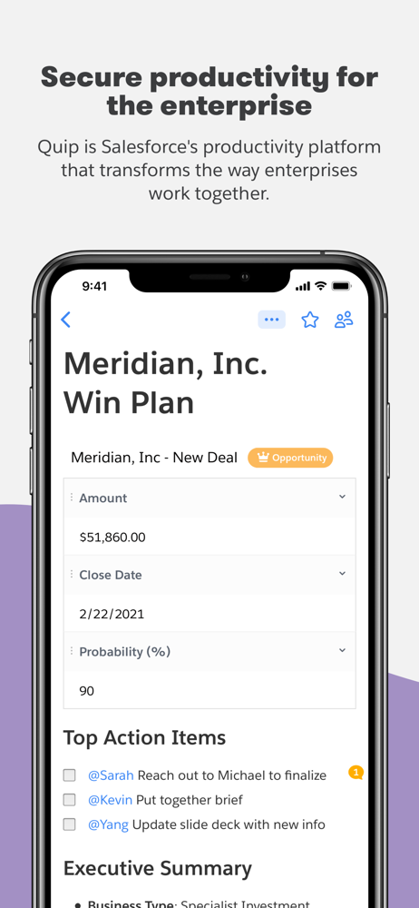
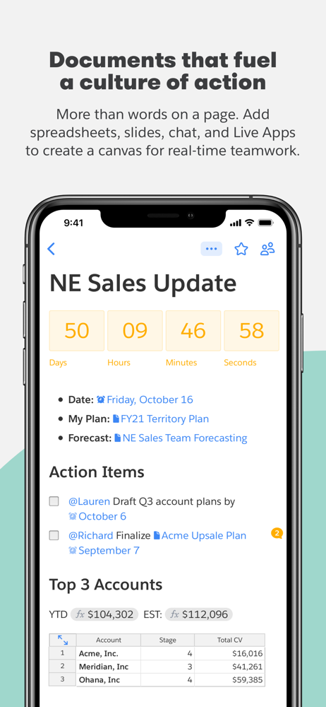
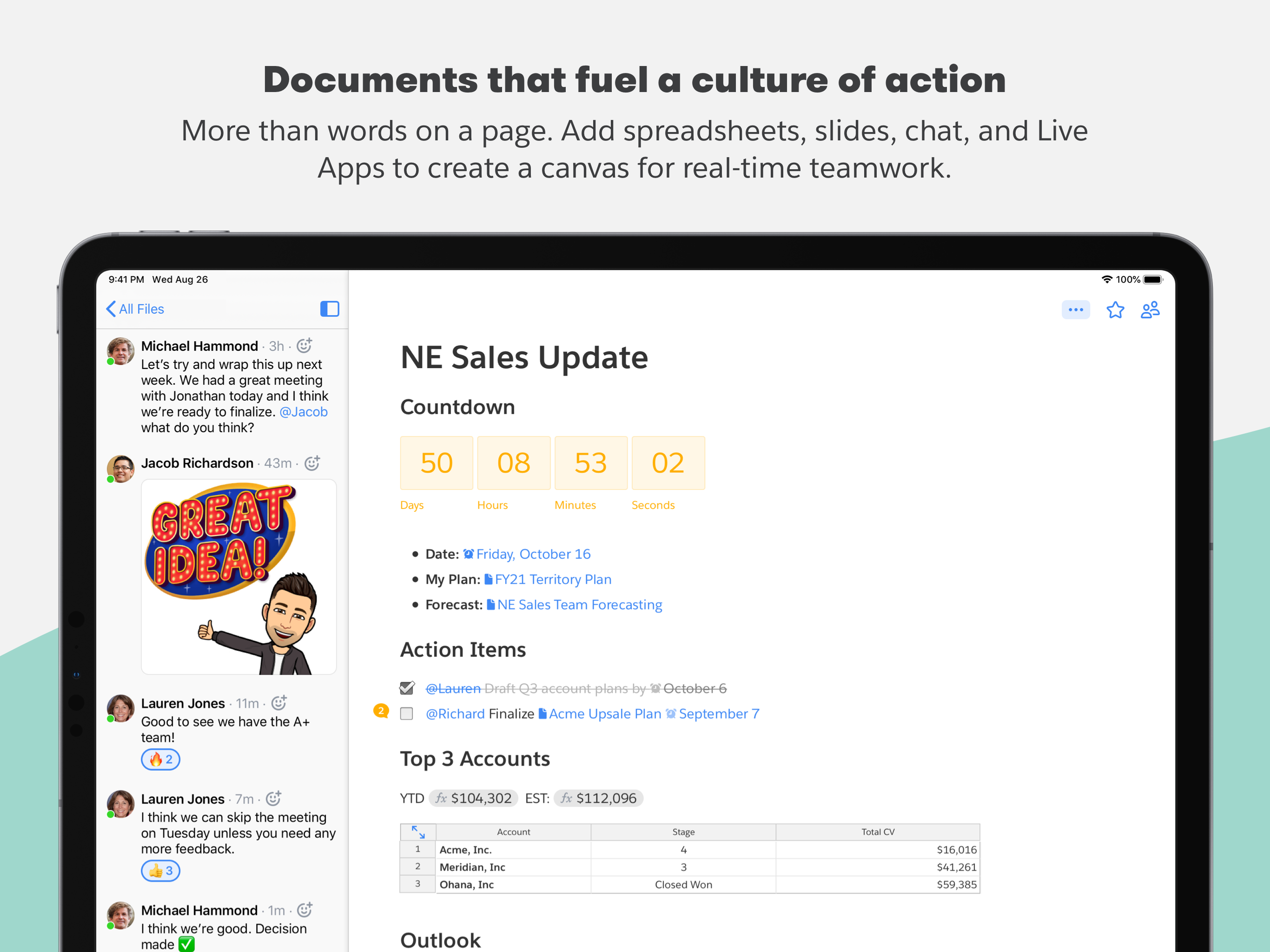
Quip is a place for teams to create living documents. It combines chat, docs, slides, and spreadsheets in one app — making collaboration fast and easy...


