Check the acquisition promise
Read the store headline, screenshots and description. What problem is the app promising to solve?
Study the storefront ↗
PSOFT · iOS
Explore the ad evidence, study the storefront, and build your next acquisition hypothesis.
01 / Creative research
Read the store headline, screenshots and description. What problem is the app promising to solve?
Study the storefront ↗Explore apps with direct store-link matches. Compare their hooks and formats without assuming the same approach works here.
Browse observed advertisers ↗Store rankings and revenue estimates describe market context. They do not establish ad spend, conversions or ROAS.
Review the market context ↗02 / Storefront & product
Study the product story and store experience behind the acquisition funnel.





03 / Market context
Keep revenue, downloads and store rankings separate from advertising performance.
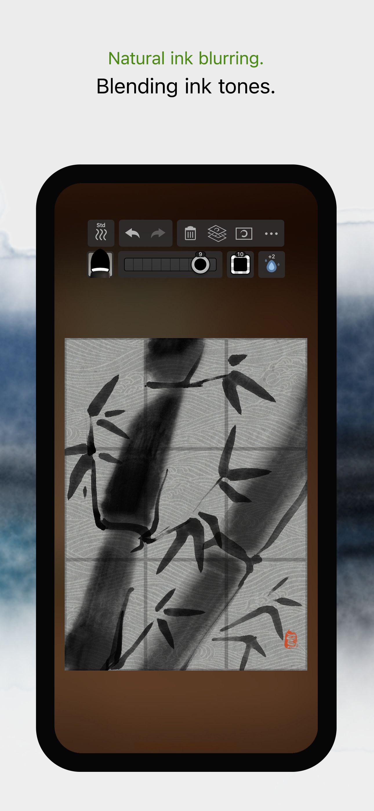
I’ve been using this app to practice writing kanji, and it had a lot of great features and the brush reacts very naturally. If I could add or change anything it would be instant erase. There is an animation that plays when you delete your drawing space that gets annoying and slows down practice. The delete key is also quite small and can be a difficult targets to hit. My workaround is to practice writing in water mode with fast drying, but adding a finger swipe to delete or a “black water” (disappearing ink) function would make it perfect to crank out hundreds of kanji. Also, the grid layer is nice, but even at the largest grid, to get a quadrant you need to zoom in. An extra large grid or paper background would be appreciated.
At first I was perplexed as to why the brushes were so much more ‘mushy’ in 3 than in 2, until I realized the default canvas resolution in 3 is much smaller than in 2! Increasing from 768x1024 to 2400x3200 fixes the problem of the dithering being too large and immediately highlights the improvements of the brush engine in 3 over 2. I imagine the reason the default is so low is for better battery life / FPS on lower spec iPads. The user should be prompted to pick a resolution on first launch to make it more obvious that there are multiple quality modes.
OK the papers on the right hand side with the Zen rotation I can and only the red brush gives you multiple colors if you hold onto it I guess or drag down from it and the eraser changes if you drag down to a bloody eraser which I don’t understand yet blatting not bloody whatever… And it looks like they erased my criticisms oh well from my previous review that’s OK what’s my one big issue… I try to do a circle and I get this lag or it goes into tilt mode or something and I get this weird straight lines on my curves and gestures that would be a dealbreaker for a real calligrapher artist! Once you buy the app it’s hard to tell how much you paid for unless you work and I’m lazy but I guess it must’ve been cheap enough if I bought it… Pretty good even if some of the 3-D backgrounds are pretty lame better to use a photo of your own of wood or something and this will be much better if you can get the texture going on with the paper and the dry brush is much better in the brush 2! Knouff said… said the Marvel comic guy…Stanley I just remembered… Stan Lee…
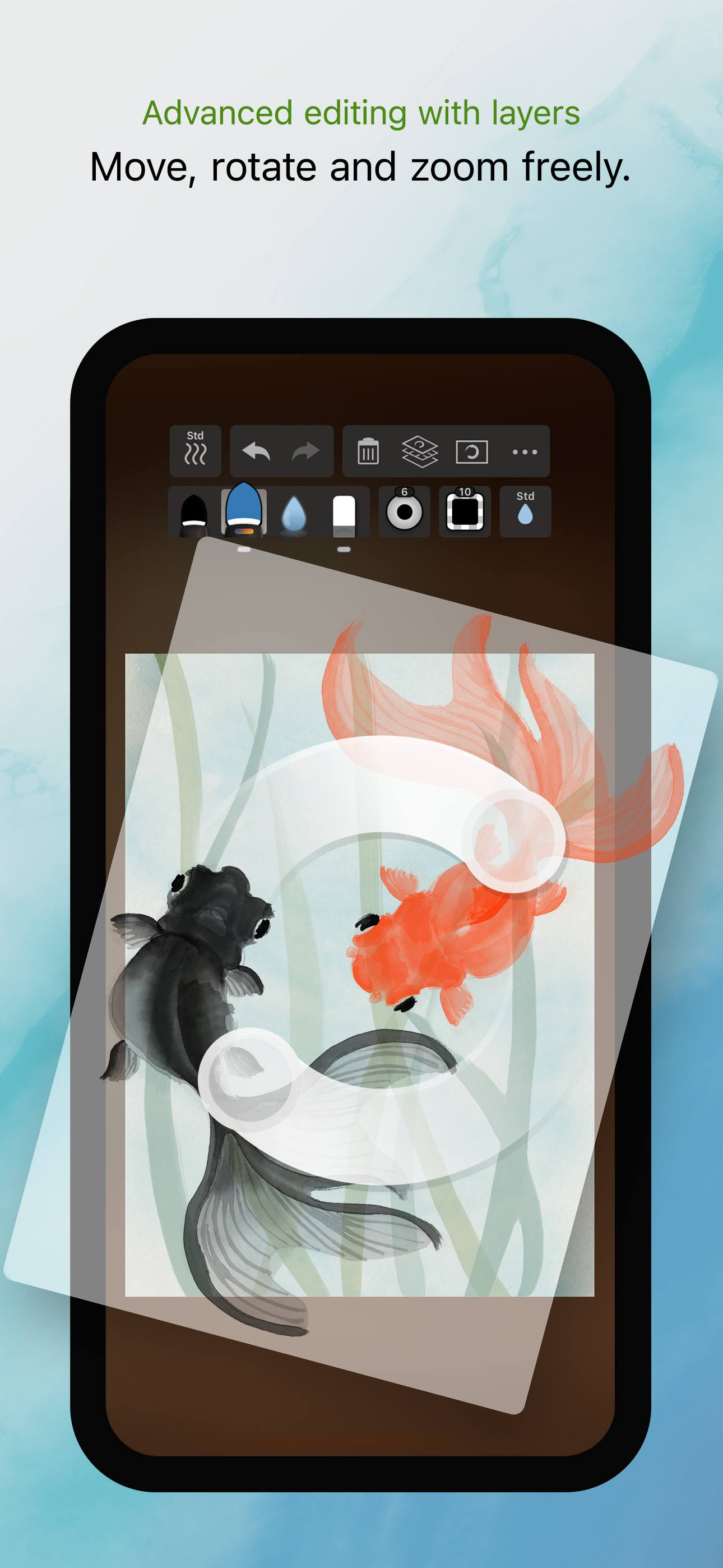
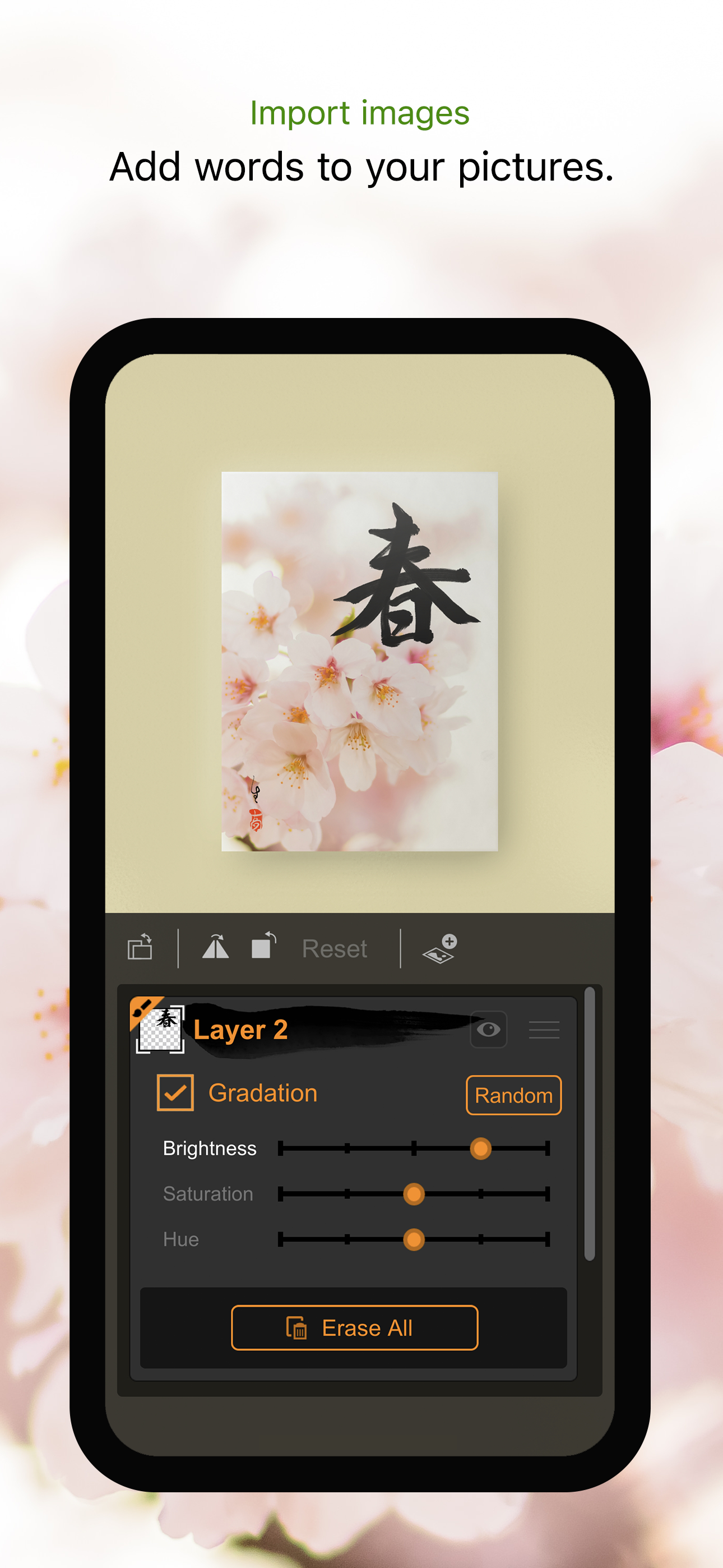
Zen Brush 3 is a drawing app focused on the strong yet beautiful feel of the East Asian ink brush which can be used to perform calligraphy, ink painti...