
Check the acquisition promise
Read the store headline, screenshots and description. What problem is the app promising to solve?
Study the storefront ↗
Sydney Srirak · iOS
Explore the ad evidence, study the storefront, and build your next acquisition hypothesis.
01 / Creative research
Read the store headline, screenshots and description. What problem is the app promising to solve?
Study the storefront ↗Explore apps with direct store-link matches. Compare their hooks and formats without assuming the same approach works here.
Browse observed advertisers ↗Store rankings and revenue estimates describe market context. They do not establish ad spend, conversions or ROAS.
Review the market context ↗02 / Storefront & product
Study the product story and store experience behind the acquisition funnel.

03 / Market context
Keep revenue, downloads and store rankings separate from advertising performance.
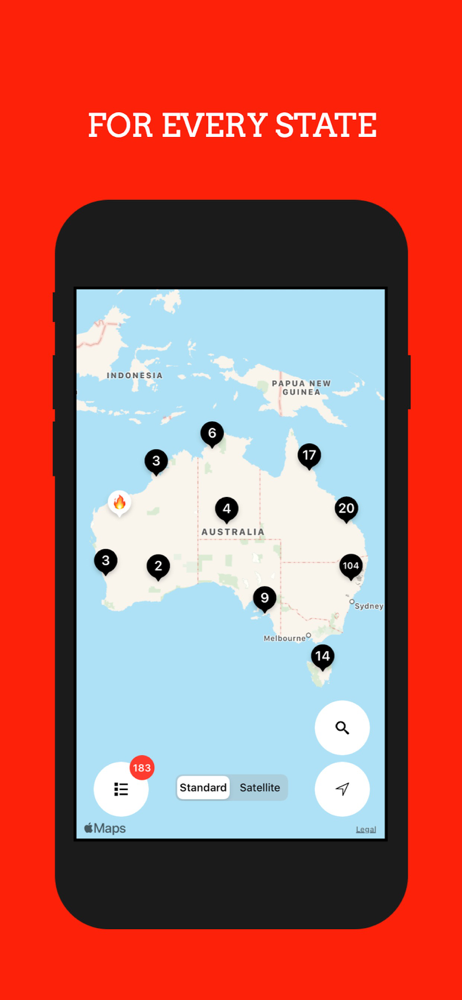
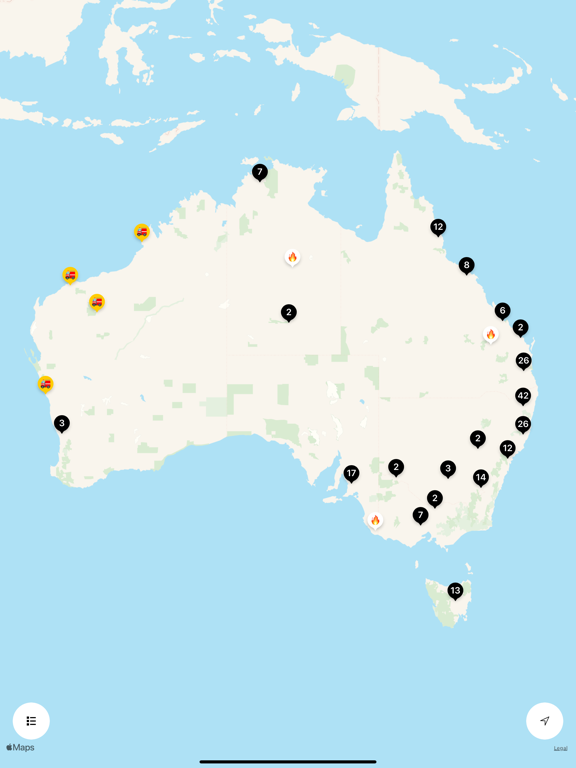
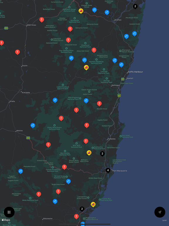
The idea of having a single app for the whole country is good. Seems to be inconsistent between how it depicts fires between the states. NSW seems right. Victoria shows a fire covering almost the whole state which stops dead on the NSW border, which is useless when you’re trying to work out if a particular town is currently or imminently at risk. It looks like all you have to do is step across the border to NSW to be safe. Maybe in Victoria they show poor air quality but in NSW they show the fire’s border? I have no idea because the Map Legend doesn’t work. Without a good legend saying what the grey patches mean it’s kind of pointless. And what’s with the massive triangle of grey starting in NSW and stretching out infinitely across the country? I’m thinking maybe this app just can’t cope with the current fire crisis, maybe a case of TMI?
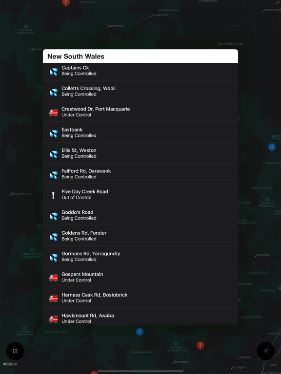
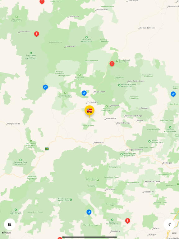
There is the basis of a good app here. I do like being able to move from State to State without using separate maps. However I’d like a legend of what all the symbols indicate. I am working many out bit by bit. Perhaps there is already a legend. If so, I haven’t found it yet. Would like a clear visual indication of area affected too as VicFires has. Would also rather a dropdown with info at the spot on the map, rather than be taken to a new screen. Again VicFires does this well.
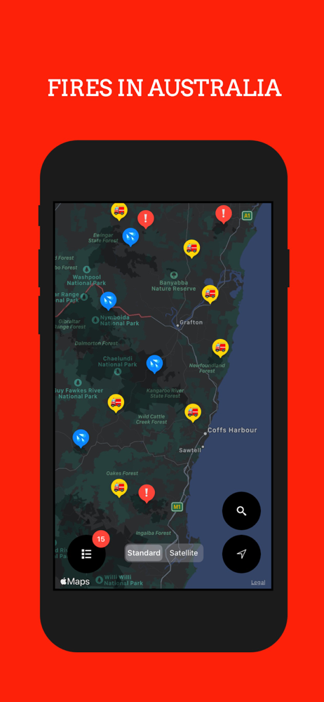
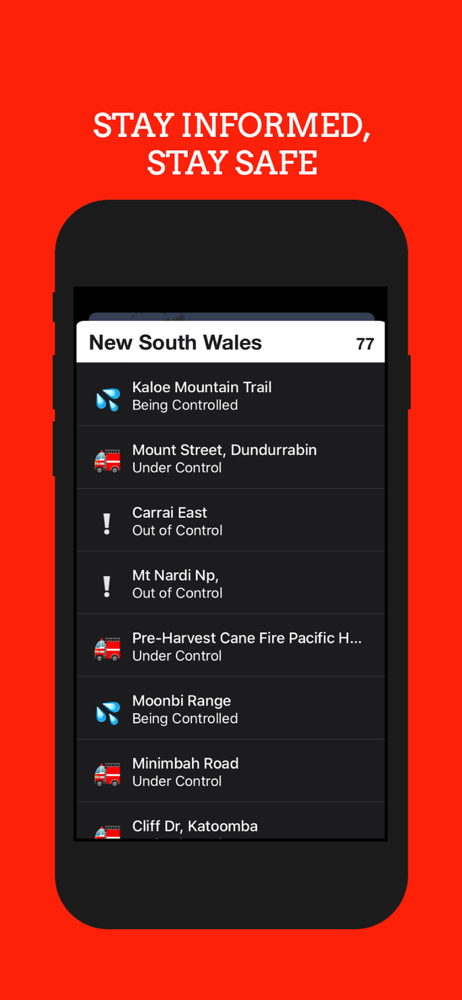
Australian Fires allows you to stay informed in a simple and quick manner. The use of different emojis to indicate the status of a fire is creative, visually pleasing and provides a high level summary of what is going on and where, without having to drill down into too much detail. The addition of the search function now makes it much easier to search for a location, which is super helpful especially when you don’t know where a particular place may be. Good job!
Australian Fires provides information about fire incidents throughout the country. Aggregating data from the RFS, CFA, FES and other various Fire and...


