Check the acquisition promise
Read the store headline, screenshots and description. What problem is the app promising to solve?
Study the storefront ↗
WoW Design Solutions Ltd · iOS
Explore the ad evidence, study the storefront, and build your next acquisition hypothesis.
01 / Creative research
Read the store headline, screenshots and description. What problem is the app promising to solve?
Study the storefront ↗Explore apps with direct store-link matches. Compare their hooks and formats without assuming the same approach works here.
Browse observed advertisers ↗Store rankings and revenue estimates describe market context. They do not establish ad spend, conversions or ROAS.
Review the market context ↗02 / Storefront & product
Study the product story and store experience behind the acquisition funnel.

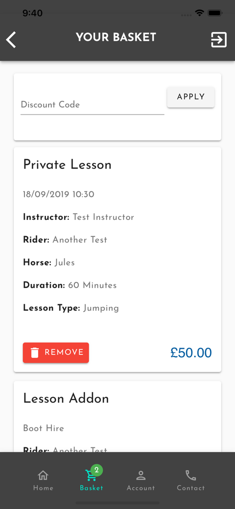
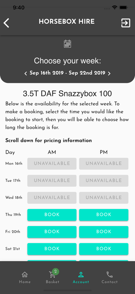

03 / Market context
Keep revenue, downloads and store rankings separate from advertising performance.
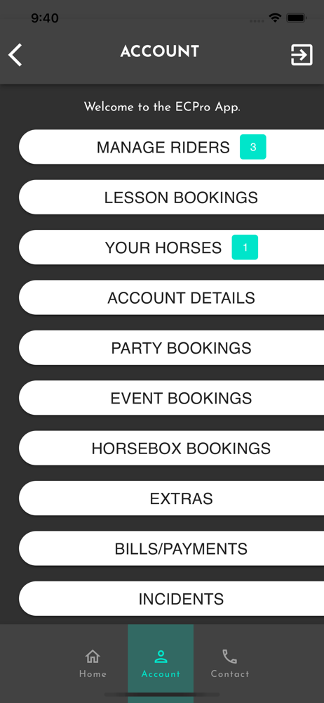
Twice we have booked lessons this month and received a confirmation email only to turn up at the yard to find no lesson had been booked. The lessons had been cancelled 4 days after booking but we were not sent an email to tell us. The yard said there is never any availability at the time I booked so why was this showing as available on the app. I have now delved into the hidden recesses of the app to find there is a notification page where there was a message re the cancellation. There is no icon on the home page to tell you when there are notifications waiting for you Why send emails for some cancellations and not others Generally this is a poor app and has wasted a great deal of our time I wish it had never been invented
Great idea, OK App, but still feels like it needs a lot of user centred design work on it. It’s not very user friendly - it randomly logs me out,I don’t get notifications that it needs to be updated via the App Store until I go to use it, it’s not intuitive to use, the navigation is poor, each time I use it, it’s trial and error to find some things, even things I use fairly regularly. It does the job, but it’s not a good user experience.
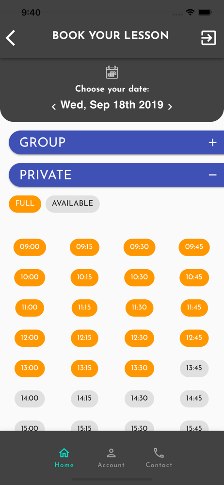
Nice idea and makes the riding school booking experience a bit easier on busy yards. However I’m a heavy user and there are SO many simple improvements I would make with the structure and navigation. Simple things like your lesson bookings saved in date (and person!) order, instead of randomly. Or that when you click into an available ‘grey’ space and it isn’t what you want or need, that you aren’t taken right back to the original full calendar and not to that same date page. I’d be happy to provide more feedback or even be part of UX research if they wanted. I did provide some of this by email and see there was an app update but sadly simple elements are still overlooked here.
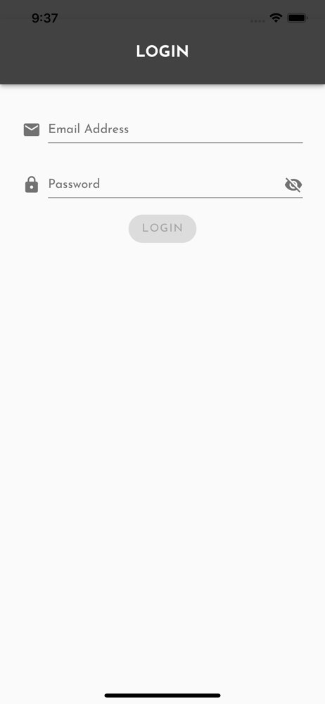
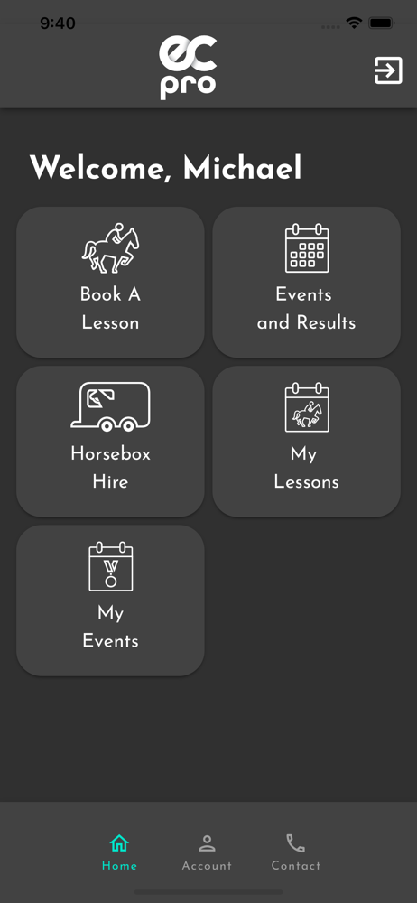
EC Pro is used by equestrian centres to manage their lessons, as well as their customers for bookings. Features: Lesson, event & horsebox booking Ho...