
Check the acquisition promise
Read the store headline, screenshots and description. What problem is the app promising to solve?
Study the storefront ↗
Rationale Design LLC · iOS
Explore the ad evidence, study the storefront, and build your next acquisition hypothesis.
01 / Creative research
Read the store headline, screenshots and description. What problem is the app promising to solve?
Study the storefront ↗Explore apps with direct store-link matches. Compare their hooks and formats without assuming the same approach works here.
Browse observed advertisers ↗Store rankings and revenue estimates describe market context. They do not establish ad spend, conversions or ROAS.
Review the market context ↗02 / Storefront & product
Study the product story and store experience behind the acquisition funnel.

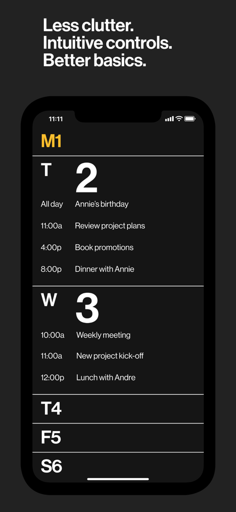


03 / Market context
Keep revenue, downloads and store rankings separate from advertising performance.
I've been a fantastical user for years until they updated it into ridiculous pricing. I've been looking for a good calendar that doesn't make me work for it visually and this is the best one out there. If you prefer to spend less time staring at a screen this is a good route to go. The design gives you what you need to know and not a ton of superfluous info. Looking forward to seeing how it evolves and keeps it simple.
I really appreciate the simplicity, but maybe this calendar’s just not for me. I’m going to try it out a bit longer to see if I adapt, but I really miss a couple things from iCal: a simple notifier in the monthly view for days with events, and easily differentiating between calendars through color coding. A great feature would be to select which calendar options show up by default when creating an event (like selecting the calendar, rather than tapping “more” to get to it. I also liked having the date as the app icon for iCal, as it’s both simple and functional.
Easily the best - aesthetically, functionally - calendar I’ve ever used or come across. Strips away so much of the UI bulls*#t you’ll almost always find, leaving you with only and exactly that which is needed. Navigation from year —> month —> day is easy and intuitive, and the syncing with any other calendars is well-worked out, with nearly instantaneous updating. I haven’t spotted a dropped event yet (which is more than I can say for Google’s own calendar app ... pulling from a Google calendar). Easy to parse a long week’s schedule, easy to add to it. It’s pretty fab.
We wanted a focused, beautiful, and clear calendar experience. Something less that can be more inspiring to use daily. Meet Minimal Calendar. With i...


