Check the acquisition promise
Read the store headline, screenshots and description. What problem is the app promising to solve?
Study the storefront ↗
The Pennsylvania State University · iOS
Explore the ad evidence, study the storefront, and build your next acquisition hypothesis.
01 / Creative research
Read the store headline, screenshots and description. What problem is the app promising to solve?
Study the storefront ↗Explore apps with direct store-link matches. Compare their hooks and formats without assuming the same approach works here.
Browse observed advertisers ↗Store rankings and revenue estimates describe market context. They do not establish ad spend, conversions or ROAS.
Review the market context ↗02 / Storefront & product
Study the product story and store experience behind the acquisition funnel.




03 / Market context
Keep revenue, downloads and store rankings separate from advertising performance.
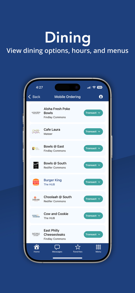
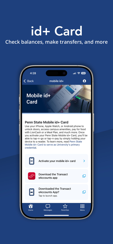
I’ve been using Penn State Go for a while now and it’s been super handy. All the stuff I actually need day to day (Canvas, email, LionPATH, Starfish, dining menus, shuttle info, mobile ordering, etc.) is in one place so I’m not constantly digging around different sites or apps. It makes checking to-do’s and class announcements way easier. Honestly, it’s just nice having everything Penn State related in one app. Definitely makes life as a student here simpler.
When first opening the app, you are greeted with a page full of options that you may need. Many very helpful in your day to day life. But as soon as you click one, the problems start to arise. To start, the messages feature rarely works as it should. The app also has you log in often, but won’t let you auto fill and will sometimes just not log in. The biggest pet peeve is how none of the icons lead you to that section like you would expect. Most of them open a page of safari in the app. The app renders itself pointless due to how you can do everything faster by a google search. The app needs an extreme amount of bug fixes before it is usable.
While I am glad this app finally exists, and appreciate all the functionality it contains, it could use some design tweaks. From the main screen you get a 4x5 grid of icons. While I would have done it differently, there’s nothing wrong with that. However, the quick access menu at the bottom is grossly underutilized. It contains the least important items, when it should contain the most frequently used items. Moving into the LionPATH navigator, the first issue I see is that all the categories are expanded by default. There should be an expandable option for each item (I.e. My Schedules, My Finances, etc..) rather than showing it all to the user immediately. Continuing, when a user makes any selection, the page goes white with “updating” at the bottom for a few seconds. The main concern here is the blank screen which refreshes once updated. It is fine, but the user experience would be more fluid if the “updating” was an overlaying text box on the previous scene rather than dedicating an entire window to “updating”. Update in the background, and then take the user to the new scene. Never take the user to a blank screen. The “dining” tab takes you to the website menu for each dining hall. For mobile users, the menu could be optimized. I actually took ist 311 with a group who dedicated their project to redesigning the menu for mobile use, and I expect they would have contacted Food Services. Otherwise, the app looks great. Visually appealing, functional in all the ways I could find. I couldn’t identify any “bugs” as of yet.
Penn State Go is the official mobile app of Penn State. The app connects you with the tools, services, and updates that matter most. With a personali...