Check the acquisition promise
Read the store headline, screenshots and description. What problem is the app promising to solve?
Study the storefront ↗
Victron Energy · iOS
Explore the ad evidence, study the storefront, and build your next acquisition hypothesis.
01 / Creative research
Read the store headline, screenshots and description. What problem is the app promising to solve?
Study the storefront ↗Explore apps with direct store-link matches. Compare their hooks and formats without assuming the same approach works here.
Browse observed advertisers ↗Store rankings and revenue estimates describe market context. They do not establish ad spend, conversions or ROAS.
Review the market context ↗02 / Storefront & product
Study the product story and store experience behind the acquisition funnel.


03 / Market context
Keep revenue, downloads and store rankings separate from advertising performance.
I’ve been using the VRM app on an Apple phone for about two years now. We’re very happy with it. We can see all necessary information, and when necessary were able to fire up the generator and charge the batteries so that they are maintained and avoid freezing. We once notice constant draw on the system. This was when the cottage was winterized, and there should have been very little electrical draw. Because of this we researched and learned that the septic pump was constantly running do a freeze up in some pipes. so ultimately, the VRM helped us troubleshoot a problem we did not know existed.
Just downloaded and checking it out. I have noticed an issue that the remote console graphics are pushed off the bottom of my iPhone 11 screen (iOS 15.6.1), with no way to slide them up into view. This makes most of the console screen unusable. This also happens on the same phone when using the web-based version of VRM in Safari, though not to such a degree. There is plenty of screen real estate if the graphics are scaled properly, like when using the console on my local network. I have no issues then. Any idea how to fix this?
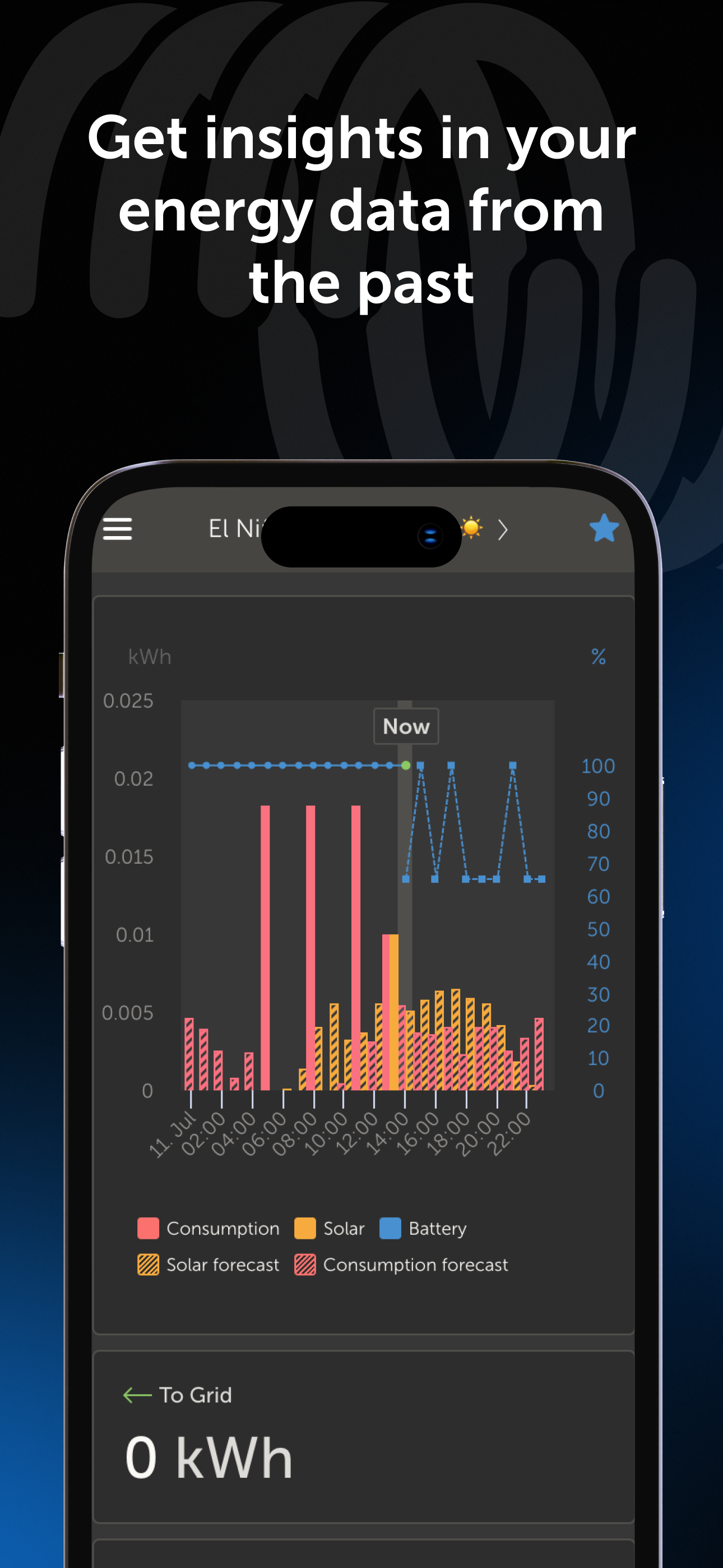
Love the service and the data available! As an installer this is my favorite platform for remote monitoring. Using my mobile phone is more cumbersome than necessary both in a web browser and in the app. Specifically, the Advanced page could be more friendly. First, I like that a tap or a hold shows a data point on all visible graphs simultaneously, but can they be more “persistent”? As soon as I scroll up or down to see other graphs, the data point disappears, and it would be helpful if it stayed. Obviously the screen is too small to tap on exactly the time point I’m interested in, so usually I slide to get where I want to be, or even to see exact numbers change over time. There are two problems with this. First, the data box is always placed at the same point on the screen where my finger is, making it impossible to read the data. Second, sliding side to side moves the entire graph back and forth, rather than just the data selection. Great work overall, and I love that there are always advancements. Thank you!
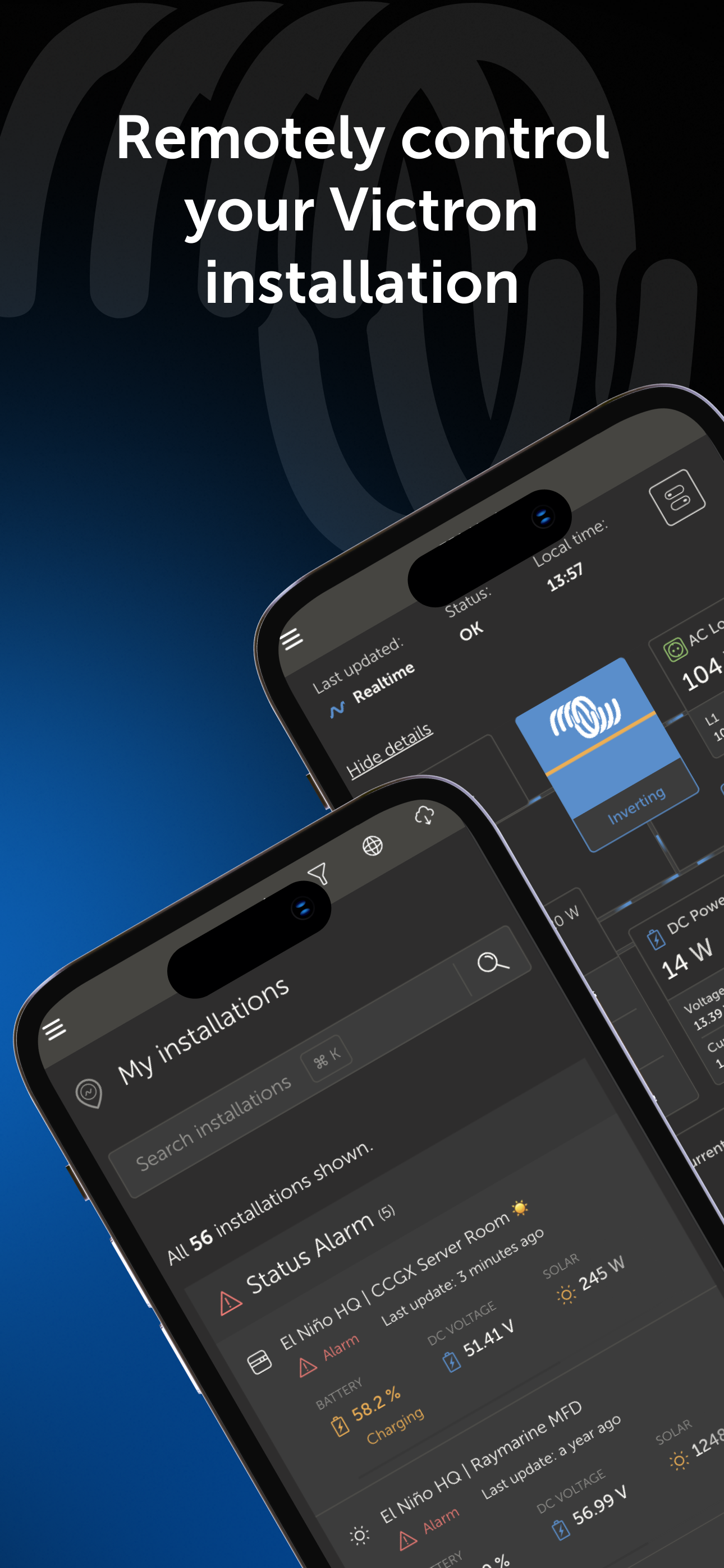
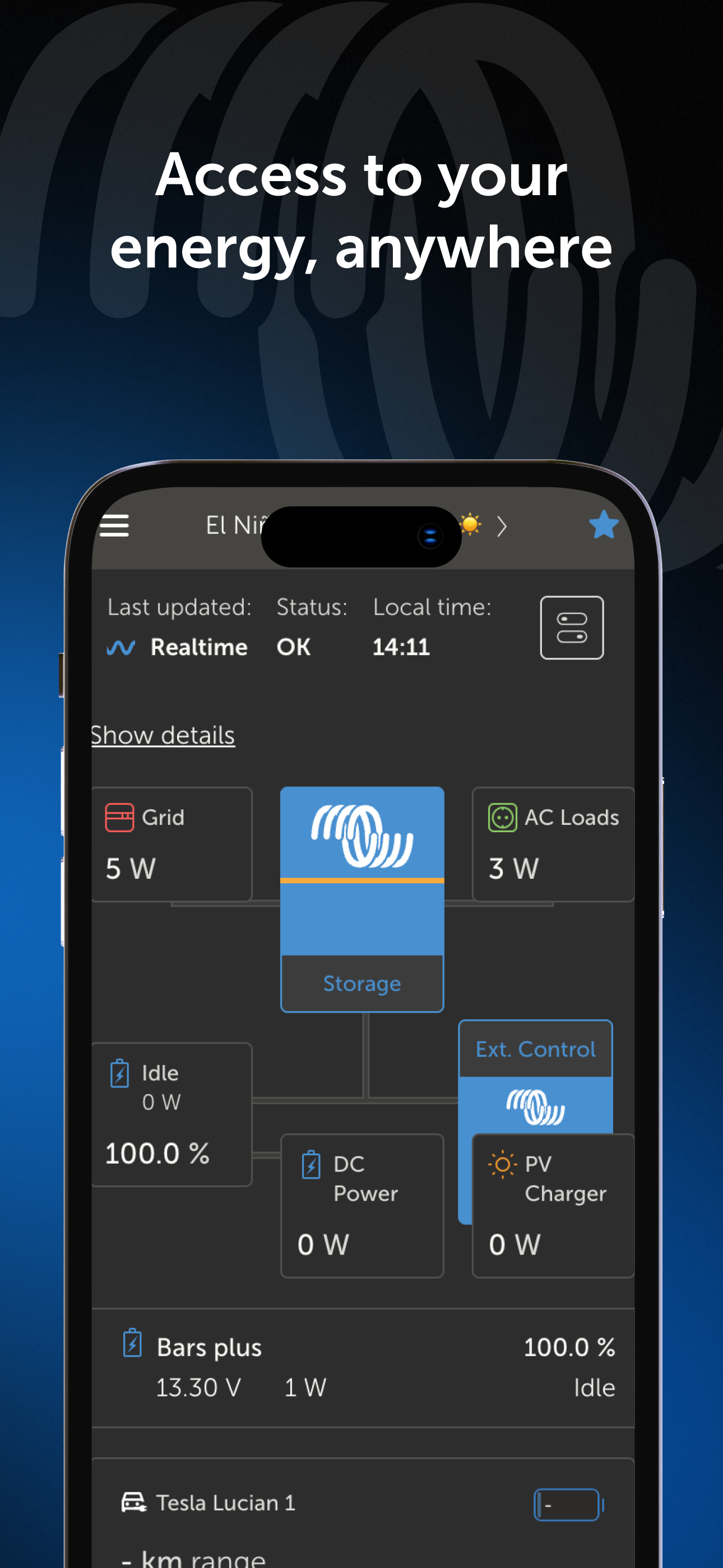
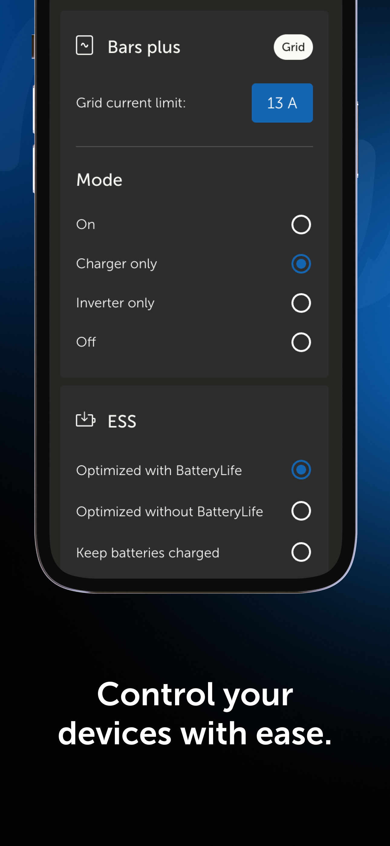
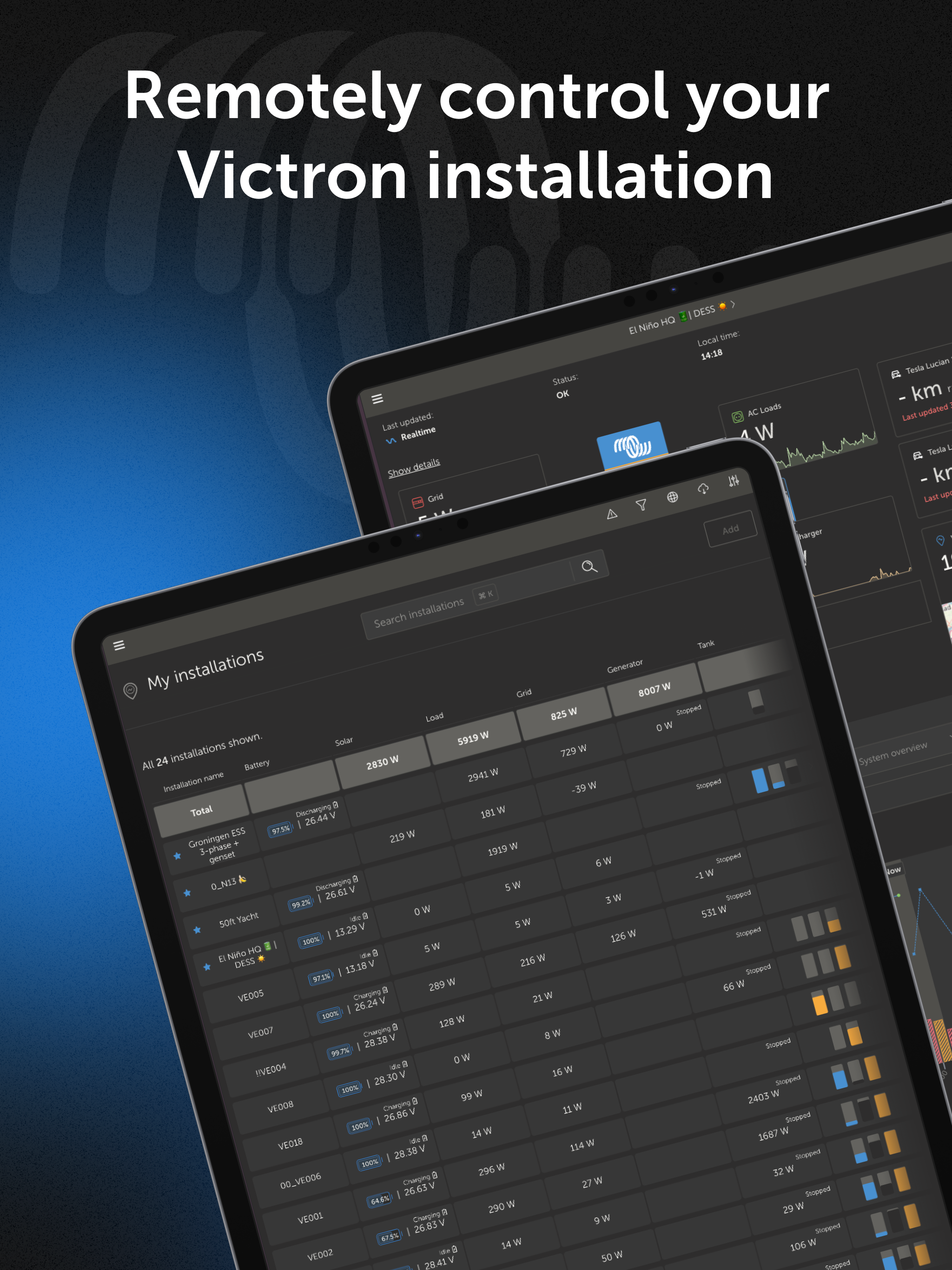
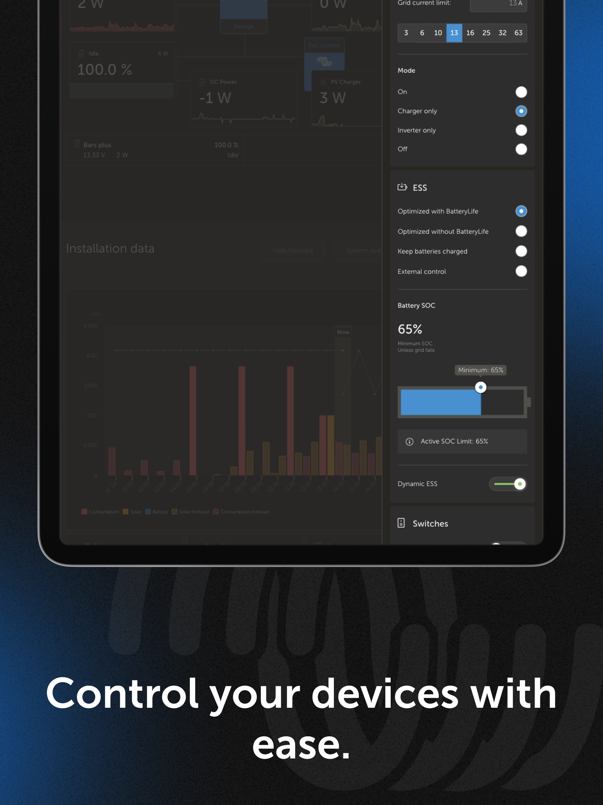
Stay in control of your energy system anytime, anywhere with the Victron VRM app! Remotely monitor your solar, battery, and power usage in real time,...