
Check the acquisition promise
Read the store headline, screenshots and description. What problem is the app promising to solve?
Study the storefront ↗
GolfN, Inc. · iOS
Explore the ad evidence, study the storefront, and build your next acquisition hypothesis.
01 / Creative research
Read the store headline, screenshots and description. What problem is the app promising to solve?
Study the storefront ↗Explore apps with direct store-link matches. Compare their hooks and formats without assuming the same approach works here.
Browse observed advertisers ↗Store rankings and revenue estimates describe market context. They do not establish ad spend, conversions or ROAS.
Review the market context ↗02 / Storefront & product
Study the product story and store experience behind the acquisition funnel.




03 / Market context
Keep revenue, downloads and store rankings separate from advertising performance.
Just a warning to everyone, the daily spin is the most bs thing ever i literally 30 seconds ago had it slow down to the speed that it stops at, and it kept going until it got to the 40 tickets option. I’ve had it where it has almost stopped on memorabilia or a club multiple times but as soon as it should it’ll go to the tickets or point pass. Honestly one of the biggest scams ever. And the cheapest membership is like $15. I’m switching to 18 birdies, they’ll give me less cortisol spikes than this bs. And you have to play at least 10-15 rounds of golf a week for multiple weeks if you wanna get enough points to order a club.
As a mobile app developer I can say without a doubt the UI/UX is clunky. Key actions blend in with normal visuals and are not as prominent as they should be, such as changing courses, the action button blends in with just a 2px border around it, it doesn’t stand out. It’s not as intuitive as it should be, it’s geared way more towards selling memberships than utilizing benefits of shot tracking to which it is lacking, great you can enter a score, but what’s clubs and distances. GPS is free because they want you to buy memberships, people may be more inclined to if the UI was More intuitive and functional. Daily spins are a joke, the randomization is keyed into points passes and tickets, several videos showing different speeds and how the randomized will stop one before and then jump to a ticket or points passes, or will go consistently without stoping to one or the other. Maybe another tactic to get users to buy memberships and placebo effect of “maybe I have better chances with a membership”. This app needs a new designer or development team lead that understands user interactions and how to make a clear action item stand out. Even just adding a white background with some opacity to make certain action buttons standout would be a huge improvement. I will say this fails the UI/UX standard guidelines produced by Apple in their development guides.
So I want to start by saying the app and concept are awesome. I’ve had a great time using it and it’s been really cool to compare the data to my Garmin. Overall, I have really enjoyed using it. My only gripe is the spin system. While I 100% realize it is RNG and likely not predetermined in any major way other than potentially favoring memberships. However, I’ve had quite a few instances where the spinner seems to fast stop on tickets one day, and then sloooooow roll from a diamond membership to tickets today. As in this literally just happened. It’s not so much that I am upset by the outcome, it’s random. But more the manner with which the spinner itself seemingly favors landing on tickets and clearly a difference in the speed it was spinning when it landed. Maybe this is by design to surprise you when it fast stops or slow stops on a cool item. Either way, still a dope app all around.
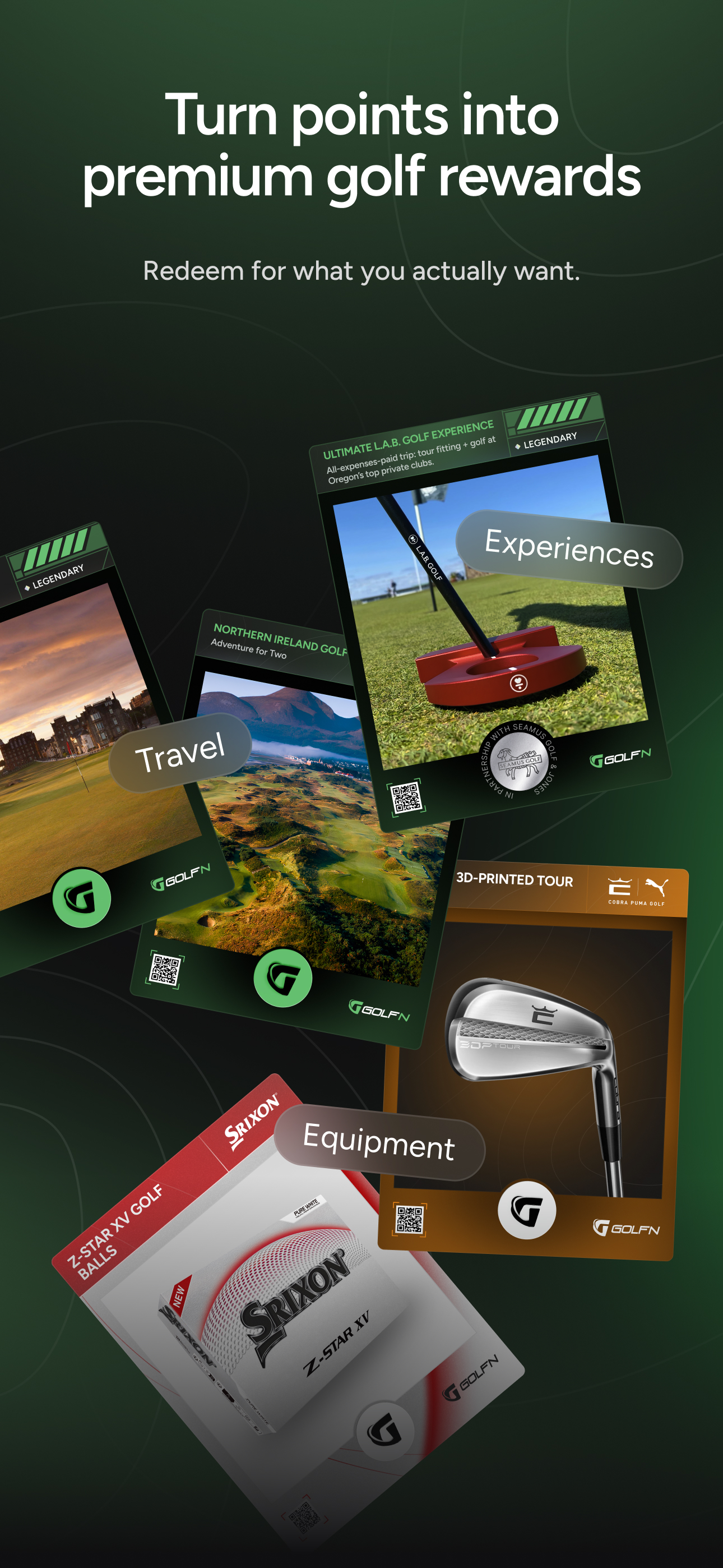
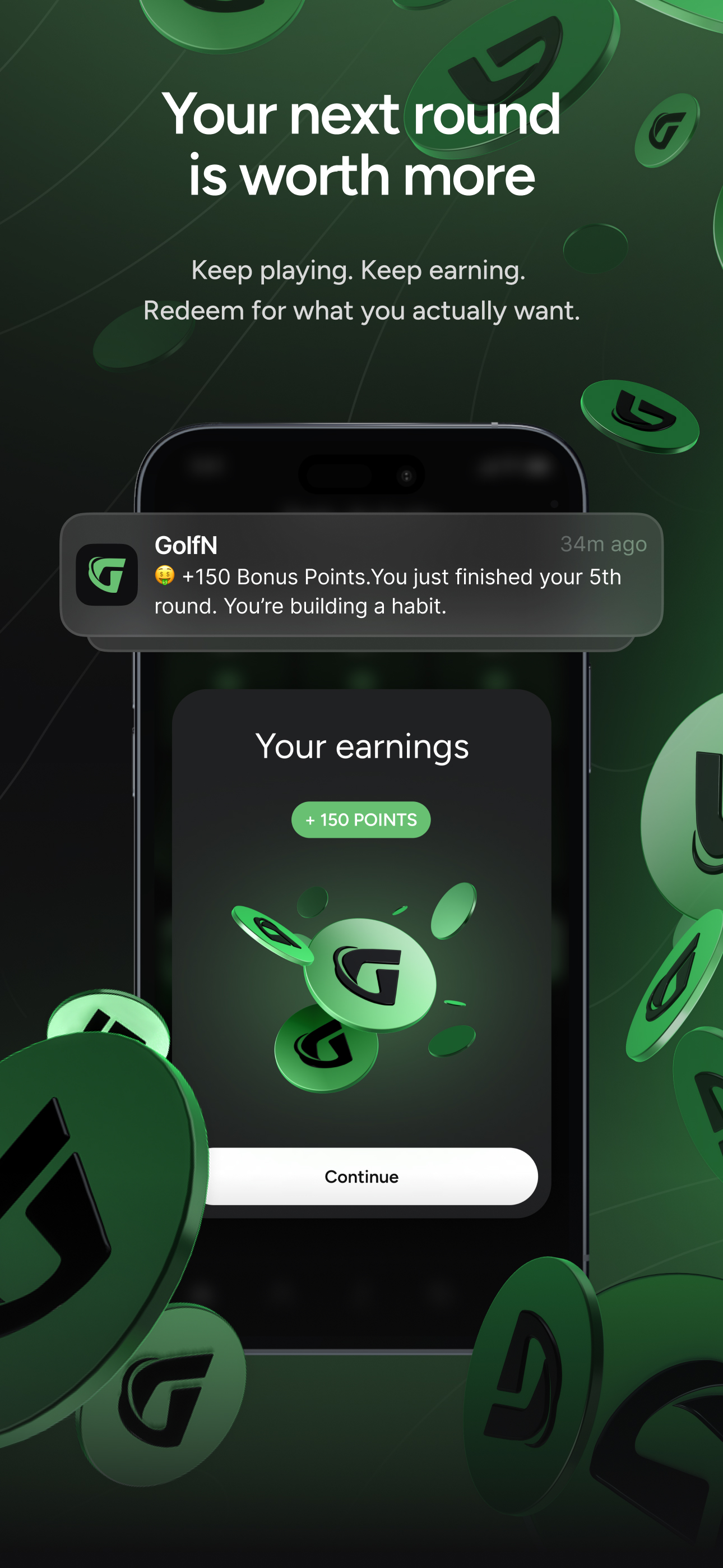
GolfN turns every round of golf into real rewards. Play your game, earn points, and redeem them for premium equipment, travel, and unforgettable exper...


