Check the acquisition promise
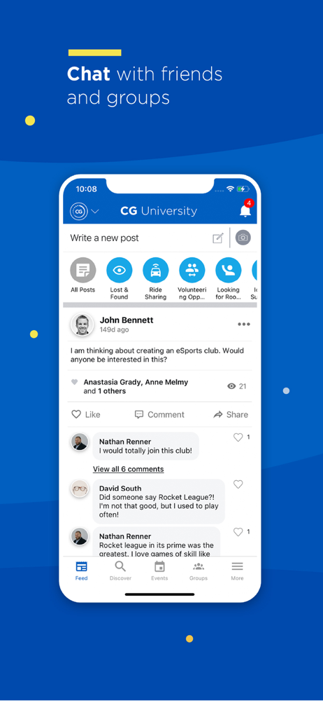
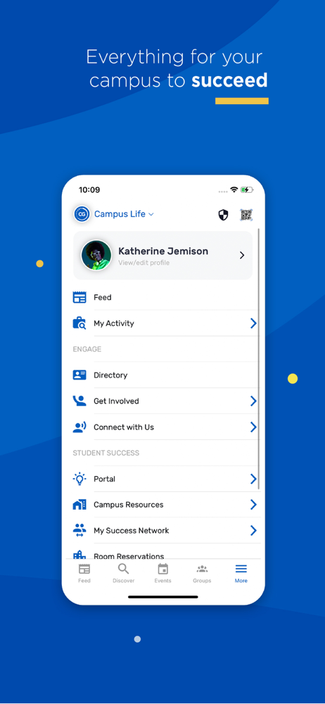
Read the store headline, screenshots and description. What problem is the app promising to solve?
Study the storefront ↗
Novalsys, Inc · iOS
Explore the ad evidence, study the storefront, and build your next acquisition hypothesis.
01 / Creative research
Read the store headline, screenshots and description. What problem is the app promising to solve?
Study the storefront ↗Explore apps with direct store-link matches. Compare their hooks and formats without assuming the same approach works here.
Browse observed advertisers ↗Store rankings and revenue estimates describe market context. They do not establish ad spend, conversions or ROAS.
Review the market context ↗02 / Storefront & product
Study the product story and store experience behind the acquisition funnel.



03 / Market context
Keep revenue, downloads and store rankings separate from advertising performance.
Would have gave it a one star, but it is a good app to see all campus events in one place. However, after a few scrolls going through revenge app gets all glitchy and then as soon as it goes back to normal and a few scrolls, it does the same thing all over again. it makes it hard to actually look at events because of how glitchy and flashy the screen is. Also the app will randomly just crash for no reason and sometimes when you go back into the app, it crashes again almost immediately depending on what you press. I just wish the app is more like its website where it’s basically the same thing it doesn’t look as good but it doesn’t crash and glitch out the only thing that would make it better however would be if you were able to press that you are interested instead of immediately registering for the event.
This app is necessary for orientation however everytime I use it I must sign in all over again and it’s incredibly annoying. Not only that but the setup is kind of confusing and complex and difficult to find things. Additionally, the emails you get don’t even connect to the app so it’s borderline pointless if you have both notifications and emails.
This app is terrible. I appreciate its concept but it’s execution is horrible. I wish I could give more specifics but I’m exhausted and my longer review glitched out and got deleted. It’s horribly unintuitive, bizarrely structured, and wildly overcomplicated. The functionality is not nearly deep enough to warrant such a convoluted structure. Loading different “apps” within it is way too confusing. There are way too many different pages that seemingly serve the same purpose while all being incredibly confusing. It’s load times are astoundingly awful and make it a chore to even navigate. They don’t speed up on faster internet or on simpler pages. Fifteen seconds to load your own profile, containing your name, profile picture, and email, and that’s it. A quarter of a minute. It makes the app feel more like a task than a tool. Also when loading your profile it just shows “()()” and an option to post a comment. Then, when it loads, it doesn’t have that option at all, and obviously the debug text is taking away. Like, come on, programmers. This is insane. There’s so much more, too. So much more. Hire a user experience manager. Come on.
CampusGroups lets schools create a private community for their student organizations, departments, teams, and any other campus organizations. With pow...