Check the acquisition promise
Read the store headline, screenshots and description. What problem is the app promising to solve?
Study the storefront ↗
Opicury Software · iOS
Explore the ad evidence, study the storefront, and build your next acquisition hypothesis.
01 / Creative research
Read the store headline, screenshots and description. What problem is the app promising to solve?
Study the storefront ↗Explore apps with direct store-link matches. Compare their hooks and formats without assuming the same approach works here.
Browse observed advertisers ↗Store rankings and revenue estimates describe market context. They do not establish ad spend, conversions or ROAS.
Review the market context ↗02 / Storefront & product
Study the product story and store experience behind the acquisition funnel.




03 / Market context
Keep revenue, downloads and store rankings separate from advertising performance.
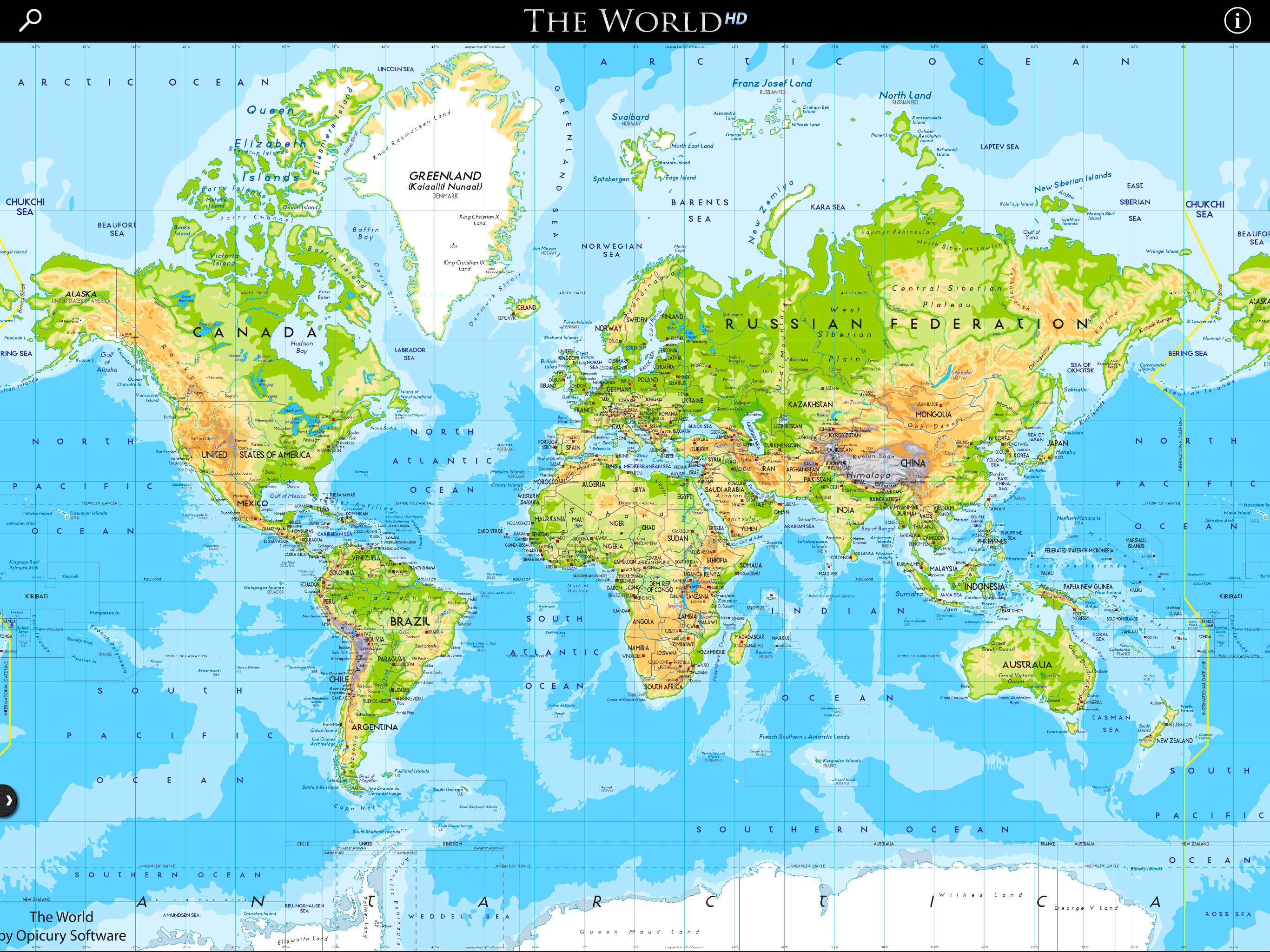
The app is relatively good at what it does, and more convenient on the iPad than some alternatives. The rendering of the maps seems generally rather good, however there seem to be some inconsistencies especially with the political maps. (For instance, the states of Mexico are sharply demarcated but not the states of Australia or Germany or the provinces of Canada.) In addition, the map presently seems to have some outdated information, for instance “Mount McKinley” in Alaska instead of the correct and official name, Denali; also, it draws the International Date Line through, rather than around, the nation of Kiribati.
I wish that we could switch to have commonly used English names for the cities. I use this to increase my knowledge but it is often hard to find the cities, rivers or even small countries as they are only given in the native language.
With the demise of the National Geographic World Atlas, this seems to be the best available. The world map is actually quite decent. Unfortunately if you want to look at regional maps, you are restricted to looking at one country at a time, without a way to relate it to the detail maps of other countries, and often presented in a way where part of the country of interest is cut off and can’t be seen in any way. The country maps are tolerable but not great, and to make things worth, much of the screen is wasted with generic information from the CIA Fact Book. When I’m looking for a map, every pixel not dedicated to the map is a pixel wasted! :( I have no objection to the CIA info being put in the app, but the app would be VASTLY improved if the public record CIA stuff was removed and the system for viewing the country maps (and the amount of detail in them) is improved.
THE PREMIER IPAD ATLAS - with RETINA VECTOR MAPS The World HD is unique in the app store because it includes both a complete set of country maps AND...