Check the acquisition promise
Read the store headline, screenshots and description. What problem is the app promising to solve?
Study the storefront ↗
Robert Chin · iOS
Explore the ad evidence, study the storefront, and build your next acquisition hypothesis.
01 / Creative research
Read the store headline, screenshots and description. What problem is the app promising to solve?
Study the storefront ↗Explore apps with direct store-link matches. Compare their hooks and formats without assuming the same approach works here.
Browse observed advertisers ↗Store rankings and revenue estimates describe market context. They do not establish ad spend, conversions or ROAS.
Review the market context ↗02 / Storefront & product
Study the product story and store experience behind the acquisition funnel.


03 / Market context
Keep revenue, downloads and store rankings separate from advertising performance.
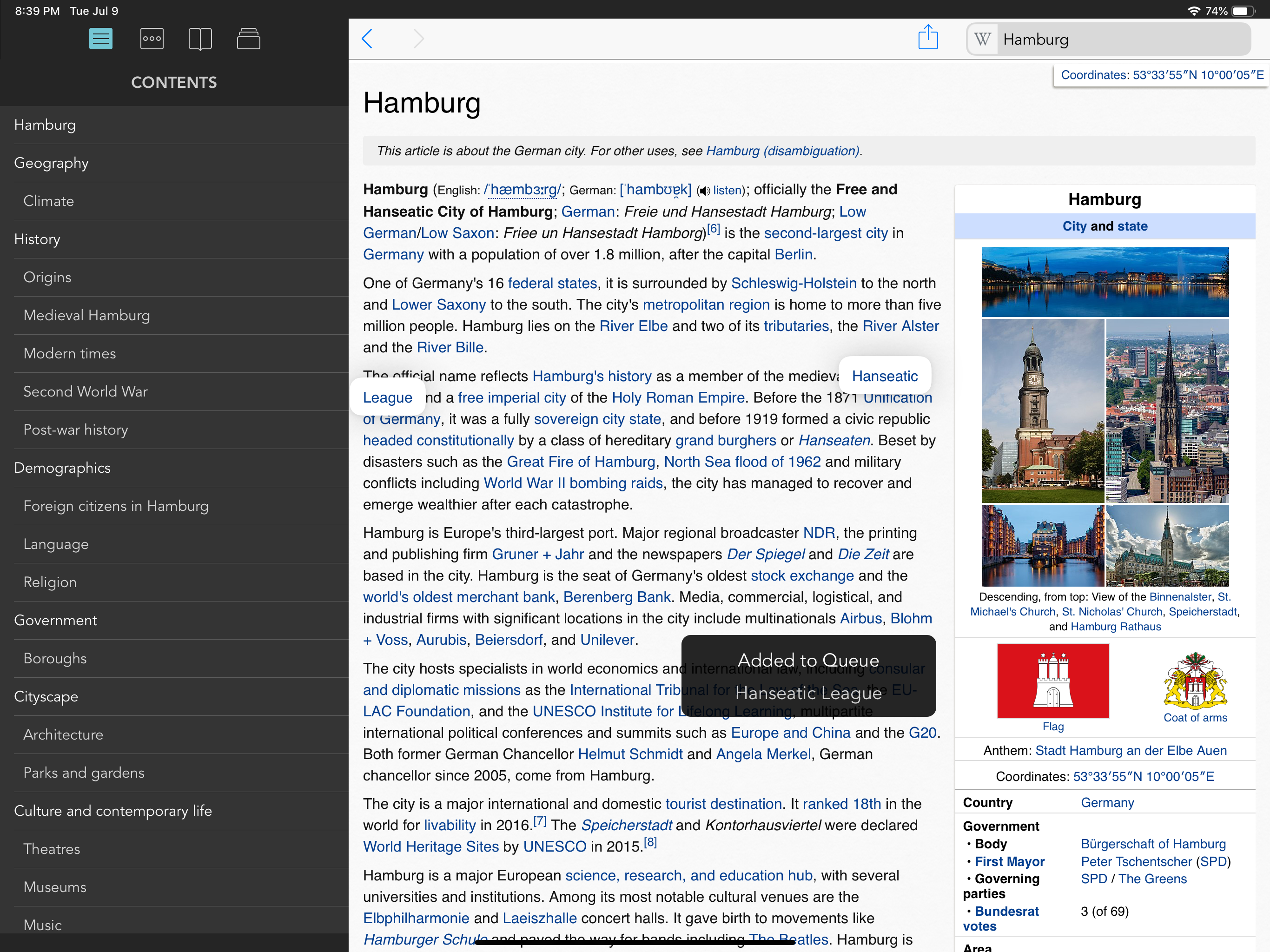
This is the ideal Wikipedia experience for searching, browsing, and reading available on the App Store. I have used this app for several years and rely on it daily. We’ve all read many Wikipedia webpages, where the page contains several words (that have links) that we are personally unfamiliar with. This results in opening of numerous tabs to read these definitions, going back-and-forth between tabs, often getting lost in chaotic tab overload. The app’s QUE feature is the solution to this problem. The app can keep track of your browsing history, only if enabled, which is very handy. All this personal data stays within the app for privacy concerns. Adjustable font and font size are ideal for a good reading experience. The only feature I would suggest/request is a true dark mode or black theme. Currently the sidebar and the reading page are white/black or white/black. For visually impaired people like myself (low vision), this is difficult on the eyes, in my case unreadable. The only mode I can read is in a dark mode. All I see is a blank page when the background is white. I’m sure many other sighted people would enjoy a true dark mode also. Thanks for your consideration, and keep up the great work.
Smart invert doesn’t keep the side bar dark, so there’s no way to make the screen all dark for calm reading that I can find. It really needs dark mode. Otherwise, it’s not really worth leaving safari with its reader mode. Please add dark mode so my money will not have gone to waste!
Wikipanion has been my favorite Wiki client since I first used it in my iPod Touch, many years ago. The features are great and has always offered a superior experience over other official and unofficial Wiki-browsing apps. My only complaint is the absence of a Dark Mode. I really, really, really need it., thou I spent many years using the app without such mode, it is mid-2021 and many popular and not-so popular apps (including Wikipedia’s official app) now offer a Dark Mode, thus my eyes have developed an habit for it. Highly recommended, the Plus version allows to keep track of your browsing and other nifty additional features.
Wikipanion Plus arrives for the iPad! The best gets even better! Enhance Wikipedia with queue mode, designed for keeping track of entries you want to...