
Check the acquisition promise
Read the store headline, screenshots and description. What problem is the app promising to solve?
Study the storefront ↗
Citizen Real Estate, LLC · iOS
Explore the ad evidence, study the storefront, and build your next acquisition hypothesis.
01 / Creative research
Read the store headline, screenshots and description. What problem is the app promising to solve?
Study the storefront ↗Explore apps with direct store-link matches. Compare their hooks and formats without assuming the same approach works here.
Browse observed advertisers ↗Store rankings and revenue estimates describe market context. They do not establish ad spend, conversions or ROAS.
Review the market context ↗02 / Storefront & product
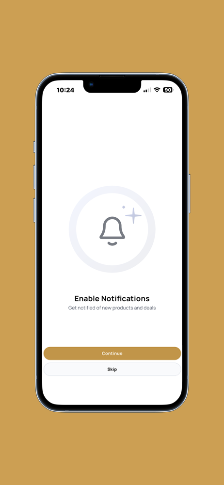
Study the product story and store experience behind the acquisition funnel.


03 / Market context
Keep revenue, downloads and store rankings separate from advertising performance.
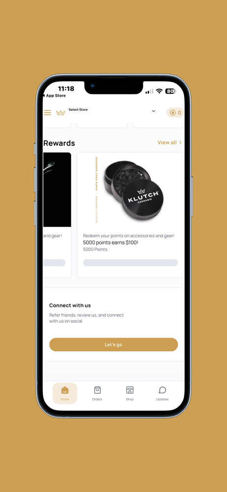
The creator of this app doesn’t seem to have ever bothered to check what it looks like on an actual phone screen. The interface is godawful. Some product names can’t even be told apart when you’re browsing unless you actually look at the specific product, making it clunky and annoying. In addition, the app now doesn’t read my location (it has all the correct permissions), which has rendered the app completely useless. It’s bad enough that Klutch prices are way too high and sales are basically unicorns, but with an app this broken, I am about done with Klutch.
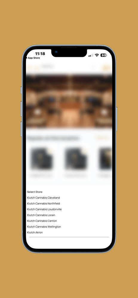
Out of 5.5” of vertical real estate on my iPhone 2.5” is taken up by TWO rows of navigation buttons, the reward points bar, and the profile/call/map buttons at the top. It says 2x I’m shopping at the Citizen by Klutch in Canton in case I forgot when I selected the store upon launching the app - Once at the top and again in the main body of the remaining 30-40% screen real estate where the actual shopping takes place. What’s even funnier to me is there is a hamburger foldout menu that when I press it, I get EVEN MORE NAVIGATION. Please just hide all of this in a foldout hamburger menu like you clearly know how to do. This is ridiculous and I would rather use a browser on mobile than this app. I can see 150% more products in one glance. The only thing this proves to be useful for is tracking points balance because it’s front and center. Looking forward to recreational sales opening on Tuesday, but I will be browsing your menu from my desktop. Cheers!
When shopping, only about half the screen is usable. Going to your orders and tapping to review an item puts you on a screen where you can't go back. The app doesn't offer anything the website doesn't other - than a lower quality experience.
Experience Klutch Cannabis at your fingertips. Shop online, manage your Loyalty account, and much more!


