Check the acquisition promise
Read the store headline, screenshots and description. What problem is the app promising to solve?
Study the storefront ↗
US Department of Veterans Affairs (VA) · iOS
Explore the ad evidence, study the storefront, and build your next acquisition hypothesis.
01 / Creative research
Read the store headline, screenshots and description. What problem is the app promising to solve?
Study the storefront ↗Explore apps with direct store-link matches. Compare their hooks and formats without assuming the same approach works here.
Browse observed advertisers ↗Store rankings and revenue estimates describe market context. They do not establish ad spend, conversions or ROAS.
Review the market context ↗02 / Storefront & product
Study the product story and store experience behind the acquisition funnel.



03 / Market context
Keep revenue, downloads and store rankings separate from advertising performance.
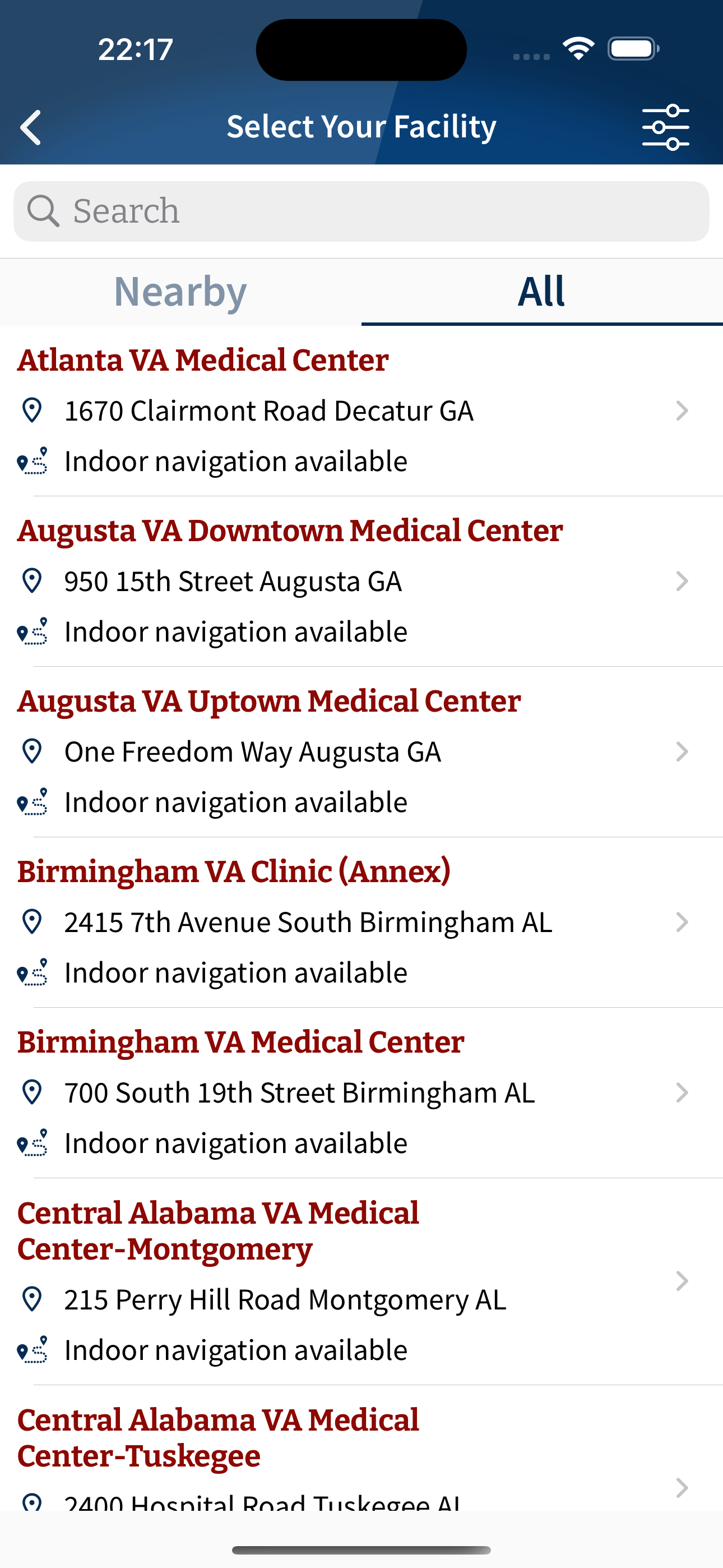
VA ME App. Dumpster Fire.🔥 If Kafka designed a mobile app, it would look like this. The VA Health and Benefits app is a masterclass in digital dysfunction—clunky, fragmented, and so riddled with usability failures it feels like a deliberate parody of government tech. Taxpayer-Funded Inefficiency With a budget that could fund a moon landing, this app still can’t deliver basic functionality. The Department of Government Efficiency (DOG) should treat this app like a crime scene. It’s not just inefficient—it’s insulting. Developers: Who Approved This? Whoever greenlit this monstrosity should fired. Veterans deserve better than a glorified error page masquerading as a health portal. The Obvious Solution: MyCharts by Epic. Epic’s MyCharts is already a proven, secure, and user-friendly platform used by leading health systems nationwide. Why reinvent the wheel with a square? Ditch this disaster and transition to MyCharts before more veterans suffer the consequences of digital monstrosity! Even the ‘Give Feedback’ button is a cruel joke. It launches your email client with no recipient address! What a joke. Paul
I like the app it does help when you look at the overall map of the facility but when you start moving in the direction of your location it will start recalculating and it take less than a minute to catch-up. At time times you can navigate yourself just by looking at the overall layout.
Please return the app to his original form where it had community based out which clinics as well as patient clinics. it makes it easier for VETERANS to check in without having stand in line at the chaos and also makes it easier for us to find our way. Removing community clinics and outpatient clinics has made the worse and make sure not want to use it. In fact, the 4.0 version was much better. It allowed community-based clinics and outpatient clinics were listed. You could do pass you schedule appointments. Please return it back to the future. Thank you.
Seamless VA Care—Anywhere Mobile Engagement puts the entire Veterans Affairs experience in your pocket. From finding the nearest VA facility to refil...