
Check the acquisition promise
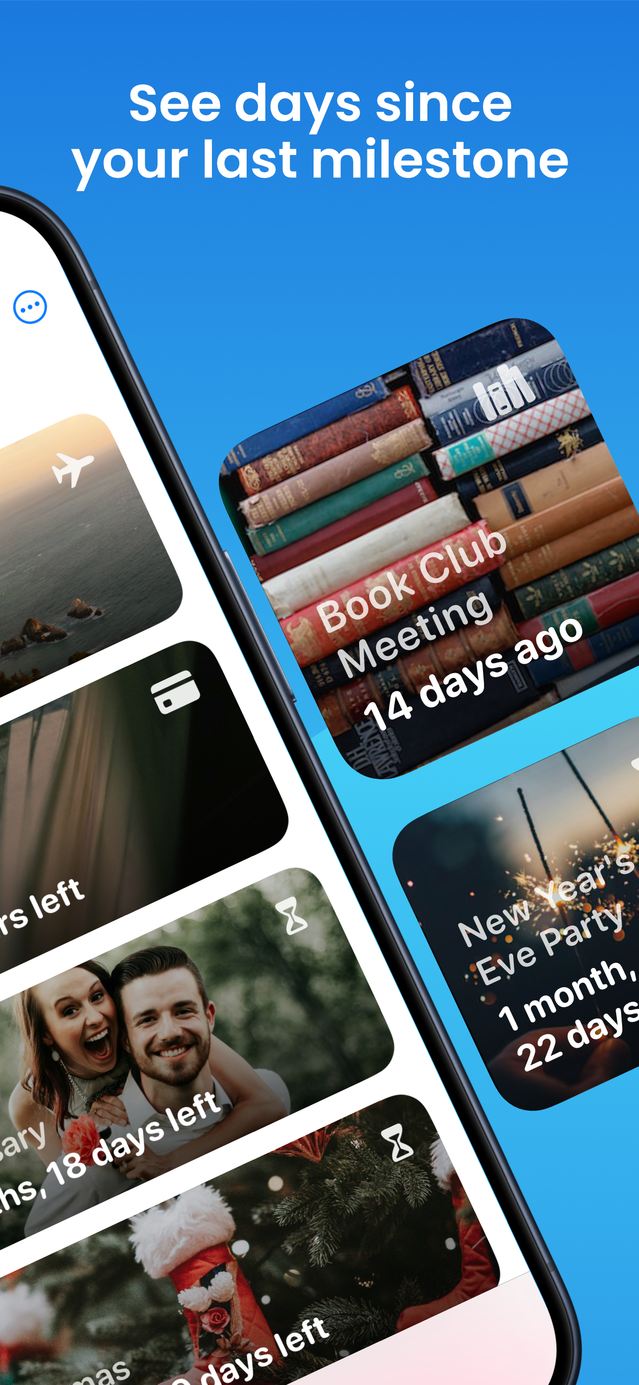
Read the store headline, screenshots and description. What problem is the app promising to solve?
Study the storefront ↗
Javier Gallo Roca · iOS
Explore the ad evidence, study the storefront, and build your next acquisition hypothesis.
01 / Creative research
Read the store headline, screenshots and description. What problem is the app promising to solve?
Study the storefront ↗Explore apps with direct store-link matches. Compare their hooks and formats without assuming the same approach works here.
Browse observed advertisers ↗Store rankings and revenue estimates describe market context. They do not establish ad spend, conversions or ROAS.
Review the market context ↗02 / Storefront & product
Study the product story and store experience behind the acquisition funnel.



03 / Market context
Keep revenue, downloads and store rankings separate from advertising performance.
Easy to use, very similar look to built in apps like reminders and calendar. I’ve downloaded probably 3-4 reminders apps and this is the one I’m going to keep. Also appreciate that it has no in app purchases, although adding an option to send a tip would be a feature I’d absolutely use Three feature requests: 1. Allow “all day events” similar to how calendar has all day events (pick default all day notification time in settings probably) 2. Let users pick what dates of time to use (ex: I want it to show checkboxes for each unit of time. Which would be especially useful customization for the widget as well. 3. Allow custom repeat (like in calendar as well). 4. Add custom and multiple alerts.
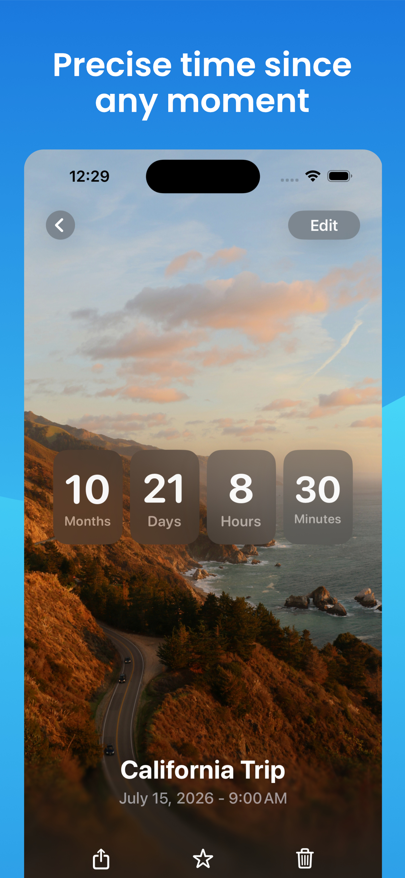
The app does exactly what I hoped it would do: it shows a time countdown widget on the lock screen! The UI is clean and simple. The only improvement I’d love to see is a fractional display of hours remaining. E.g. when there’s 5 hours 55 minutes remaining, the app shows “5 Hours Left”. It would be great if the display was a bit more precise and showed something like “5¾ hours left” instead.
The app looks really promising—clean and fairly intuitive UX. Unfortunately, it is very crude in the presentation of the countdown. What I mean is this. You can program a target date of say 55 days in the future. Unless, you are actually on the detail page of this countdown within the app, in ALL other areas, including the widgets, you will see 1 month displayed as the countdown period. Meaning the app somehow rounds down the actual countdown period, so you don’t actually see the 55 days. This is a huge disappointment. If people are using this for a countdown, then most of us probably would like a more accurate countdown display.
Count Time – Your Personal Event Tracker Track time counting down or up for your most important moments—whether it’s a birthday, a concert, a trip, o...
| Name | Price | Type |
|---|---|---|
| Monthly Plan | $1.99 | Monthly |
| Weekly Plan | $2.99 | Weekly |
| Annual Plan | $9.99 | Yearly |
| Welcome Annual Plan | $9.99 | Yearly |
| Annual | $19.99 | Yearly |
| Lifetime | $19.99 | One-time |


