Check the acquisition promise
Read the store headline, screenshots and description. What problem is the app promising to solve?
Study the storefront ↗
King Schools, Inc. · iOS
Explore the ad evidence, study the storefront, and build your next acquisition hypothesis.
01 / Creative research
Read the store headline, screenshots and description. What problem is the app promising to solve?
Study the storefront ↗Explore apps with direct store-link matches. Compare their hooks and formats without assuming the same approach works here.
Browse observed advertisers ↗Store rankings and revenue estimates describe market context. They do not establish ad spend, conversions or ROAS.
Review the market context ↗02 / Storefront & product
Study the product story and store experience behind the acquisition funnel.


03 / Market context
Keep revenue, downloads and store rankings separate from advertising performance.
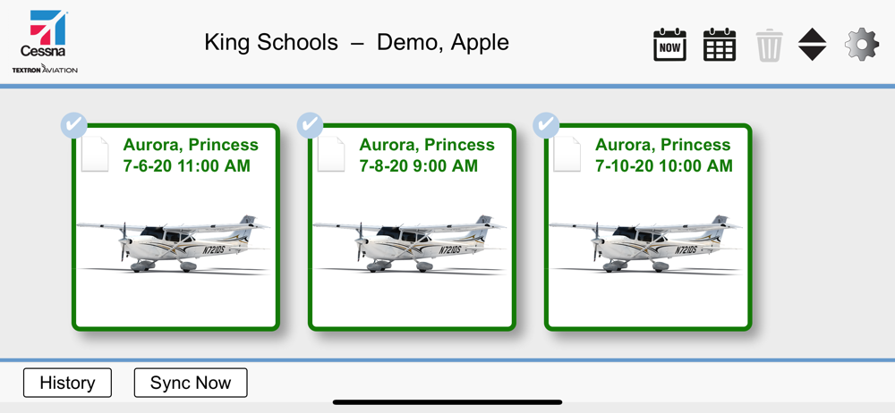
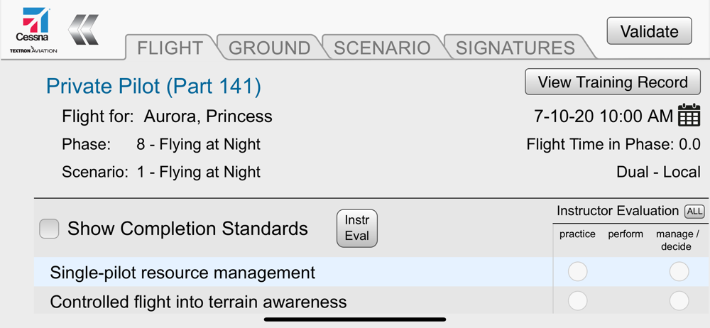
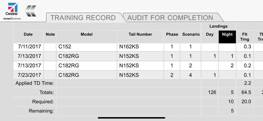
I used to use this app all the time to check off progress steps with my students while flying. I loved how after I selected a student, it would automatically take me to their next phase in sequence. After the last update, it no longer does this. Every student I select it shows stage 1 phase 1 regardless of where they are in the program. It also does not allow me to look at their training record as they all show up blank. I’m sure this might just be an issue that could be solved with an update. But wondering if anyone else is having this issue? Would love to see it addressed.
For a mobile app, the lack of flexibility is surprising. You cannot use it in portrait mode. This is a ridiculous and inexplicable design choice. I cannot figure out an intuitive way to look at a students entire previous training record, only showing most current entry. The only way to pull up student records who aren’t assigned to you forces you to scroll through the entire student list. In landscape mode on a mobile phone this is incredibly difficult. The scroll field is too small, causing you to continually and accidentally minimize the app, just trying to get to a student name that is far down the alphabet. This should be a text searchable field. When you are a check instructor, you are looking at the entire client base, not just your own students. Someone should’ve taken this into consideration. Chief pilot and assistant chiefs would have the same problem. Whoever designed this simply tried to adapt an already clunky interface from the desktop. Modern designs and user interfaces have made this a simpler task and should be adopted. Very disappointed with this app. It has great potential to be useful.
Great app and easy to use.
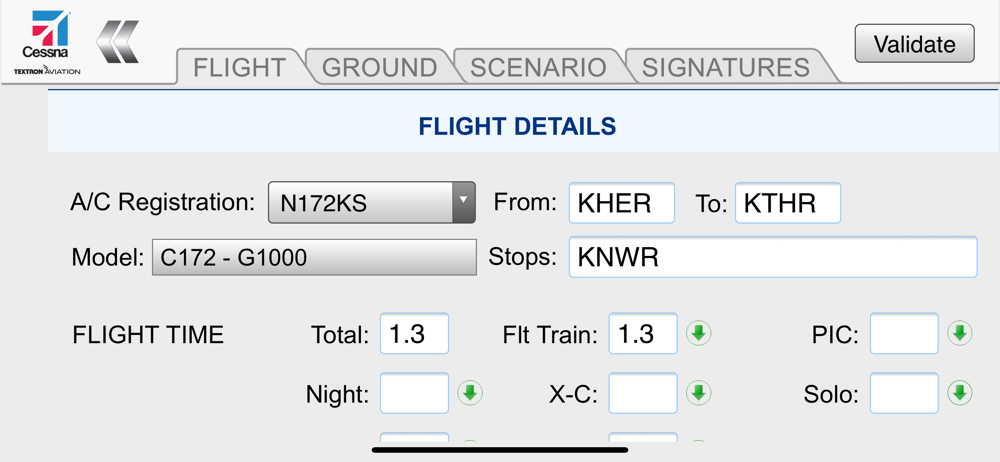
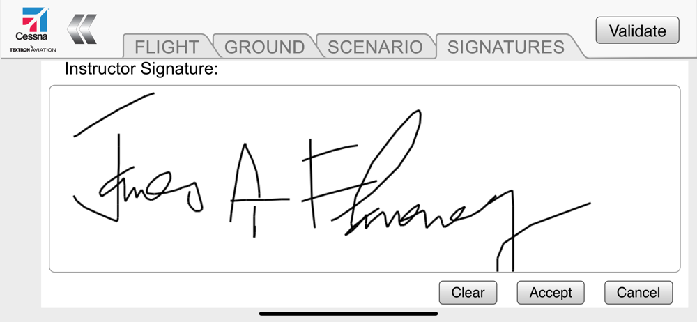
CTA Companion provides Cessna Pilot Center instructors mobile access to flight training scenarios and customer training records, and allows instructor...