
Check the acquisition promise
Read the store headline, screenshots and description. What problem is the app promising to solve?
Study the storefront ↗
Tyne and Wear Passenger Transport Executive · iOS
Explore the ad evidence, study the storefront, and build your next acquisition hypothesis.
01 / Creative research
Read the store headline, screenshots and description. What problem is the app promising to solve?
Study the storefront ↗Explore apps with direct store-link matches. Compare their hooks and formats without assuming the same approach works here.
Browse observed advertisers ↗Store rankings and revenue estimates describe market context. They do not establish ad spend, conversions or ROAS.
Review the market context ↗02 / Storefront & product
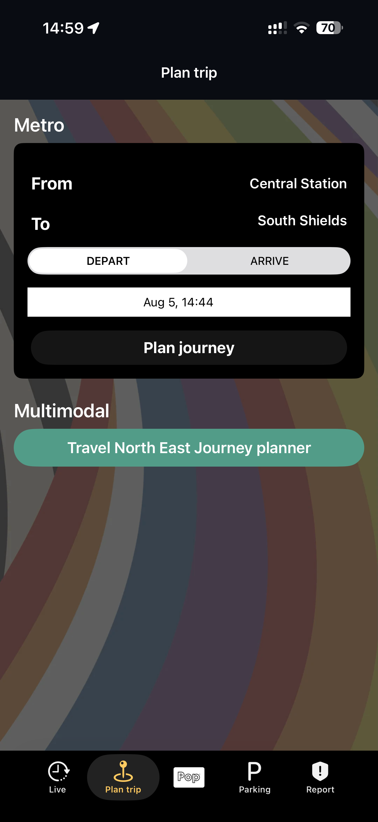
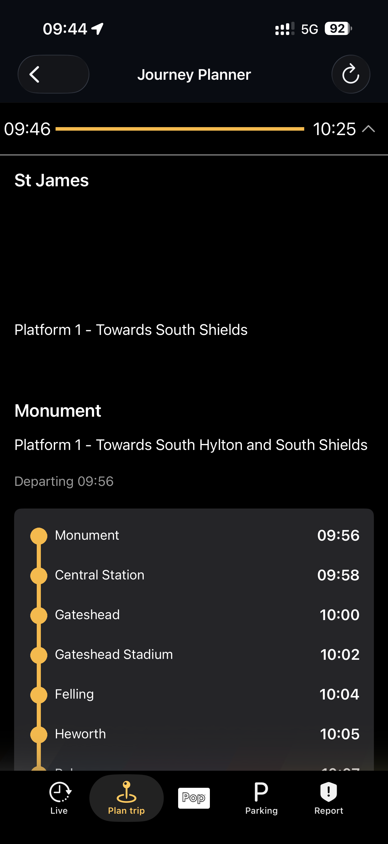
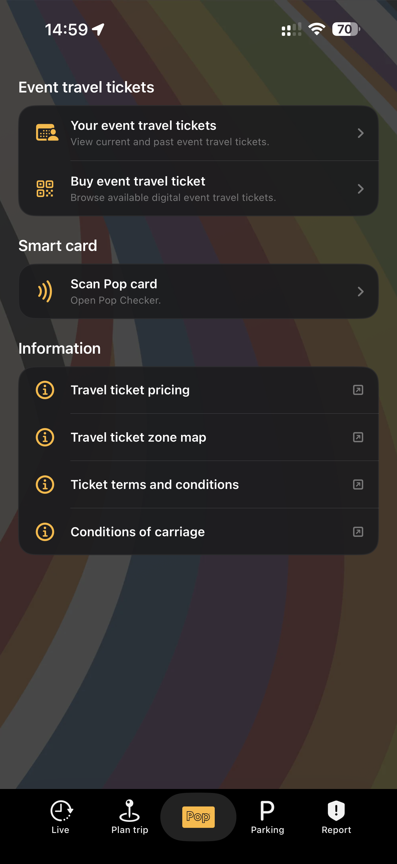
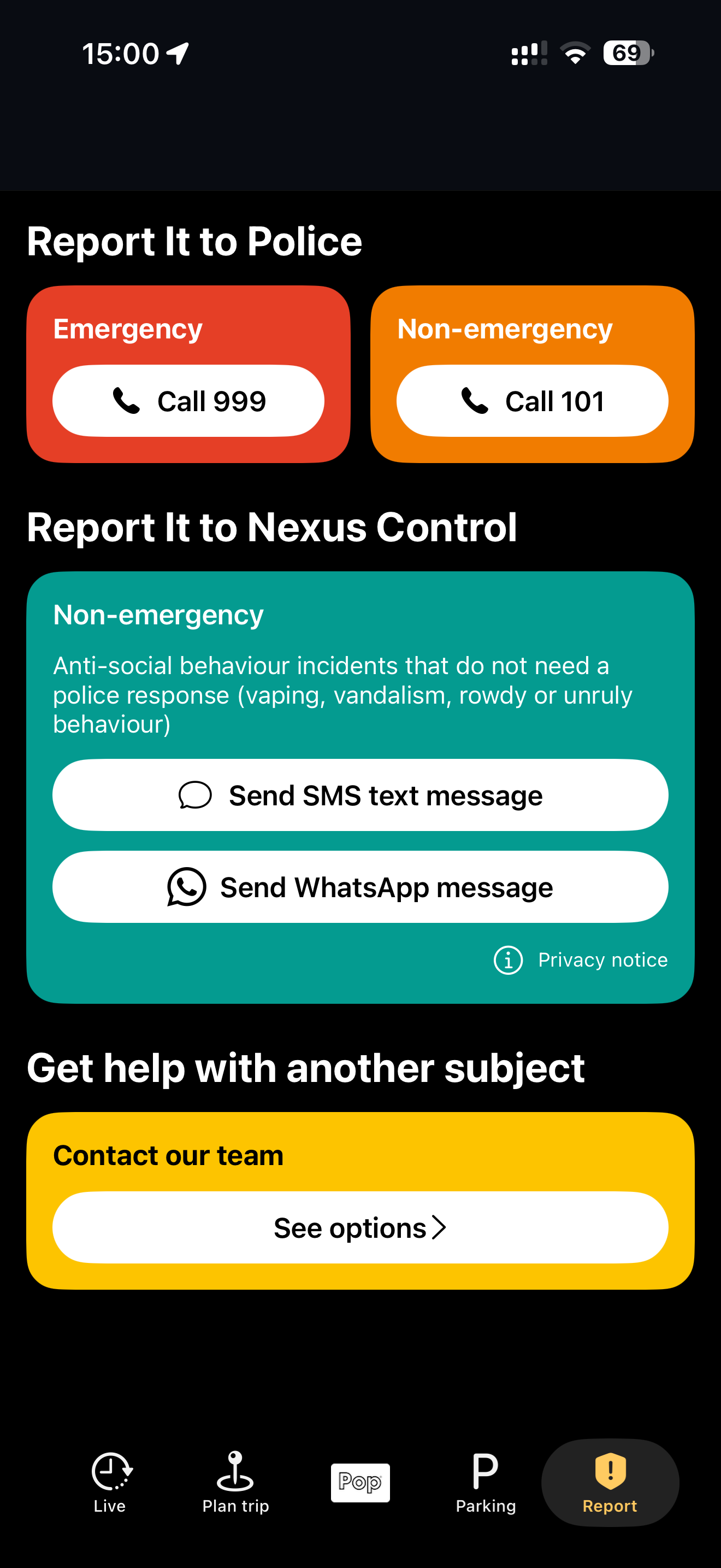
Study the product story and store experience behind the acquisition funnel.




03 / Market context
Keep revenue, downloads and store rankings separate from advertising performance.
As a daily commuter. The map, which is rather useless takes up more screen space than the actual list of train times. You can’t specify which platform you need times for, so you end up with a long lists of trains in a really small space (see South Gosforth station). All we need is list of trains leaving the specified station, platform and their destination.
The recent changes to add real time map tracking have not actually resulted in any improvements for the end user. All we really need to know is when the next metro is coming and be able to trust that information. Seeing the metro position on a large map that takes up most of the scene and blocks me from being able to see the list of upcoming trains has made the experience a lot worse. The map doesn’t add any information I don’t already know from the live arrival time, and now those are harder to get to! I know this was added due to frequent requests from the public but I would urge you to rethink the implementation. Seeing the list of upcoming arrivals is the most important feature of this app. The original addition of live arrival times was good enough.
I dunno who decided the design of the pop app now but the last design was actually simple to navigate and worked. The journey planners gone out the window,when your typing it in on the link it provides it doesn’t come up with metro stations close by,comes up with every other Newcastle they have on the whole nexus network. Absolutely brilliant idea to make the app less accessible for passengers. The design in general is unappealing compared to the last one. It’s not like we didn’t have a tracker before. Why do we need to see the full map? Massive flawed design. Change it back to how it was before. I actually can’t read it anymore and it’s stressful to navigate. I’m 24! Who came up with the horrible idea. Seems overkill but think about those who have learning difficulties. I don’t have any myself and im struggling to read the journey planner on the link. It’s coming up places outside the north east !
The Pop App is the official app for Tyne and Wear Metro. Plan journeys, track Metro services live on a map, receive real-time updates and notificati...


