Check the acquisition promise
Read the store headline, screenshots and description. What problem is the app promising to solve?
Study the storefront ↗
Jupiter Interactive Group LLC · iOS
Explore the ad evidence, study the storefront, and build your next acquisition hypothesis.
01 / Creative research
Read the store headline, screenshots and description. What problem is the app promising to solve?
Study the storefront ↗Explore apps with direct store-link matches. Compare their hooks and formats without assuming the same approach works here.
Browse observed advertisers ↗Store rankings and revenue estimates describe market context. They do not establish ad spend, conversions or ROAS.
Review the market context ↗02 / Storefront & product
Study the product story and store experience behind the acquisition funnel.



03 / Market context
Keep revenue, downloads and store rankings separate from advertising performance.
I love this concept and want to love the app so much, but my initial take is that it’s kind of a mess. The feature of setting different article lifespans for different feeds is great, except when you go change the lifespan for a feed and then hit save, nothing gets saves, so there doesn’t seem to be any way to *use* the feature. I clicked something that opened an article preview pane, which is nice, but then there’s no way to close it - the entire control disappears! - and I was stuck until I figured out that “sift mode” under the view menu really means “hide preview pane.” Basically - awesome thinking - please be a little less clever in the UI so users aren’t left scratching their heads wondering how to do what they want. And how do I actually change article lifespans? Because that’s one of the main things that attracted me to this, so it is a bummer to have paid my ten bucks and find it just isn’t there anywhere I can find it.
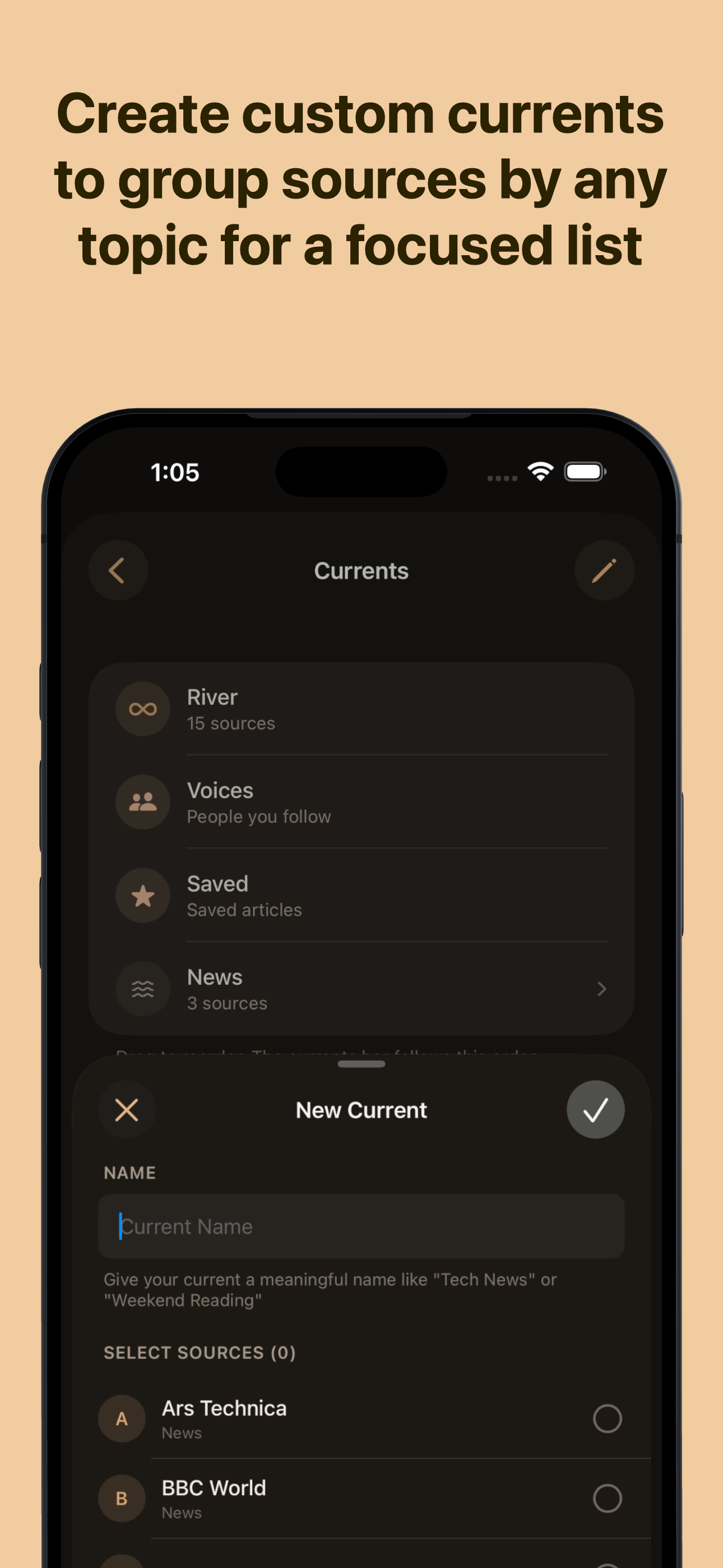
The app is visually and structurally very well designed. I paid for the app and very happy to support developers producing high quality apps like this one. However, the reader is missing a key feature that sadly keeps me from switching over from my current RSS reader, Feedly. Although the app supports different “Currents” (categories in Feedly speak) each current has to be viewed separately via the menu bar. Feedly has a great feature which provides a Today view option that displays the 6-7 of the most recent posts from each category (or skips a category if there are none) so I can scroll down and see just a handful of articles from each category. Feels much calmer and more organized and less chaotic than a stream of random, unrelated topics. Also, once I scroll past an article it’s marked as read so I don’t have to constantly remove articles from my feed manually. And after I get through last category, the feed is done, with a big checkmark and some basic stats, which makes me feel like I accomplished something even when I really haven’t.
I guess for a long time, the whole RSS mantra tired me out. I would get some new app and add in an OPML file and watch the app dutifully download thousands of subscription items. It seemed like no matter what I could only really look at the “today” menu. When I went backwards, I was faced with thousands of things. I wanted something different. No counts, no feeling of frustration with the reading. Enter Current Reader. I use the app on my Mac and iPhone. With the latest updates, I’m really enjoying the experience of losing the counts and whatever status they all had. There are things still being built and issues being fixed and that’s the other good thing with this. I can just watch as the app evolves. Right now though, for me and how I have worked on defining my use case, it works well. Thanks Terry. Loving the app.
Current is an RSS reader built on a simple idea: your feed should never make you feel behind. There are no unread counts. No red badges. No number cl...